Copy link to clipboard
Copied
Hello dear community,
A long time ago I was looking for a cover art for a classical music album, in digital format (png or something like that), but all online pics were kind of mediocre quality. I asked here somehow, and I got completely blown away by the reply of one user that basically told me "why don't you do it yourself?".
And I was like... what do you mean? You... you can't do this, hahaha, it's a cover art.
Then this guy started to make the background (exact color tone, exact texture, it had like sparkling effects, he made all of it manually, simulated perfectly the effect), found the exact font for all the letters, composed everything and shared the picture. I could not believe it. Simply would have never thought of that as a solution.
Anyways, now I want to do the same with an apparently much simpler picture:
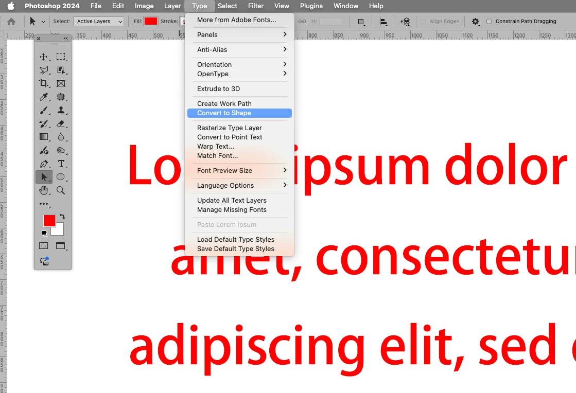
That's a white background. I want to replicate the letters and design so I can make it way bigger than this. So far I've used a webpage called myfonts to analyze the fonts, top right is PF DIN text universal, the bottom is FF DIN Pro Condensed Bold, and I'm having trouble finding the hr font, really looks like Fuglesans Bold but the h is not really the same, and I am annoyed by that. Also, it's really hard to "guess" the little letter details to match perfectly the original design, like distance between letters, how "bold" they are, what variables in the font changed... Also, I don't know how to make the smiley thing in a correct way.
Once composed, how can I link everything together so I can change the image size all together?
Thank you!
1) Please don’t do that to a Type Layer because that destroys the Type/vector data.
Use the kerning to edit the distances of letters from each other (alt-left arrow and alt-right arrow) or at the very least Type > Convert to Shape, which will create a Shape Layer (a Solid Color Layer with a Vector Mask) in which you can use the Direct Selection Tool (A) to select complete subPathItems by alt-clicking them to move them (if necessary).
2) You may have to get accustomed to working with the Pen
...Copy link to clipboard
Copied
I don't know how to make the smiley thing in a correct way.
By @rambomhtri
Many logos combine standard fonts with hand-drawn elements or altered font shapes. To me it looks like the “smiley” thing is a reference to the musical tie symbol, but it doesn’t quite have the same shape. They could have taken the tie symbol from a music notation font and altered it using the path editing tools, or they might have used the same tools to draw it from nothing, as shown in the demo below. This is much easier if you are familiar with using the Pen tool and path editing tools that are used to edit vector shapes in many Adobe graphics and video applications.
If you find a font character that comes close, you can select it, choose Type > Convert to Shape, and then use the path editing tools to alter the outline however you want.
Once composed, how can I link everything together so I can change the image size all together?
By @rambomhtri
Simply create a layer group. Select the layers that make up the design, and choose Layer > Group Layers. They will now appear to be contained in a “folder” in the Layers panel, and when that group is selected you can manipulate everything in the layer group as a unit.
Copy link to clipboard
Copied
Yeah, I think it's a legato, a music symbol. I am doing it from scratch, I will share the complete picture here once I'm finished.
Copy link to clipboard
Copied
If at all possible, do this logo in Illustrator or another vector-based app like Inkscape.
Copy link to clipboard
Copied
Good one, I should have mentioned that part and I completely agree. @rambomhtri, for a logo like this that is all type and hard-edged lines, using a vector application such as Illustrator or Inkscape is typically better because you can export it in a format, such as SVG, that preserves resolution-independent scalability of the type and vector shapes.
I was focusing on how it could be done in Photoshop, but I should have remembered that Photoshop is not the best for scalable logo design.
Copy link to clipboard
Copied
Yeah, I was thinkig about it as a LOGO, but it was really a picture that happened to be a logo, not the other way around. I normally don't want to work with these kind of pics, also I am not familiar at all with Ilustrator. But yeah, thank you, I thought about it and knew a software like Illustrator would be more precise for this.
Vector based imager are awesome, I love that you can zoom in or out without losing any quality.
Copy link to clipboard
Copied
"I want to replicate the letters and design so I can make it way bigger than this"
You can't do that with Photoshop. Illustrator is the way to go. Doing type in Illustrator is really easy and its drawing one vector shape.
Copy link to clipboard
Copied
I'm having trouble finding the hr font, really looks like Fuglesans Bold but the h is not really the same, and I am annoyed by that.
For two (relatively) simple letters like these it might be best to just recreate them.
In such cases it is useful to use the extreme points of a shape so one can lock the point’s Bezier-handles to horizontal/vertical by pressing the shift-key.
Copy link to clipboard
Copied
I've done this much so far, and just to make sure, I created a 4K picture with 300ppi:
I don't know what are those cyan lines TBH... first time I see them, but also I believe first time I open a project and select the premade movie 4K canvas. Anyways, I am having big trouble finding the hr letters or recreating them. I don't know what font it is, and recreating it with rectangles doesn't look professional, or at least I can't make it look professional.
Copy link to clipboard
Copied
The cyan lines are guides (View > Show > Guides).
Why is »orchester« a plain pixel layer and not a Type Layer? This means that re-scaling will degrade it, possibly notably.
I recommend you use the Pen Tool to create a Shape Layer for the »hr«.
Copy link to clipboard
Copied
I rasterized the orchester word so I could move each letter individually. I was not able to fit the size and space between them, also some letters like the t or h had to be cut.
Ideally I thought "okay, I will create a layer for each letter and then move each to the exact position". Then I tried to cut the t or h but in letter format they wouldn't allow it, so I rasterized them all and worked them like pictures. Do you know any better way? That's the best I could do.
I tried to use the pen tool but it was not working, the curves were not getting 100% correct, you could tell the r was weird... I still haven't managed to do it, I am kind of stuck.
Copy link to clipboard
Copied
1) Please don’t do that to a Type Layer because that destroys the Type/vector data.
Use the kerning to edit the distances of letters from each other (alt-left arrow and alt-right arrow) or at the very least Type > Convert to Shape, which will create a Shape Layer (a Solid Color Layer with a Vector Mask) in which you can use the Direct Selection Tool (A) to select complete subPathItems by alt-clicking them to move them (if necessary).
2) You may have to get accustomed to working with the Pen Tool.
Like I mentioned earlier: Setting the points at the horizontal and vertical extremes allows to use the shift key to lock the handles to vertical and horizontal direction when dragging them.
Copy link to clipboard
Copied
Here it is!
I have a question though... how do I make sure that all the lines that should be parallel, are parallel, and how do I make sure that all the curves join each other as smooth as possible.
I can make zoom and use my eyes, but that does not feel like precise at all, I mean, I am working with a computer, might be okay if I am drawing on a paper in real life, but... For example I touched the width of the r, and now I can't tell if the r "tower" is a rectangle or not.
Copy link to clipboard
Copied
Use guides and snapping. There is an option to snap vector tools to the pixel grid, in Preferences.
Copy link to clipboard
Copied
Did you use the Bezier handles at all?
Edit: Fewer Points with connecting curves instead of many corner-points can be beneficial for later scaling for example.
Copy link to clipboard
Copied
I made it!
Wow the pen tool came very handy, have not used that tool that much TBH, but my God!
Copy link to clipboard
Copied
Copy link to clipboard
Copied
To recreate the cover art, use vector software like Adobe Illustrator or Inkscape. Start by identifying the fonts (e.g., PF DIN Text Universal, FF DIN Pro Condensed Bold) and replicate the text, adjusting kerning, weight, and spacing to match the original. For the smiley face, use shape tools. Group all elements to maintain proportional scaling. Export the design as a scalable vector file (SVG, EPS) or high-resolution PNG for flexibility. This method ensures quality is preserved at any size.
Copy link to clipboard
Copied
Thank you for parroting what we have been saying.
Find more inspiration, events, and resources on the new Adobe Community
Explore Now