How do I get this effect with my font?
Copy link to clipboard
Copied
I have photoshop - is there anything I can do to make my text look like this?
Explore related tutorials & articles
Copy link to clipboard
Copied
I'm moving this to the Photoshop forum.
You should also tell us about your Photoshop version.
IMHO, Illustrator would be probably the better choice for an effect like this.
Copy link to clipboard
Copied
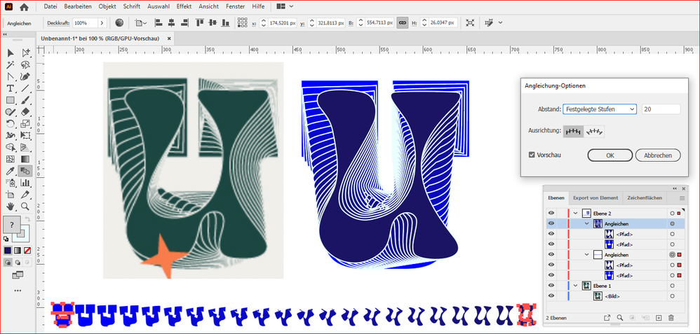
My guess is: I see remnants of the original font at the "base". (This original font also looks familiar; one of those super-blocky slab serif fonts.) It looks like the word was duplicated, then probably was modified in steps as each duplicate was done using a combination of the path and shape tools. (It looks like a fill of dark green with a thin white stroke.)
(And, I'm sorry to say, Photoshop's vector tools are a mess compared to Illustrator's. You're much better off doing it there.)
Copy link to clipboard
Copied
One possibility (in Illustrator) is the front and back shapes were created then made into a Live Blend to create the in-between shapes. Photoshop does not have a Blend feature.
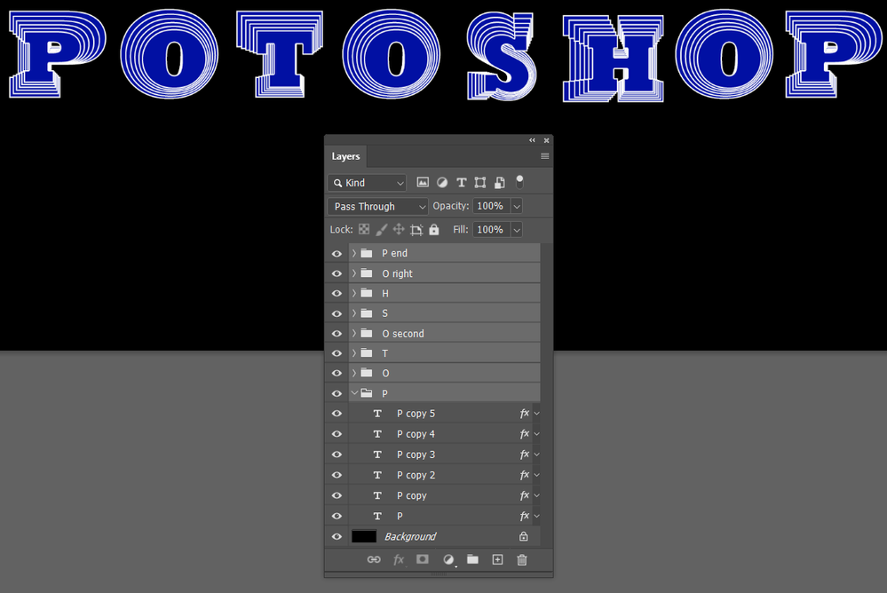
In Photoshop you could modify each shape individually, each on its own layer.
Jane
Copy link to clipboard
Copied
is absolutely correct. In Illustrator you can do this with Live-Blends. But the result is difficult to predict. Even moving an anchor point can lead to a completely different result.
Copy link to clipboard
Copied
I'd bet my bottom dollar that's what that is. The results are so similar.
Copy link to clipboard
Copied
You can do a similar effect with Step & Repeat, but nowhere near as complex as the example which appears to warp each step as well as reduce its size.
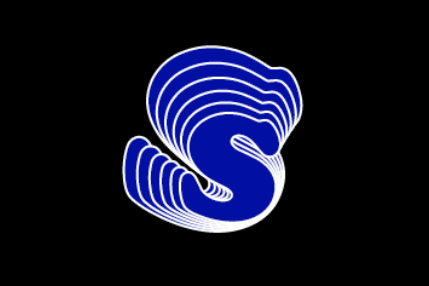
I tried adding some warp to the Free Transform steps, but it broke the Step & Repeat (which can be very touch and go, like it doesn't work with Smart Objects). The shape of the initial character makes a difference. If you don't have Illustrator, it at least gives you an option, and if you don't mind manually producing the steps, you could get exactly the same or even wilder effects. You'd need to add the Stroke, and make the character a Smart Object for the warp to work.
Copy link to clipboard
Copied
BTW I started with Rockwell because the example looks to have a slab serif font, but changed to Cooper Black which is nearer to the example character shape.


