- Home
- Photoshop ecosystem
- Discussions
- How do I make an image more "vibrant"?
- How do I make an image more "vibrant"?
How do I make an image more "vibrant"?
Copy link to clipboard
Copied
Hello, first time posting!
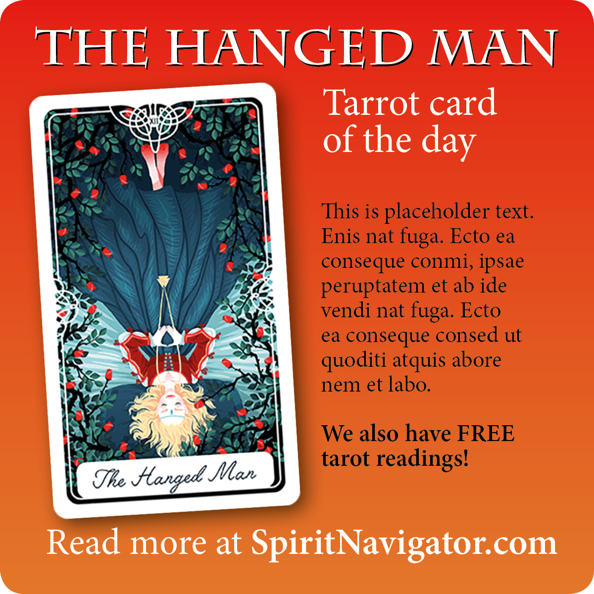
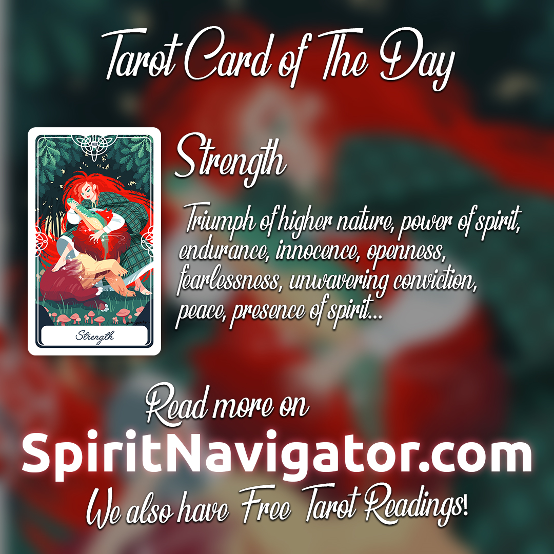
I am the lead designer of Spirit Navigator. My task for the week was to design a set of images like the sample one below, but we haven't released them yet into the public, so no resharing, please. My boss tells me that the images should be "more vibrant and colorful" so I tried the different color manipulation options presenting more than 20 options for each image (they're 22 in total, so that makes 440 images... ugh), but he's still not satisfied with the results. I am using Photoshop CS6, the methods I applied to the images were mainly from the Adjustments options and playing with the sliders to achieve an effect that I thought would be satisfactory. I used Vibrance, Hue/Saturation controls, Exposure levels, the Color balance functions and the Curves graph. I've tried almost everything and I am at a point that I'm close to surrendering. Do you have any tips for me? How do I make an image "more vibrant" than this? Any tips are welcome. Please help I'm desperate! ![]()
(p.s. on a side note it might be that my boss is having a bad week or something, but this is going on for more than I thought it would... already for 22 simple images)

Explore related tutorials & articles
Copy link to clipboard
Copied
It sounds like you need to get a better description of what your boss means. If you've adjusted saturation etc, that would make the image more vibrant. Your background image does look a little muddy, maybe due to the blur. Maybe not so much blur, but get your boss to explain better.
Copy link to clipboard
Copied
This is public forum so you’ve already shared... maybe it’s the colours themselves. That’s a nice green but it isn’t a vibrant green. You wouldn’t fix that with a slider but by choosing a diffetent design colour. Idea: pick one image, make designs with different shades, present for picking a favourite. Also ask for examples of “good colours” in other work. The consumer taste is for unrealistic and oversaturated, just go to a tv shop.
Copy link to clipboard
Copied
These things are very subjective, but I would have thought IMO the ad would be more powerful and interesting if the tarot card was the main feature, like this:
Copy link to clipboard
Copied
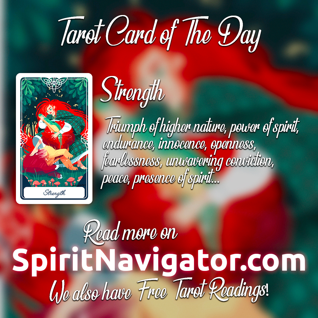
Is this more like what you are looking for? The first image is yours and the second is a re-working with more vibrant color.


Copy link to clipboard
Copied
Since there is no address or price information presented, I assume this appears in a web page.
What is its purpose?
Is this font choice, particularly for the four lines of type, easy or difficult to read?
Is there a purpose for the the out-of-focus taro background or is it a distraction?
Should the taro card be actual size?
Is the design uncluttered and appropriate for the market and product or service?
Perhaps "more colorful and vibrant" is not the problem. Perhaps it would be wise to begin again.

