• Global community
    • Language:
      • Deutsch
      • English
      • Español
      • Français
      • Português
  • 日本語コミュニティ
    Dedicated community for Japanese speakers
  • 한국 커뮤니티
    Dedicated community for Korean speakers
Exit
0

How to give solid color a liquid texture??

Community Beginner ,
Jul 29, 2019 Jul 29, 2019

Copy link to clipboard

Copied

Hey everyone!

I am about to begin my second semester towards a BA degree in graphic design, so I am still a beginner & still very much learning the art that is Photoshop CC.

I have scoured the web in search for help on this with no luck!

I am looking to add texture to a solid color in order for it to appear more liquid-like, or wine-like, to be more specific.

I have created a tilted wine glass using a Custom Shape, & used the Curvature setting of the Pen Tool to create the wine in the glass.

Does anyone have any suggestions as to filters, effects or other editing options I can use to give my solid shape just a little more depth/character/etc.?? This is going to be a very simple decal sticker for a friend's boat, so I'm not looking for a ton of detail or realism here. Just something to help make it look a little less...flat.

Thank you in advance!! I look forward to learning something new!

Views

2.2K

Translate

Translate

Report

Report
Community guidelines
Be kind and respectful, give credit to the original source of content, and search for duplicates before posting. Learn more
community guidelines

correct answers 1 Correct answer

Community Expert , Jul 29, 2019 Jul 29, 2019

With anything like this, try and find examples of the real thing.  When you know what it is supposed to look like, you can think about how to illustrate that look.  This is a photograph I found on flickr

I've found an empty wine glass and made a selection and removed the background.  You can see the transparency around it.

I have tilted the glass and made a selection with a level top, and matching the bottom of the glass

I have filled this selection grey on its own layer.  This is just a trick I us

...

Votes

Translate

Translate
Adobe
Community Expert ,
Jul 29, 2019 Jul 29, 2019

Copy link to clipboard

Copied

With anything like this, try and find examples of the real thing.  When you know what it is supposed to look like, you can think about how to illustrate that look.  This is a photograph I found on flickr

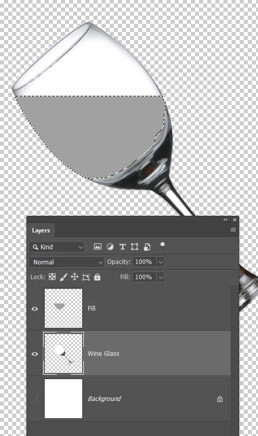
I've found an empty wine glass and made a selection and removed the background.  You can see the transparency around it.

I have tilted the glass and made a selection with a level top, and matching the bottom of the glass

I have filled this selection grey on its own layer.  This is just a trick I use to save that shape and selection.  You'll see why later.b
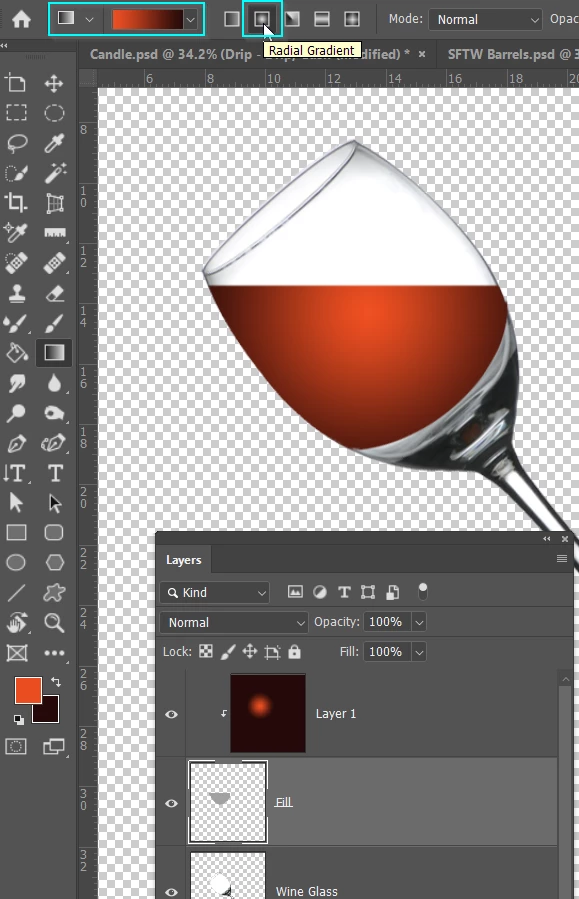
I've set red as foreground colour, and black as background

Selected the gradient tool and Radial in the Options bar

Then dragged out a gradient from the center of the glass, but on a new layer.

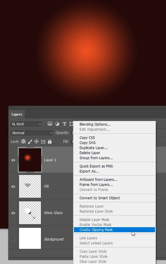
You can see that has filled the layer, but I have clipped that layer to the grey template layer I made earlier, which locks it to that shape
To make that 'clipping mask' right click the layer, and choose Create Clipping Mask

You can also hold down the Alt (Opt) key, and click on the intersection between the two layers.
This is why I like to clip to a template layer.

I can move the gradient.
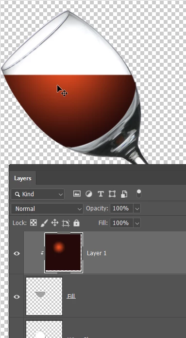
I can use the Smudge key to drag the gradient into different position.

Or I can delete most of the gradient layer just leaving a rectangle that covers the template, and use Free Transform > Warp to shape it.

The point is, I still have the outline intact no mater what I do with the gradient layer.  That is a powerful aid to achieving the look you want.
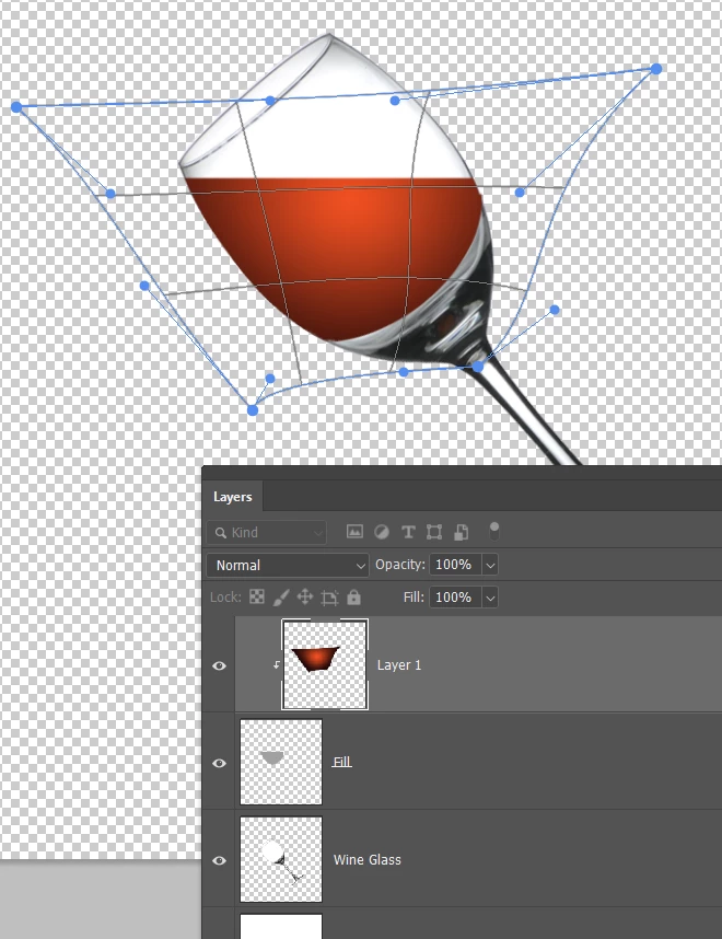
In all of the above examples, the bottom edge of the gradient is probably to well defined.  We can't blur the entire template, but we can blur just one part of it.

I've selected the template layer, and turned on Quick Mask by hitting the Q key.

Then paint with black just on that bottom edge that we want to soften.

Note Quick mask usually uses red, and I have changed it to gree to show up against the colour of the wine
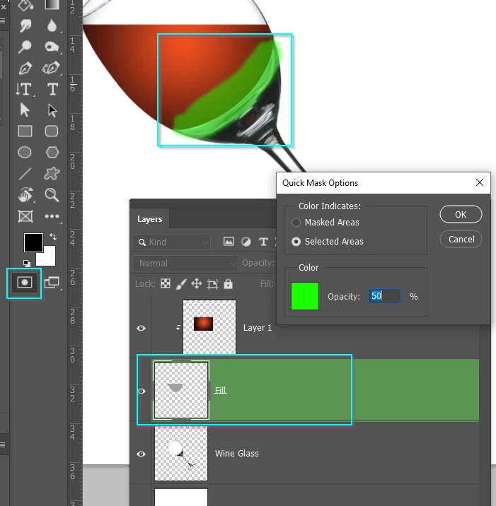
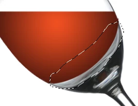
Turn off Quick mask which leaves us with the selection
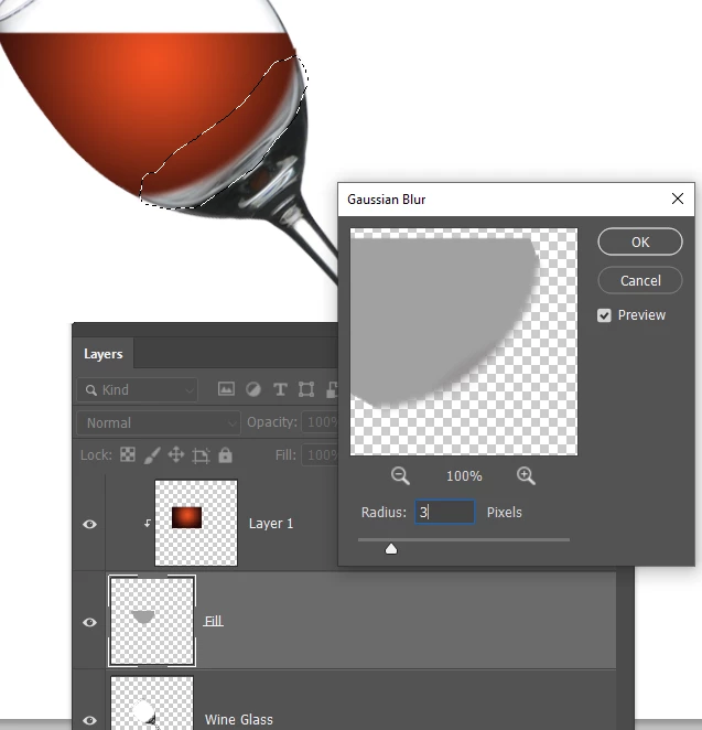
We can now use Gaussian Blur to soften just that bottom edge.  You can see how the transition is softer there, but we still have a sharp outline in the rest of the wine layer.
That's enough to be getting on with.  If you need help with specific look, textures etc, ask and preferably with an example image so we are all on the same page.

Votes

Translate

Translate

Report

Report
Community guidelines
Be kind and respectful, give credit to the original source of content, and search for duplicates before posting. Learn more
community guidelines
Community Expert ,
Jul 29, 2019 Jul 29, 2019

Copy link to clipboard

Copied

How to make things look less flat. Just add some highlights.

You don't need to get it perfect right off the bat.  You can blur, or Free Transform to shape your highlight to the object.

A red disk. You don't any flatter than this

Inner Shadow layer style

Bevel % Emboss.  I find this can be limited with large objects...

...so I have turned it off and filled a white circle on a new layer

And blurred it.  I also reduced the Inner Shadow.

Shading is how you give flat objects some depth

Votes

Translate

Translate

Report

Report
Community guidelines
Be kind and respectful, give credit to the original source of content, and search for duplicates before posting. Learn more
community guidelines
Community Beginner ,
Aug 16, 2019 Aug 16, 2019

Copy link to clipboard

Copied

LATEST

This is EXACTLY what I was looking for!! Thank you SO much for taking the time to show me this! It's perfect! I think this is exactly what my design needs to add just a little bit of realism without losing the graphic look i'm going for. Thank you again!

Votes

Translate

Translate

Report

Report
Community guidelines
Be kind and respectful, give credit to the original source of content, and search for duplicates before posting. Learn more
community guidelines
Community Expert ,
Jul 30, 2019 Jul 30, 2019

Copy link to clipboard

Copied

Greate job Trevor.Dennis!

https://www.smashingmagazine.com/2008/09/38-photoshop-tutorials-on-rain-showers-and-water-drops/

Votes

Translate

Translate

Report

Report
Community guidelines
Be kind and respectful, give credit to the original source of content, and search for duplicates before posting. Learn more
community guidelines