

- Home
- Photoshop ecosystem
- Discussions
- Re: How to make a realistic shadow from this pictu...
- Re: How to make a realistic shadow from this pictu...

Copy link to clipboard
Copied
Hello,
I have tried and tried and tried to make a realistic shadow, but I can't make it looking realistic using this tutorial Create Highly Realistic Shadows by Detaching Drop Shadow in Photoshop - YouTube
What can I do to make this shadow realistic?


 1 Correct answer

Hi
To answer a couple of your questions.
You said there is no fade, that is why I used s low opacity soft brush (0%hardness) so that I built up the shadow. I was also using pen pressure so my strokes varied between 0 and 25% opacity.
Sorry about the confusion on the c25%. I was abbreviating 'circa 25%' meaning 'around 25%'. But that was setting the maximum when pressing hard with my pen. If you don't use a tablet then set the opacity lower.
Dave
Explore related tutorials & articles
 15
Replies
15
15
Replies
15
Copy link to clipboard
Copied
Hi
I'd forget the drop shadow. Just decide where your lights are coming from then paint using a soft round brush at opacity c25% and on a layer set to multiply blend mode. Keep the shadows dark where the items are close to the ground and faded further away. If you overdo it just switch the brush to white (keeping the brush opacity to c25%) and paint the overdone shadows out.
Dave
Copy link to clipboard
Copied
Hello Dave,
Thank you for replying so quickly!
I tried you technique but there is no fade when doing it your way?
Copy link to clipboard
Copied
Hi
To answer a couple of your questions.
You said there is no fade, that is why I used s low opacity soft brush (0%hardness) so that I built up the shadow. I was also using pen pressure so my strokes varied between 0 and 25% opacity.
Sorry about the confusion on the c25%. I was abbreviating 'circa 25%' meaning 'around 25%'. But that was setting the maximum when pressing hard with my pen. If you don't use a tablet then set the opacity lower.
Dave
Copy link to clipboard
Copied
Thanks!!!
I used your technique now,
what do you think of the outcome?
Copy link to clipboard
Copied
Hi
Yes that is getting there. I would probably darken it slightly where her trouser seat meets the floor in a similar way to the shoe, but not by too much otherwise it won't fit with the rest of the shadow.
Dave
Copy link to clipboard
Copied
Thank you Dave!
How about now? Is there anything else I should fix before posting this on my website? (I will fix a more realistic cut of the person, this was only a mock up for the shadows).

Copy link to clipboard
Copied
Go for it. I might have spread that dark shadow so that it faded over a little more area but that is just being picky. Shadows only really catch your eye when they are not right. If you don't notice them, you've got them about right.
Dave
Copy link to clipboard
Copied
Pardon me for being such a beginner Dave, but what is c25?

Copy link to clipboard
Copied
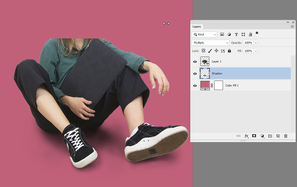
You have the shadow there on a solid background. I would just extract the shadow:

Copy link to clipboard
Copied
It worked a little better!
Still a little too unrealistic though..
Copy link to clipboard
Copied
I would go with Dave's suggestion, or a combination. You can separate the shadow and use it for a mask for curves or levels to give the shadow more punch. You can use the burn and dodge tools to accentuate the tones in the layer mask.

Copy link to clipboard
Copied
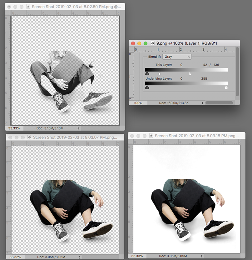
Since the shadow already exists and is available in the Red Channel (R) of the red background Image, copy the R channel and add it as a Layer on the silhouetted version with a transparent background. Place a clear layer below the R layer and turn off the layer that has the color image on a transparent background.
The layer stack becomes R channel on top, clear layer in the middle, and the silhouetted color image on its transparent surround on bottom.
Go to the top layer, the copy of the R channel, double click to bring up Layer Style and in the Blend If section move the top right slider as shown. (To split the slider, hold down the Option key and click and drag the left side of the slider.) Then drag the bottom layer up so it becomes the top layer.
In the set shown below it is placed on a white background.

Copy link to clipboard
Copied
Dave's approach is the way to go here, and the key point to getting it realistic is what he says here:
Keep the shadows dark where the items are close to the ground and faded further away.
This is important. A real shadow isn't uniform, and that's why a click-the-button Drop Shadow doesn't look realistic.

Copy link to clipboard
Copied
Hi
In addition to all these good answers, try to add a more concentrate shadow right under the body touching the floor
E


Copy link to clipboard
Copied
Something I do is use the Smudge tool to reshape shadow layers pulling and pushing pixels into a better position.
You can blur just one part of a shadow layer by selecting it. It is sometimes best to feather the selection when doing this.
A good way to assess how much feather is to use Quick Mask.
Enter quick Mask and apply Gaussian Blur to Quick Mask.
The preview will show how much feather is being applied
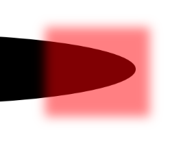
Come out of Quick Mask and apply Gaussian Blur. I was only able to use a value of 5 pixels. More than that, and the transition became apparent. I could have stepped back and increased the feather though.

Reshaped with the Smudge tool. This trick is a real time saver.

As with all illustration, if you are not sure how it should look, go find some real life photographs with similar lighting.

Find more inspiration, events, and resources on the new Adobe Community
Explore Now
 AdChoices