chrisc17114396
Participating Frequently
September 19, 2018
Question

How to show more depth?

  • September 19, 2018
  • 4 replies
  • 886 views

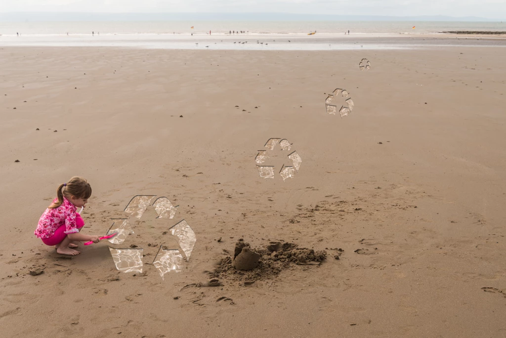
I am trying to create this composite of a beach scene, and I want the recycle logos to look as if they've been dug out of the sand. I've got as far as I can with my current knowledge but there are three clear problems:

1) The edges of the logos are far too clean sharp, is there a way to 'roughen' them?

2) I have played with the perspective option in the transform tool, but the logos still don't quite look as if they are flat on the sand.

3) I have used the emboss and drop shadow effects on the logos, and it gives some depth, but still doesn't look quite right.

Any advice on any of these issues, or anything else that would help me achieve the effect I'm going for would be much appreciated. Thanks!

    This topic has been closed for replies.

    4 replies

    Community Expert
    September 19, 2018

    The other ACPs are on the money in terms of the perspective and smart objects.   Also,  I might add, to include a little bit more to the illusion of depth, is to slightly blur the logos that are further away. 

    Trevor.Dennis
    Community Expert
    Community Expert
    September 19, 2018

    I'm covering a couple of points with the one image here.

    1)     I have made the Recycle Icon layer a Smart Object. Then double clicked to open it in a new window

    I then added a layer in that window. 'Ctrl a' to select all, and stroked with red.

    This gives us a permanent bounding box to fit to the perspective.  When done, we open the SO again, and turn off the red bounding box

    2)     I have set up some guides as a semi arbitrary perspective.

    We can see the horizon, so we know that is right. I have also placed a vertical guide in the centre of the image.  This gives us our single point Vanishing Point

    I have placed a vertical guide each side of the canvas to use as a Three Point Perspective.  With no information in the image to set those two, I have just guessed, but they'll work fine.

    Note: I use Lazy Nezumi Pro's Vanishing Lines preset to draw perspective. Set the pivot points to the three vanishing points, and I am good to go.

    Make the SO about the right size for the nearest placement, and position at the right height, in the center of the image.

    Draw some guides on a new layer from the vertical vanishing point (VP) intersecting the bottom corners of the SO bounding box

    Use Free Transform (FT) perspective to fit to the guides. 

    You have some choices to make, but by far the easiest is to stick with single point perspective just using the center VP.  If you are doing that, move the SO into position

    Note I should have said a while back to work with a copy of the SO, but do so using New Smart Object via Copy

    Draw some more guides from the centre VP to the bottom of the bounding box

    And FT the SO to match the guides, but drag just using the center upper handle

    Repeat for the other recycle icons

    There's a trick you can do with Layer Styles, of reducing the Layer's Fill Opacity to zero, which just leaves the layer style.

    To distress the outline, ctrl click the layer to load it as a selection, and add a layer mask.

    The mask will exactly fit the layer at this stage, and make no difference

    Three steps coming up...

    Ctrl click the layer again to load the selection.

    Go Select > Invert selection

    Then Select > Modify > Expand I used 3 pixels

    The selection will now intrude slightly into the layer mask.

    With the mask selected, fill with black (Alt backspace)

    With the mask selected use Filter > Gallery and distress the edge.  With such a small image this was tricky, but I used Distort > Glass withg values of 1, 1 to get this

    It depends on the pixel size of your image as to how well this will work  — it won't work on the smaller icons for sure — but there other ways to distress the mask outline like stroking it it with a rough brush.  I'll post this as it is kind of long, and then show you how to do that.

    D Fosse
    Community Expert
    Community Expert
    September 19, 2018

    Wait a second. That's stretched. What about the foreshortening - what I called "longitudinal" perspective?

    Trevor.Dennis
    Community Expert
    Community Expert
    September 19, 2018

    https://forums.adobe.com/people/D+Fosse  wrote

    Wait a second. That's stretched. What about the foreshortening - what I called "longitudinal" perspective?

    Yes Dag, you are right.  I went the wrong way.  The funny thing is I did it right when practicing, and then got too clever for my own good. 

    D Fosse
    Community Expert
    Community Expert
    September 19, 2018

    As for the perspective, the sides of the bounding box should project to a single point on the horizon, like this:

    The "longitudinal" perspective is a bit more tricky. I just did it by eye here, but maybe there's a trick for that too.

    There was an excellent and very informative thread just about perspective only a few weeks ago. Can't find it now, anyone have a link?

    c.pfaffenbichler
    Community Expert
    Community Expert
    September 19, 2018
    Any advice on any of these issues

    Smart Objects, Smart Objects, Smart Objects.

    chrisc17114396
    Participating Frequently
    September 19, 2018

    They already are smart objects. I converted them to smart objects so that I could resize them and adjust the effects etc.

    D Fosse
    Community Expert
    Community Expert
    September 19, 2018

    First of all you need to get the perspective right. This is just very quick'n'dirty - it can be done more accurately:

    Second, consider the light. The direction seems roughly right (it's pretty diffuse so soft shadows!) - but nothing inside the tracks can be brighter than outside the tracks. Here it looks like someone poured milk in there.

    The roughening will be less important once you get those right. I'm sure there's a filter for it if needed.