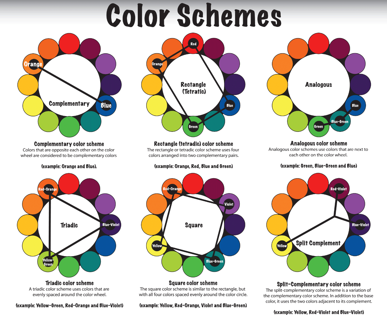
The color wheels in post #0 are wrong
The color wheels in the link in #1 are wrong:
https://www.diyphotography.net/work-color-harmonies-improve-photos/
Even Johannes Itten, the inventor of color harmony, had used wrong color wheels:
http://www.farbtabelle.at/farbkreis/
And Adobe offers as well a wrong color wheel:
https://color.adobe.com/de/create
Why are they all wrong?
A complementary color in the wheel is 180° opposed, and mixed 1:1 with the
original color or eventually with a slightly varied mixture proportion, it delivers
a neutral gray, that is a gray in the respective RGB colorspace.
Opposed to Red is Cyan, oppposed to Yellow is Blue, opposed to Green is
Magenta, opposed to Cyan is Red ...
In all the mentioned examples this doesn't hold true.
Where are correct color wheels?
Color wheel - Wikipedia
this one:
File:Hsv color circle.svg - Wikipedia
Nevertheless, based on correct color wheels, the idea of "harmony" might have
some importance.
Best regards --Gernot Hoffmann


 2
Replies
2
Replies


 AdChoices