- Home
- Photoshop ecosystem
- Discussions
- Re: How would you improve this picture?
- Re: How would you improve this picture?
Copy link to clipboard
Copied
 1 Correct answer
When creating the impression of a wide vista, one of the first considerations is cropping to enhance that impression. I suggest you consider the proportions similar to the one shown here. (Tap to enlarge)
Next, remember that the viewer is drawn to the lightest part of an image first. If it is unrewarding: burned out or lacking in detail or significance in the of overall image, consider removing it. (Pinpoints from a distant light source are an exception.)
Finally, in horizon photographs, un
...Explore related tutorials & articles
Copy link to clipboard
Copied
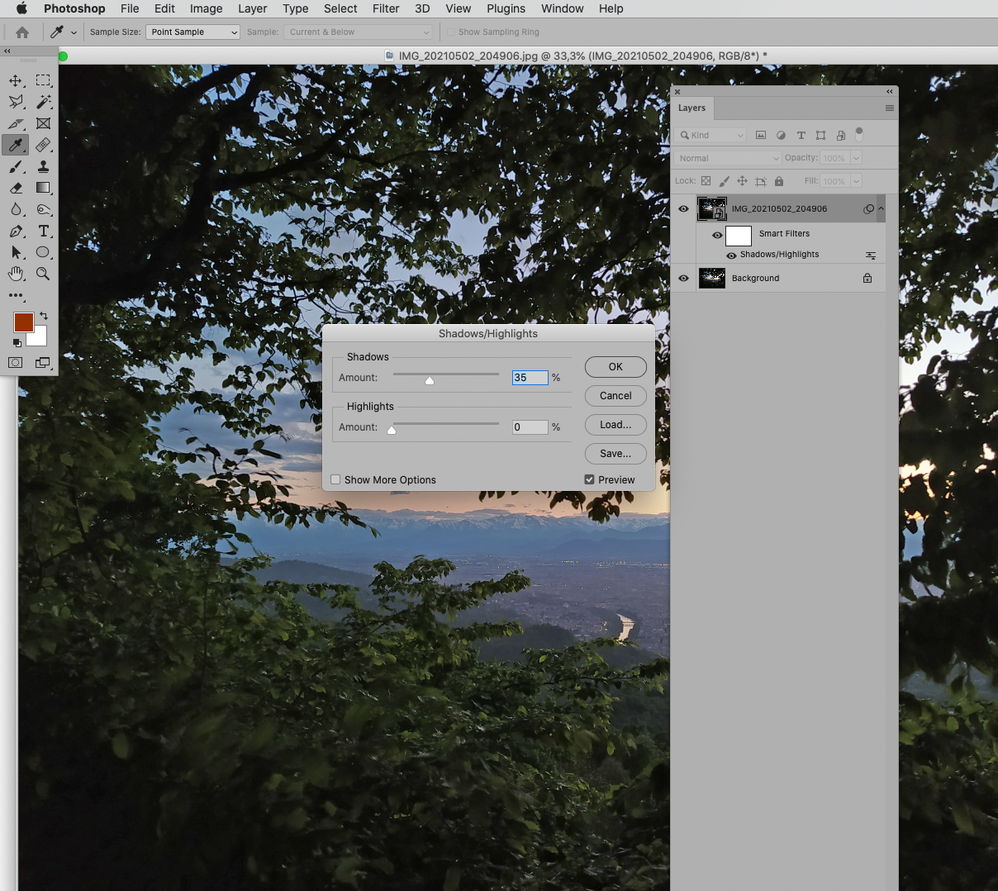
Shadows/Highlights is not very often that useful to me, but as it can be applied as a Smart Filter I would in this case recommend try it to get some more contrast in the almost black areas. Maybe mask it somewhat, too.
Maybe also sharpen the town on the river.
Copy link to clipboard
Copied
Why a smart filter and why should i mask the darker area?
Copy link to clipboard
Copied
Smart Filter because the alternative is using the Filter destructively – and that has obvious drawbacks.
Naturally one could achieve great results before Smart Object even existed in Photoshop but why would one deliberately work worse than possible?
And a Layer Mask or Filter Mask would allow you to apply the effect selectively (if at all).
Copy link to clipboard
Copied
When creating the impression of a wide vista, one of the first considerations is cropping to enhance that impression. I suggest you consider the proportions similar to the one shown here. (Tap to enlarge)
Next, remember that the viewer is drawn to the lightest part of an image first. If it is unrewarding: burned out or lacking in detail or significance in the of overall image, consider removing it. (Pinpoints from a distant light source are an exception.)
Finally, in horizon photographs, unless the sky consists of a brilliant array of colors, the sky rarely benefits from yellow. I suggest you consider adjusting the right part of the sky.
One parting comment: @c.pfaffenbichler 's choice to drag the green out of the deep shadows was superb. Still, with the lightest part of the image so large and yet offering so little, perhaps a photograph taken at daybreak would have been a better decision.
Copy link to clipboard
Copied
A twilight is similar to a daybreak, don't you think the same?
Copy link to clipboard
Copied
I assumed we were looking east. (Don't ask me why.) Same game looking west. Good luck.
Copy link to clipboard
Copied
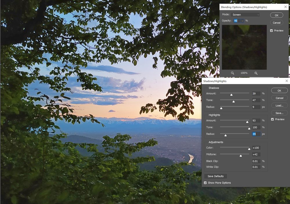
I used Shadow/highlight with smart filter too.
and blend mode is screen //
Find more inspiration, events, and resources on the new Adobe Community
Explore Now


