d0v3
Participating Frequently
January 11, 2023
Answered

I don't understand pictures and desktop resolution..

  • January 11, 2023
  • 1 reply
  • 654 views

Hi everyone,


It's maybe a stupid question but i really need your help..


I'm studyng UX/UI and a big part of my work is to.. export pictures from photoshop for a website.
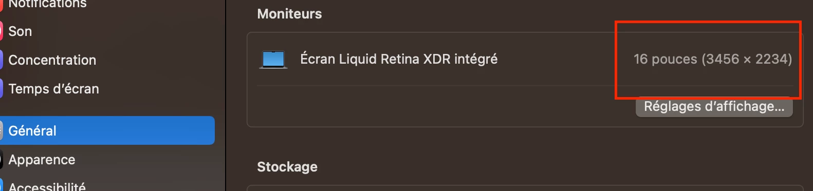
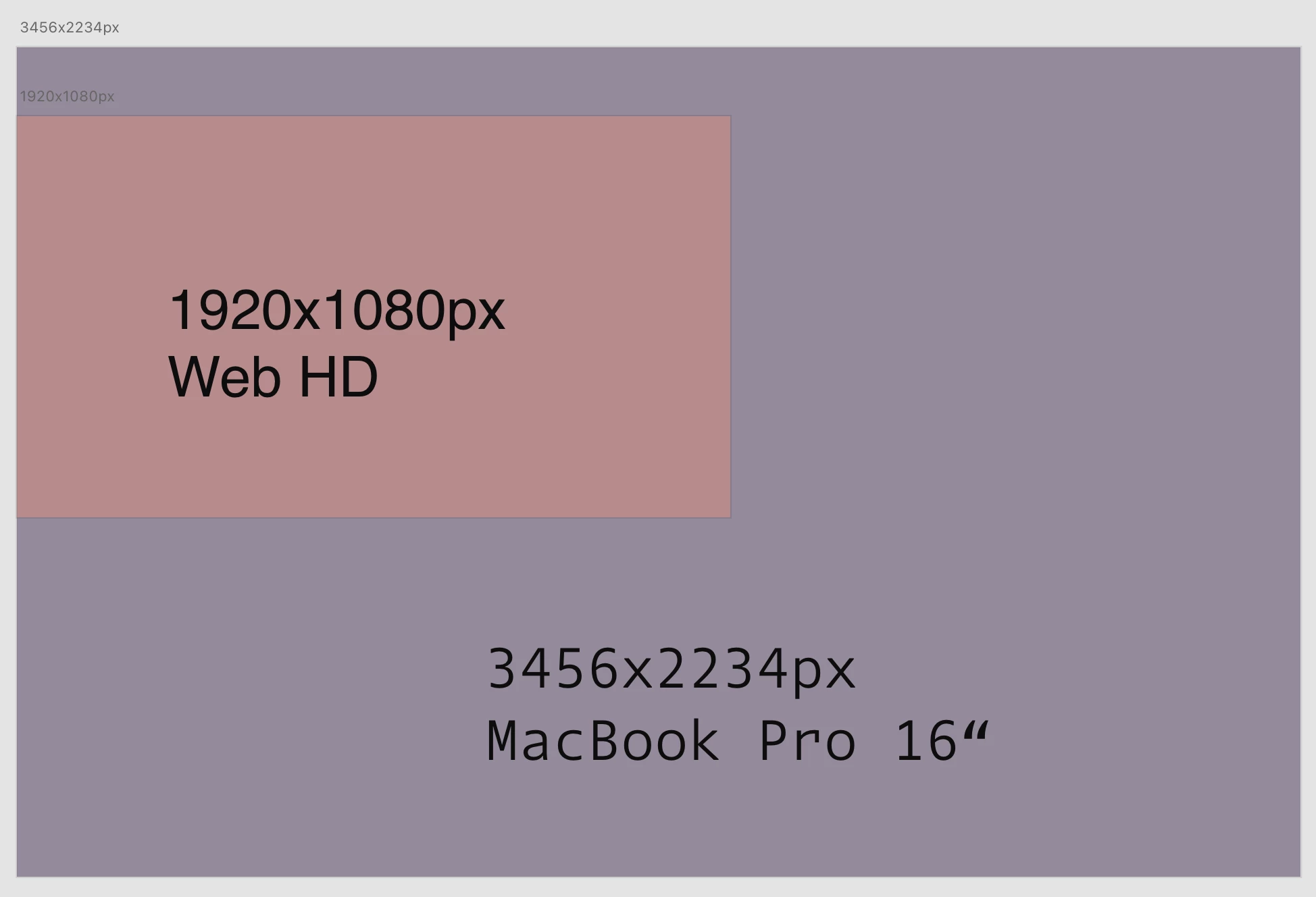
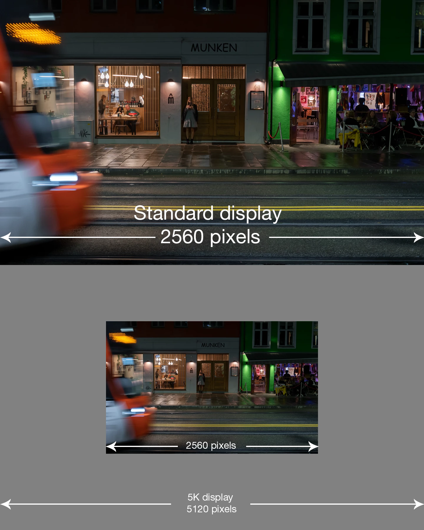
I'm working with Macbook Pro M1 16“ with a 3546x2234px resolution and i'm training with Editor X and WP.


First point that i don't understand :

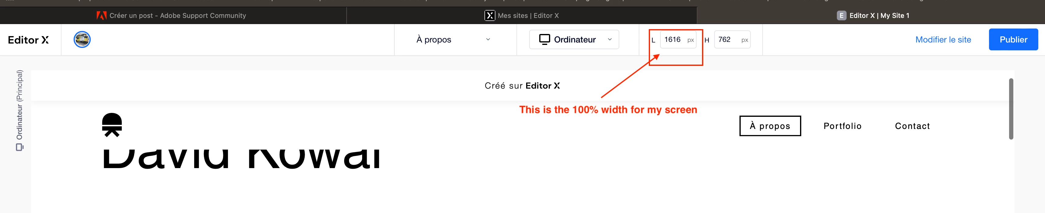
When i'm working with Editor X, i see that the maximum resolution for my screen is 1620px width, but my macbook resolution is 3024px width.. Why ?


Second point that i don't undestand :

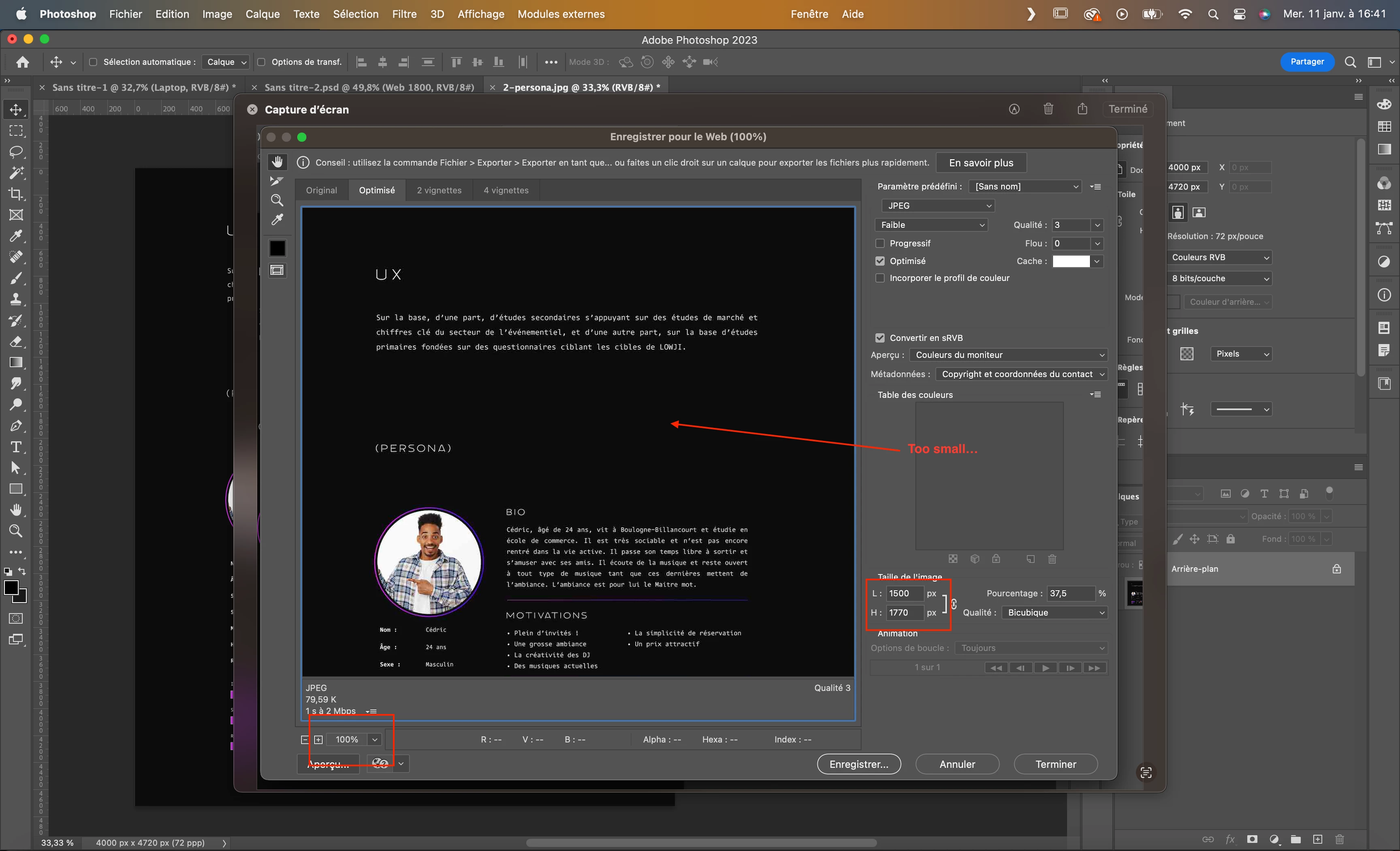
So when i export a picture, i'm thinking that to get a clear picture, i need to export it at the size that i want to be diplayed on the website. But when i export a 1500px pixel picture on photoshop, the picture seems very small 😕😕 and when i integrate it on the website, it's not clean at all. So i have to export the picture at least 2x bigger than what i was thinking, so 3000px (Weighter picture, slower website).

Why ?


So how to export my pictures ?


I don't speak english very well so it's difficult to me to explain it very clearly, i'm sorry and i hope someone might help me.


Thank you


This topic has been closed for replies.
Correct answer D Fosse

First the illustration (substitute whatever pixel dimensions apply for your screen; the principle is the same):


And here's what you need to know:


  • 100% in Photoshop has nothing to do with size. It means one image pixel is represented by exactly one physical screen pixel.
  • Consumer-oriented image viewers and web browsers scale up when they detect a high resolution display. They use four screen pixels to represent one image pixel - in other words turn your high resolution display into an ordinary low resolution display.
  • This is the industry-standard workaround to ensure the same material can be used everywhere, regardless of what screen technology the user happens to have.
  • Photoshop can't do that - it's used for a whole lot of things besides web, where it has to display accurately. So that's what it does.

1 reply

D Fosse
Community Expert
D FosseCommunity ExpertCorrect answer
Community Expert
January 11, 2023

First the illustration (substitute whatever pixel dimensions apply for your screen; the principle is the same):


And here's what you need to know:


  • 100% in Photoshop has nothing to do with size. It means one image pixel is represented by exactly one physical screen pixel.
  • Consumer-oriented image viewers and web browsers scale up when they detect a high resolution display. They use four screen pixels to represent one image pixel - in other words turn your high resolution display into an ordinary low resolution display.
  • This is the industry-standard workaround to ensure the same material can be used everywhere, regardless of what screen technology the user happens to have.
  • Photoshop can't do that - it's used for a whole lot of things besides web, where it has to display accurately. So that's what it does.
d0v3
d0v3Author
Participating Frequently
January 11, 2023

Thank your for the reply,


I understand, thanks to Retina display, we need to multiply the picture by 4 the definition picture for a clear display on a Retina screen. 

So it is a game to export the same image x4 with the minimum weight. That's difficult for complex and big pictures. 

Thank you again 

D Fosse
Community Expert
Community Expert
January 11, 2023

There is actually a way to upload two images, and the browser decides which one to use based on detected screen resolution. But this is entirely in the realm of website coding, and outside Photoshop control. The site has to be built to support that (and fairly few are).