Link in Zwischenablage kopieren
Kopiert
Hey all,
I'm a novice Photoshopper and hoping a kind soul can help. I have searched for this answer but cannot get it right. I believe this is simple - and hope someone can describe clear steps to solve the issue!
1) I have a text box. It is a three letter acronym. I have selected size/font etc.
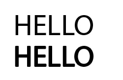
2) I wish to make the text itself thicker - not bigger, or further spaced apart - simply, thicker.
Can anyone tell me how to do that? It's just a text box with 3 letters in it. Which I need to make thicker.
Thanks!
If you want to thicken a font you can use Stroke in Layer Styles.
Link in Zwischenablage kopieren
Kopiert
Could you please post screenshots with the pertinent Panels (Toolbar, Layers, Character, Options Bar, …) visible?
What is the font you used?
Does the font have other Styles (light, roman, bold, black, …)?
Link in Zwischenablage kopieren
Kopiert
Thanks for your reply. I've kept this very simple but hopefully you can see - the font is Arial, the size is 16pt and it is in bold, with Smooth style. It is a text box on a background which is a rectangle filled in green. That's it.
Link in Zwischenablage kopieren
Kopiert
If you want to thicken a font you can use Stroke in Layer Styles.
Link in Zwischenablage kopieren
Kopiert
Fabulous! I had tried that earlier but through random trial and error I have gotten to what I needed!
Thank you both for helping!
Link in Zwischenablage kopieren
Kopiert
For any complete newbs like my stumbling onto this, follow these steps:
1) Double click the text box in the layers area
2) This brings up a menu, including "Stroke" - click on that
3) In this, select "Outside" from "Position", choose your fill colour (same as text) and select Size - 1pt did the job for me.
Link in Zwischenablage kopieren
Kopiert
The corners may suffer with the LAyer Style Stroke, though, whereas a Stroke on a Shape Layer can maintain unrounded corners.
Link in Zwischenablage kopieren
Kopiert
Thank you so much for telling me about the "Outside" position. No one else had mentioned that and I couldn't figure out why it wasn't changing.
Link in Zwischenablage kopieren
Kopiert
Unfortunately, the smallest stroke thickness is 1px. I had to triple my image size to get the font thickness to a good size.
Any good reason why fractions are not allowed here?
Link in Zwischenablage kopieren
Kopiert
Yes, Photohop is pixel oriented image editing software.
And have you tried a Shape Layer Stroke instead of the Layer Style?
Edit: That Stroke allows for fractions as it is vector based, though vector output is only possible in certain file formats.
Link in Zwischenablage kopieren
Kopiert
Indeed, that works much better. I had a bit of a hard time figuring out how to apply that to text, though. Because apparently it cannot be applied to text. I had to "Type > Convert to Shape" first. Then swithch to the Path Selection tool, as seen in your screenshot.
Sure, Photohop is pixel oriented. But then, why can I apply fractions to path strokes, and not to Layer Style strokes?
Thank you!
Link in Zwischenablage kopieren
Kopiert
Shape Layer Strokes are (more or less) vector data, though vector output is only possible in certain file formats.
Link in Zwischenablage kopieren
Kopiert
While using an outside Stroke definitely works, it is better practice to use a different font that is designed to look the way it does without modification. When searching for a font to fit your needs, start typing Bo (bold) Bl (black) He (heavy) into the font field with Type tool selected.
You can do the same thing with other font atributes, like wide, narrow, light, italic, com (comic — Hey, I like comic fonts!). You can combine those shortcuts. i.e. bo it (bold italic).
Weitere Inspirationen, Events und Ressourcen finden Sie in der neuen Adobe Community
Jetzt ansehen