Nicolas Alexander Otto
Known Participant
June 24, 2022
Question

Lightroom and Photoshop histograms and color display don't match up

  • June 24, 2022
  • 5 replies
  • 2741 views

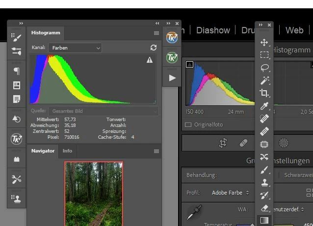
Recently I discovered something that I found rather annoying and would love to know more about how to resolve the issue. As can be seen in the image below the color histogram in PS and LR do not match once I open a file developed file. In LR the histogram looks fine, yet in PS it clearly shows the blue channel is clipping. The original file should be Adobe RGB and so is PS (if I open the same file and convert it to sRGB the difference becomes even worse). So the color space should be the same as far as I know which is why I can't really understand why there should be a difference. The Gamut warning in PS also clearly warns about color clipping yet in LR none of the same is visible.

Any idea what might be causing this? Thanks in Advance 🙂


P.S. I am running LR 11.4 and PS 23.4.1 on a WIN 10 maschine. 

This topic has been closed for replies.

5 replies

TheDigitalDog
Inspiring
June 25, 2022

Two more quick examples (to illustrate, it's not hard to find lots of images that fit this behavior). 


1. Sony capture of last month's sunset during the bad fires here in NM;

And the gamut map of this rendered image in ProPhoto RGB vs. the gamut of Adobe RGB (1998):

The arrow shows a really dark, saturated orange but of course, there are many important oranges and reds that fall outside Adobe RGB (1998) gamut and would get clipped if that Working Space was used. 


2. From 2005 shot on an old Canon 5D in the Amazon, again nothing outrageous if one feels neon lights are): 

Now the same kind of gamut mapping:

Raw to Adobe RGB (1998) is not very good if clipping is, (as the OP has indicated) problematic. 

Raw to ProPhoto RGB, is much better. If you want to encode colors you can capture and output. 

Author “Color Management for Photographers" & "Photoshop CC Color Management/pluralsight"
Nicolas Alexander Otto
Known Participant
June 25, 2022

Okay, so basically working in ProPhoto would still be preferalbe? Now I am confused. I mean I could still throw away the data, to end up with a "see is what you get" approach right? I don't quite get what the advantage is of printing colors which you cant edit because you cant see them. But maybe I just lack imagination. 😄

TheDigitalDog
Inspiring
June 25, 2022

@Nicolas Alexander Otto wrote:

Okay, so basically working in ProPhoto would still be preferalbe? Now I am confused. I mean I could still throw away the data, to end up with a "see is what you get" approach right? I don't quite get what the advantage is of printing colors which you cant edit because you cant see them. But maybe I just lack imagination. 😄


Here are your options: Use a color space from raw that contains all the colors you can capture but some you may never see on  a display (but as shown, on some printers). Or, clip colors so you can see everything but can't use elsewhere due to the gamut limitations of your display (even a wide gamut display). I print. I want all those colors I can capture. Today and in the future as printing gamuts get larger all the time. 

Not seeing some colors outside display gamut really isn't a big deal. You'll end up with surprises on print (when that area of color space exceeeds the display) when you start editing colors out of display gamut, usually dealing with Vibrance or Satruation. SO if you are moving said sliders and all of a sudden, you don't see anything update on screen: STOP and back off. Otherwise, the color gamut of a printer and a display are hugely difference in shape and often size. I provided one gamut map showing this too.

Again, I print; I refuse to clip colors I can capture and can use, simply because some are outside the display gamut. 


Lastly, even with the best display, profiles and soft proofing, you'll never get 100% WYSIWYG. You can get very close such you hopefully end up making one print and you're happy. The idea of color management and soft proofing is to get to that goal with as little loss of time, paper and ink as possible. But it's never perfection and it never will be; a reflective print under all kinds of lighting will never match an emissive display. 


So again, up to you: don't clip colors you have and may use but can't see on the display or, clip them because you want to 'see' everything on that display alone. And that's true of all printers and Working Spaces. NO printer can print the entire color gamut of even sRGB. 

Author “Color Management for Photographers" & "Photoshop CC Color Management/pluralsight"
TheDigitalDog
Inspiring
June 25, 2022

Quickly looking through my LR catalog, easy to spot an image where Adobe RGB (1998) isn't going to contain the colors I've captured and can output.

Nothing special, quick shot inside a restaurant on old 5DMII and yes, neon and Fluorescent lighting, part of the world some of us capture:

Now I encode in ProPhoto RGB from LR as recommended by Adobe and others, plot the color gamut of the actual image pixels against Adobe RGB (1998) in two views, easy to see colors that would clip outside its gamut:

Anything outside that red triangle is captured and rendered colors that would clip if I used that Working Space. So I do not. 


Do I want to throw away any colors I've captured and can print? No, I do not today or in the future. 


Can I actually print some of those colors on a 10-year-old, 8- color inkjet printer (yes), and would a newer 10-12 ink printer print even more colors? Yes


Green gamut plot, a very old Epson 3880 printer and yes, there are colors outside Adobe RGB (1998) that are in printer color gamut I can use: 

Can I easily find more images that behave this way and more? Yes, I can. But by encoding in ProPhoto RGB from Raw, I don't have to think about which may or may not. 

Are there colors I can't see on my wide gamut display (that exist and can be output)? Yes. Is this a problem for editing? No, not if you know some simple ways not to overdo the edit. 

Will colors clip if I need to convert to sRGB as you see above? Yes. Does that harm the image for the intended use? No it doesn't. It is what it is, for the output color space needed; sRGB for the web. It had to massively resampled down and saved in JPEG too; not an issue for web use.  Will any of that affect a big print on a wide gamut printer? No. Because I keep high-bit, wide gamut data, all the data I can capture and output. Is any of this more 'work' using LR? No. 


When shooting professionally, did I have to pop a 2x2 back on my 4x5 view camera? No, I shot 4x5 when I needed that size film. I shot 2x2 when I needed that size film and based on the demands of the job. Digital is a lot more flexible. I can have the best of both worlds (wide gamut, high bit, high resolution of not, depending on the needs of the data). 

Author “Color Management for Photographers" & "Photoshop CC Color Management/pluralsight"
TheDigitalDog
Inspiring
June 24, 2022

All you have to do is soft proof to Adobe RGB (1998) or whatever color space you wish to match in Photoshop to get the LR/ACR Histogram to use the same color space for the Histogram. They will not be 100% identical for a number of reasons like scaling of the pixels, bit depth and cache but close enough. When you don't soft proof in LR, the Histogram is based on Melissa RGB which is ProPhoto RGB primaries (thus gamut) but with a 2.2 TRC just like sRGB. 


Lastly, the gamut warning overlay in Photoshop is nearly useless:

The Out Of Gamut Overlay in Photoshop and Lightroom

In this 25-minute video, I'll cover everything you need to know about the Out Of Gamut (OOG) overlay in Photoshop and Lightroom. You'll see why, with a rare exception, you can ignore this very old feature and still deal with out of gamut colors using modern color management tools. 


YouTube: https://www.youtube.com/watch?v=00O-GTDyL0w

High resolution: http://digitaldog.net/files/OOG_Video.mp4

Author “Color Management for Photographers" & "Photoshop CC Color Management/pluralsight"
Nicolas Alexander Otto
Known Participant
June 24, 2022

Thanks for the intel! Looks interesting. I wonder why I never had this issue before. But I never knew that the Histogram in LR was actaully ProPhoto RGB. I guess it still makes sense then to Edit in ProPhoto until the export from PS? Even though I refrained from doing that mostly because I only have a Adobe RGB Screen. But then again I think that I don't get posterization as fast when I use the bigger color space? Anyway gonna watch that video about the gamut display now! 

TheDigitalDog
Inspiring
June 24, 2022

Technically it isn't ProPhoto RGB due to the TRC. Close enough. And yes, encode raw to ProPhoto RGB in 16-bit:


Author “Color Management for Photographers" & "Photoshop CC Color Management/pluralsight"
D Fosse
Community Expert
Community Expert
June 24, 2022

In fact, this is a very good illustration of a basic shortcoming in Bayer sensor cameras: low-level blue components tend to drop to zero, leaving a dense yellow color cast. It's mostly obvious in shadow values because there you see it as clipping, but it's distributed over the whole tonal range.


I've seen this phenomenon in every camera I have ever owned, and from time to time you get threads here dealing with the same issue. There are ways to overcome it, but that's beyond the scope of this thread. Just knowing about it is a good start.

D Fosse
Community Expert
Community Expert
June 24, 2022

This is normal and expected (given the original data). The histograms represent two different color spaces.


In Lightroom it's a custom color space with ProPhoto primaries and sRGB tone response curve. In Photoshop it's Adobe RGB.


You need to do something with your deep yellows here - that's what causes the blue channel to clip.


Nicolas Alexander Otto
Known Participant
June 24, 2022

That's odd. If that is the case why did I never encounter this image before? I just checked but apparently as the following commenter noted soft proofing in Adobe RGB seems to alleviate the issue, now I get the clipped channel in LR as well. Technically speaking it would make more sense to edit in the Adobe RGB rather then the ProPhoto Space? Or keep the ProPhoto space until converting to sRGB on export from PS in the end? I assume that the former makes more sense in order not to work in a color space that I can't see rather than the latter where I might not get posterization that fast but ultimatley encoutering the same out of gamut problem once I convert to sRGB upon export?