

Limited Color Pallet

Copy link to clipboard
Copied
Hi All
This is a follow-up post to my research in the scripting forum.
I'd like to try emulating traditional painting with Photoshop. Imagine you are Bob Ross.
You have 16 tubes of paint - white, black, and 14 colors of your choice. I want to limit the color choices to only these 16 colors.
So, I will create 16 different swatches. And then choose only the colors from the swatches, *not* from the color wheel or color panel.
The problem is, when you use the mixer tool or smudge tool in your painting, then it adds in these millions of colors in between your pixels when mixing or smudging.
I am trying to limit the color to *only* those 16 color swatches - so when you use the mixer or smudge tools, it will look very blocky in between transitions - but for now, this is what I am trying to achieve.
I know that Indexed mode can do this, but then you are unable to use the mixer brush, or add more layers, etc. Indexed mode is very limited.
So I am trying to find a way in RGB mode to limit the pallet to 16 colors only. We can use a "posterize" adjustment layer ontop of the painting layer and then select a value of 16, but for some reason this does not limit the entire painting to just 16 colors. it indeed makes the transitions when mixing or smudging look very blocky, but the colors are not limited to just 16.
Does anyone know of a way to limit the image to just 16 colors in RGB mode, while maintaining all functionality within photoshop (add layers, mixer brush, everything else that PS has to offer, because Index mode removes all this functionality)
Thanks!!


Explore related tutorials & articles
 23
Replies
23
23
Replies
23

Copy link to clipboard
Copied
No, not directly possible as far as I know.
If you are interested in a more indexed painting look, check out this technique:
I've used this to great effect for limited palette looks. Works quite well, and you can use pretty much all tools in Photoshop RGB mode, and still get a controlled limited old-fashioned retro look.
Alternatively, if you need an indexed image mode with layers: several pixel art applications exist which accommodate this. The best one (in my opinion) is Pro Motion NG, which also has the option to set up artificial limitations for colours channels and even pixel sizes (for example a 2-1 pixel size like the old Amstrad and C64 machines). It's the spiritual successor to Deluxe Paint (Amiga times!).
But mixing and smudging is extremely limited in low colour indexed modes. I would check out Dan Fessler's "Index Painting" technique first. It's pretty neat.
Copy link to clipboard
Copied
I wanted to clarify what is happening with the Posterize adjustment layer in case it helps. The number you set within Posterize is setting the number of tones for each channel. For example, setting a value of 2 gives 2 tones per RGB channel which allows for a total of 8 colours (including black and white).
RGB values…
0,0,0 (Black)
255,0,0 (Red)
0,255,0 (Green)
0,0,255 (Blue)
255,255,0 (Yellow)
255,0,255 (Pink)
0,255,255 (Cyan)
255,255,255 (White)
Copy link to clipboard
Copied
Ah yes, DeluxePaint!!! My childhood. I had many Amiga computers, including the 500 and 1200, and had several versions of DeluxePaint. Thanks for bringing back these beautiful memories. Sometimes I think back to those teenage years with a tear or two 
The Dan Fessler blog looks completely amazing --- but oh so complicated! It seems to do exactly what I'm aiming for, but I will have to study that entire blog to understand how to do it, unless you might have a quicker way to get it going?
Copy link to clipboard
Copied
If you miss DeluxePaint, this might yield some nostalgic feelings:
https://thecompany.pl/game/Deluxe+Paint+5.2
It's a package executable of an Amiga emulator with Deluxe Paint 5.2 auto-running - download, double-click, and relive those Amiga memories 🙂
It's still a damn good pixel art editor!

Copy link to clipboard
Copied
Hi
Your request seems confused. You say you want to use the mixer brush but do not want to have it produce mixed colours.
You compare to Bob Ross who used oils on a palette. He did use a limited range of paint colours but then blended and mixed the colours both on the palette and on the canvas to give an infinite range.
When painting, I tend to have two documents open. The painting itself and a second which contains circles of colour applied with a brush on an empty layer above a 50% grey background. That document is my palette.
I use a combination of plain brush and mixer brush on the main canvas, loading from that palette document.
If you genuinely only want limited colours then use posterize or index colour but forget the mixer brush.
Dave

Copy link to clipboard
Copied
gangeek wrote
Does anyone know of a way to limit the image to just 16 colors
Hi
If you created 16 spot color channels, you could limit yourself to 16 colors. But Bob Ross mixed those colors, and I would go with Dave’s answer. I can’t think of a reason to actually do this!
~ Jane
Copy link to clipboard
Copied
thanks everyone. I want to start with just 16 colors and learn how to do it. Then from there I would jump up to higher amounts like 64, 256, etc. I figure that a lower amount of colors might lead to a more traditional appearance. Millions of colors, especially when smudged or blurred or applied with a digital airbrush can look, well, "digital". I would really like to produce a painting that when looked at, the viewer will genuinely question whether it has been done on a computer or with real paints. A limited color pallet is where I would like to start 
Copy link to clipboard
Copied
gangeek wrote
I would really like to produce a painting that when looked at, the viewer will genuinely question whether it has been done on a computer or with real paints.
Hi,
If that is your goal, then that’s another reason to pay close attention to the advice posted here, especially from . If what you want to try fails, then come back and re-read his advice in this thread.
Jane
Copy link to clipboard
Copied
but jane-e, how do i do so with just 24 instead of 16?
Copy link to clipboard
Copied
Hi
Don't forget that real paints mix. So you might start with a limited palette but the range of colours is not limited to those unless you paint them one at a time without mixing and allow each to dry before the next. That gives you a painting by numbers effect. Realistic oil painting uses the wet on wet technique in which colours are mixed both on the pallete and on the canvas. Hence the advice in my earlier post.
Dave
Copy link to clipboard
Copied

Copy link to clipboard
Copied
Thank you for this contribution. It answers so many questions for painterly artists. Nice!
I have painted many portraits using digital resources and once printed on canvas, the result is even better than using the old style paint and brushes. A limited pallet a great artist does not make. When I could not afford more than four tubes of paint, I had to mix. Now, the colors are endless. Enjoy! Best regards, JH
Copy link to clipboard
Copied
Yes, thanks to all for contributing to this. I apologize, but this is a difficult scenario to explain for me. I will try a different approach:
Imagine your swatches panel has 32 colors. Pretend they are aligned in a color-wheel or color-cube format like in this picture:
https://i.stack.imgur.com/5QyHy.png
Click on one of them, and it becomes your foreground color. Now go into your image, and do a little painting. Next, let's say you want to darken your current color a little bit. So you go back into the swatches panel to select a shade darker than your current color - but the problem is, the last swatch you selected is not highlighted, so you cannot quickly select the new, darker swatch because you don't know which swatch you are currently using. If you selected a blue color the first time, how can you come back in the panel and select a darker blue if you don't know which one is currently selected as your foreground color?
What I am hoping to do is when using the eyedropper tool in your painting to select a new color, that it will somehow indicate in the swatches panel which color you have clicked on in your image. So for example, if you painted a red barn in your painting, you might want to find exactly which red swatch you used to paint the barn. It would be nice that when you use the eyedropper on the red barn, then that exact red swatch in the swatches panel becomes highlighted - this way you know *exacly* which red swatch it is, and then you can easily select a darker shade of red in the panel because since the swatch is now highlighted, you have a reference point to select your new color/shade.
Which brings me to the point - if I use the mixer brush or smudge tools for example, then we are introducing millions of new colors into the painting, which would make this request impossible. The swatches panel would also need to have millions of swatches in it in order to highlight the eyedropped color in the painting.
So If the image is limited to just 32 colors, then eyedropping on any color could highlight that color in the swatches panel. I am using the limited color pallet idea as if we were using tubes of paint, like traditional painting - 32 swatches would be like having 32 tubes of paint - I am forced to use just those 32 colors and nothing in between - I will pick colors from the swatches panel, and never from the color wheel - this assures me that I am trying to emulate a traditional method of painting
I hope this makes sense and I thank anyone who has read this far. Basically, I am trying to find a way to use the eyedropper tool on the painting, and then have that eyedropped color become highlighted in the swatches panel. And the only way I can see this happening is to work with a limited amount of swatches.
Would this make sense?

Copy link to clipboard
Copied
Hi!
I think I understand what you are looking for--and it's not in the functionality of the program. If you click on a color in your document with the Eye Dropper tool, it will not highlight that color in the Swatches panel. It doesn't work that way. But if you open the Foreground Color Dialog (by clicking on the Foreground color box in the Tools panel) and then select with the Eyedropper you can see your color and it's values.
My question is why do you need to see the color highlighted in the Swatches panel? If you follow Dave's suggestion and create your own Palette of 16 colors you can compare what you select with the Eyedropper tool, with the color on your palette.
And, in reference to the Mixer Brush above--you can set the Parameters of the brush so that it doesn't introduce any other colors by what you select tin the Options bar. If yu want to create areas of flat color, I would suggest using a custom brush with a painterly edge and not deal with the Mixer brushes until you take some time to play with them more.
Let us know if that helps or if you have any other questions.
Michelle
Copy link to clipboard
Copied
Thanks Michelle. yes you are right that is what I am looking for - that when you use the eyedropper tool on your painting, that the color you "eyedrop" on becomes highlighted in the swatches panel.
This way, I can match the current foreground color to its swatch, and then select a new color in the swatches panel by using that highlighted swatch as a reference point. Confusing, but hope it makes sense.
This way, it forces me to stick to the swatches panel and not use the color wheel. Using the color wheel is like having a million tubes of paint. I want just 32 tubes of paint, and those 32 tubes will be in the swatches panel. When I eyedrop a color on my painting, that color becomes highlighted in the swatches panel so I know exactly which color it is, and I can select another color in the swatches panel by using that highlighted swatch as a comparison reference. Otherwise without the highlighted/active swatch, I have no idea which swatch matches the current foreground color.
I will look closer at Dave's proposition - I will try it on my system and see how that works
Thanks all
Copy link to clipboard
Copied
One of the ways you can tell if you have the same color is by the numbers. If you have the Info palette visible as you move over the color with the Eyedropper tool is to look at the RGB values in the Info palette and you will know they are the same if the numbers don't change as you move from one to the other.
I think the best way to figure out what works best for you is by trial and error. Just jump in and start playing with the colors. You'll find what you like and how you like to work. Sometimes the joy is in the process and not just in the end result.
Let us know if you have any other questions@
Michelle
Copy link to clipboard
Copied
gangeek wrote
So for example, if you painted a red barn in your painting, you might want to find exactly which red swatch you used to paint the barn. It would be nice that when you use the eyedropper on the red barn, then that exact red swatch in the swatches panel becomes highlighted - this way you know *exacly* which red swatch it is, and then you can easily select a darker shade of red in the panel because since the swatch is now highlighted, you have a reference point to select your new color/shade.
Hi
What version of PS are you using? The panel menu in your screen shot looks like it must be from a very old version and it does not have a menu item for "Show Recent Colors", which would show you that swatch of red you just used on the barn.
Illustrator will highlight the swatch that is used, and if it is set to a global color, then editing the swatch will change all objects in the file.
Do you want your image to look like
- A paint by number
- A realistic painting
- A drawing as might be done in Illustrator?
You can't have all three, so you have to pick one.
Jane
Copy link to clipboard
Copied
greetings jane-e,
I would essentially enjoy to create a digital landscape painting that looks convincingly like a traditional painting. Where you look at the image, and you can not tell at all whether it has been done in real acrylic paint or in Photoshop. This is very difficult to achieve. Every digital landscape painting I've ever seen, have dead giveaways that they are done on a computer, no matter how good they are (including all of my own!!) Blending, smudging, and the use of the airbrush tool tend to be giveaways - some edges just look too sharp in some areas and too smooth in others.
What I've done is load a few raditional paintings from the internet into Photoshop, and then convert it to Indexed Mode with the maximum of 256 colors. The good news is that when you do this, the painting barely loses any color information at all- when zooming in close, the painting is essentially the same in RGB mode as it is in Indexed Mode. Which leads me to believe that so long as you have a swatch panel of 256 colors, you can create a lovely traditional-looking painting that is convincing. I find that having access to millions of colors might give a "digital" look to the painting.
I hope that if I can limit everything to 256 colors in the swatches panel, then I feel like there's no room to cheat or improve the image using digital enhancements - I'll be forced to work in a restricted coor mode that will not go beyond 256 colors. And since a traditional landscape looks the same in Indexed Mode (256) as it does in RGB Mode (millions of colors), I can be confident that working with this limited pallet may offer a better opportunity to produce something very traditional-like.
So why not work in indexed mode, you say? Well, to contradict myself - the mixer or smudge tools are not available in this mode, and neither are layers. But if the mixer brush were to be available, it would be nice for the brush to create a blend between two colors, but again - using only the colors available in the swatches panel instead of using millions of colors as the mixer brush does in RGB mode. 256 colors would suffice in creating a decent blend.
And since the swatches panel will now contain just 256 colors, I was hoping to find a way to highlight the swatch in the panel when eyedropping a color in the image (the same way illustrator does this?). With the swatch highlighted, I can now use that as a reference point to select a different color swatch (perhaps a shade or two darker) - but without the swatch being highlighted, I cannot do this easily, as I don't know which swatch is currently active.
Not aiming for realism here, just a convincing landscape that looks like it was done in real acrylics. And a limlited color pallet is one step towards achieving this, I hope.
As for the highlighted swatches idea - perhaps Adobe could consider this in a future release?
Copy link to clipboard
Copied
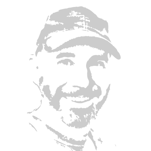
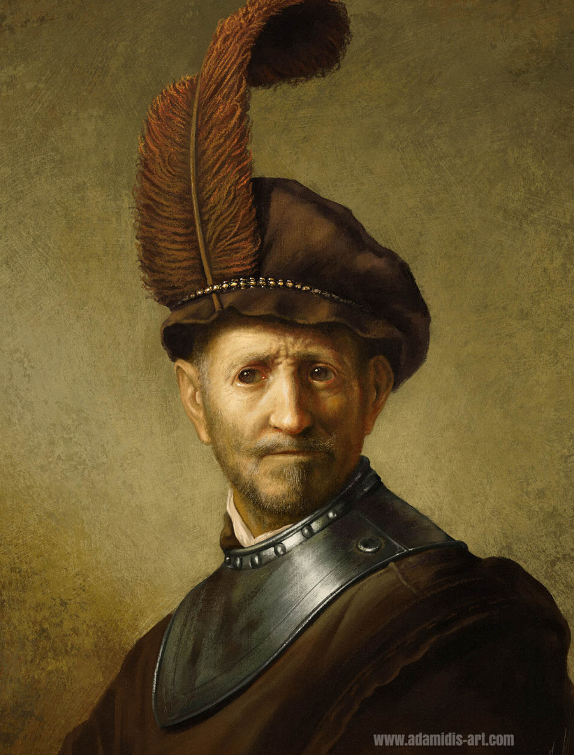
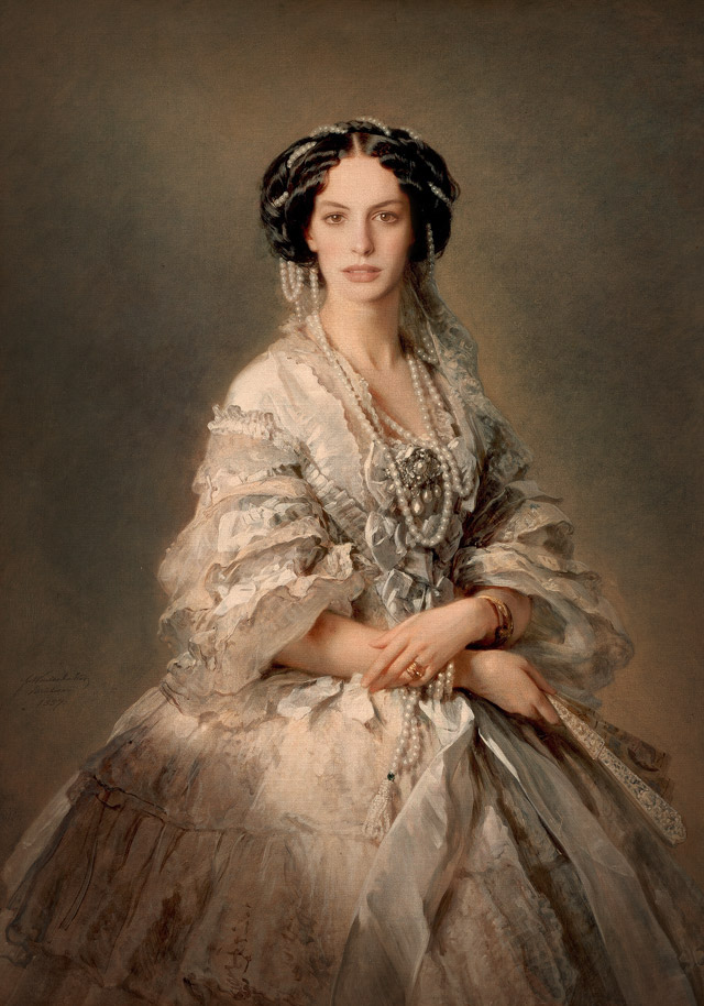
So... are you looking to emulate something like these in Photoshop?
Copy link to clipboard
Copied
Greets, rayek.elfin!
These examples are nice, but you can see the digital blending going on in the pillow on the 2nd image. There is no grain, or texture to the painting. The last one indeed looks like a photo with filters. And the top one is nice, but again we can see the very sharp details in his crest and the sharp edges along his silhouette. But those are indeed fantastic - I think the first one is the most convincing but the details are too small/too sharp, giving away its digital look - the edges on the hat and shoulders/crest are very sharp, but look at the feather - THAT looks quite natural, because the edges are not sharp - if the rest of the edges in the painting were rendered like the feather then it would look more natural. And if a larger, granier brush was used for the highlights on his crest it would go a long way into making it look like real paints. I think tiny details that are sharp and precise are also a giveaway - like the highlights in his crest - its an indication that the image was zoomed in very close to paint in those details
I was thinking something more along the lines of these:
Screenshot - a7d15a044f8d6c76f09a615c0f23fe84 - Gyazo
Screenshot - 8c6c91844cb29cedf004ac1ce56e3371 - Gyazo
Notice that in the color transitions in these are grainy and don't have a 'mixed' or 'smudged' appearance to them. The color pallets look to be very limited and if you convert these to 256 Index Mode, they will probably not change at all. I enjoy the grainy color transitions, as if the colors have been blended with a dry brush. By the way, these are traditional paintings not digital. They look rough and less polished - which is how a painting done in acrylics will look. A digital painting can look too sharp, clean and too smooth, with too many colors (millions).
I apologize but I canny seem to figure out how to embed these pictures here - do you know how I can show the pictures here instead of their links?
Copy link to clipboard
Copied
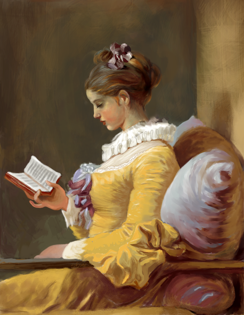
gangeek wrote
These examples are nice, but you can see the digital blending going on in the pillow on the 2nd image.
Is this the one you see the digital blending on? I’m not sure where the other two hang, but I’ve seen this one at least a hundred times.
Here is the link to the National Art Gallery Page to Young Girl Reading by Jean Honoré Fragonard: Art Object Page
Copy link to clipboard
Copied
If you look carefully, you'll see the obvious differences between the digital study and the original from NAG:
The first one is a digital study of the original by Rembrandt:
https://www.artstation.com/artwork/q1NyL
I should not have included the third one, I realize now: it's a Photoshopped celebrity face in a real painting. I thought the artist had taken that as a digital study, but I was in a rush when posting these, and it warranted a second look, since the face looks too photographic compared to the rest.
Back on topic:
I know of one other software option that allows for painting with a fixed colour palette, and which keeps track of these colours in the painting itself as if working in an indexed colour mode (but with layers and mixing/full transparency). That would be an animation app called OpenToonz: its raster 'levels' keep track of the colours, and these can be changed at any time.
But mixing between colours on the same layer ('level') doesn't work well, and this workflow requires actual layering to allow mixing to happen. And even though a limited palette might be used, it still looks digital.
You can't have your cake and eat it too. Digital and a physical canvasses are just very different animals. Digital painting software cannot keep track of fixed palette colour choices the way gangeek wants while also allow for mixing colours in a believable digital oil painting manner - at the very least limitations are introduced: in 256 colour indexed colour mode mixing doesn't work well, nor in OpenToonz's raster mode. So colours can be tracked and linked to their palette entries, but both introduce limitations inherent to the implementation itself.
For example, in indexed mode transparency is either on or off. While Photoshop doesn't support layers in indexed mode, other applications like Pro Motion NG do, but even then the nature of how indexed mode works just isn't valid for an convincing oil paint look or effect. OpenToonz comes closer, but again mixing on the same layer between two or more different palette entries behaves completely different, and just looks wrong and odd.
As explained earlier in this thread, vector apps like Illustrator retain that direct palette entry link to colours, but not very feasible for more painterly expressive art (or at least not that suitable, although I have seen some impressive work).
The only digital art software that crosses the boundaries between digital painting and vector, and blends them successfully is ClipStudio Paint in my opinion: it allows for painting with a limited colour palette, and draw with vector strokes and they look and feel like bitmap ones. But the strokes can be selected, edited like in a vector app, and the colour changed afterwards. So it is possible to have a very limited color palette of 16 colours, and only stick with those in CS Paint. It has oil paint brushes. You work in layers, and it becomes very controllable. And like Photoshop it has a live posterization layer effect to limit the number of colours when mixing.
It doesn't have the option to pick up a colour from the canvas and automatically select that palette entry, but at least you will be able to work with a very limited controlled colour palette, and have full control over each brush stroke in terms of a restricted colour palette.
Reuben Lara has some interesting tutorials for this software:
Tips For Dry Brush Painting - Clip Studio Paint - YouTube
Now imagine the limited colour palette method with vector bitmap brushing in layers. Might come close to what you want.
Copy link to clipboard
Copied
greets rayek-elfin, I will definitely have a look at the proposed softwares.
That youtube video is wonderful - If he was to move that canvas texture layer to the top, and set it to 'overlay' or 'soft light' or something, then it may give a more traditional appearance to the painting - right now its too smooth and polished with very sharp edges and that canvas texture is becoming covered up by his brushstrokes. Move the canvas texture layer to the top of the layer stack and it will be gold. With that said, Reuben is a genious!! A very talented and knowledgeable artist! I am going to watch the entire video. Thanks for suggesting it
Well, I will continue on with the quest to use a limited pallet somehow. Perhaps I will upload a few examples of what I'm working on to give you a better idea of what I mean.
Regards and many thank you's again, please do take care

Find more inspiration, events, and resources on the new Adobe Community
Explore Now
 AdChoices