Exit
  • Global community
    • Language:
      • Deutsch
      • English
      • Español
      • Français
      • Português
  • 日本語コミュニティ
  • 한국 커뮤니티
0

Lining out text in photoshop

New Here ,
Aug 31, 2018 Aug 31, 2018

Dear forum members,

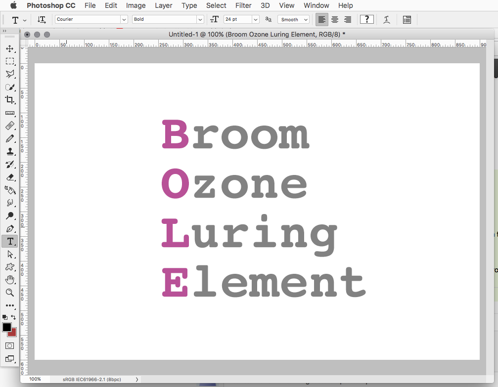
I am creating a logo that exists out of pure text. See the screenshot that I attached to this post. Schermafbeelding 2018-08-31 om 19.54.50.png

Now, as you can see, I want this:

Broom

Ozone
LuringElement

BOLE would be vertical, bold and in another color compared to the remaining parts of the words.

BOLE, would be - most important of all - lined out so that:

room

zone

uring

lement

Would all start from the same position, as they do in the above 'plain' text.

I tried everything I could think of, but I just can't get it to line out properly.

Does anyone that knows what I want (my apologies if I'm rather vague-ish), how I can get what I want?

Is this even possible, at all?

Cheers,

G

746
Translate
Report
Community guidelines
Be kind and respectful, give credit to the original source of content, and search for duplicates before posting. Learn more
community guidelines

correct answers 1 Correct answer

Guide , Aug 31, 2018 Aug 31, 2018

Two ways.(maybe someone knows even more possibilities)

1 make two separate words instead of one so you can place the "b" separate from the "room" (use guides to be able to position accurately)

2 Place your cursor between the first en second letter, then use Alt + left/right arrow keys to change the kerning

Translate
Adobe
Guide ,
Aug 31, 2018 Aug 31, 2018

Two ways.(maybe someone knows even more possibilities)

1 make two separate words instead of one so you can place the "b" separate from the "room" (use guides to be able to position accurately)

2 Place your cursor between the first en second letter, then use Alt + left/right arrow keys to change the kerning

Translate
Report
Community guidelines
Be kind and respectful, give credit to the original source of content, and search for duplicates before posting. Learn more
community guidelines
New Here ,
Aug 31, 2018 Aug 31, 2018

Going to give this a try. Thank you!

Translate
Report
Community guidelines
Be kind and respectful, give credit to the original source of content, and search for duplicates before posting. Learn more
community guidelines
Community Expert ,
Aug 31, 2018 Aug 31, 2018

Unless i'm missing something in your description, it looks like you could just type the text normally and then change the colors of the text.

That is, type Broom, hit return/enter, type Ozone, hit return/enter, etc for the rest.

br-1.png

Then using the Type Tool cursor to highlight parts of the text and change the color like highlighting the B and changing the color to lavender.

Translate
Report
Community guidelines
Be kind and respectful, give credit to the original source of content, and search for duplicates before posting. Learn more
community guidelines
New Here ,
Aug 31, 2018 Aug 31, 2018

Dear Jeff,

As you can see, the r, z, u and l are not aligned. I think mostly due to the 'O' being wider than other letters in the whole thing.

Perhaps what I'm asking for is absolutely impossible, but perhaps it is with spacing, lining out things, or some other option we're not aware of?

If anything is or remains not clear, please let me know and I'll try to eleborate.

Translate
Report
Community guidelines
Be kind and respectful, give credit to the original source of content, and search for duplicates before posting. Learn more
community guidelines
Community Expert ,
Aug 31, 2018 Aug 31, 2018

Something like this?

br-3b.png

Translate
Report
Community guidelines
Be kind and respectful, give credit to the original source of content, and search for duplicates before posting. Learn more
community guidelines
New Here ,
Sep 01, 2018 Sep 01, 2018

Well, it somehow comes closer.

But by seeing the options and your result, I think that what I want is simply not possible due to each letter having a different width?

The idea that I have, is to have each letter aligned as 'BOLE'

More like:

B r
O z
L u
E l

But as you see, the 'z' is already aligned more to the right due to the width of the 'O'.

Translate
Report
Community guidelines
Be kind and respectful, give credit to the original source of content, and search for duplicates before posting. Learn more
community guidelines
Community Expert ,
Sep 01, 2018 Sep 01, 2018
LATEST

Try some different fonts and see if they line up better.

For example, here's the Courier font:

cour.png

Translate
Report
Community guidelines
Be kind and respectful, give credit to the original source of content, and search for duplicates before posting. Learn more
community guidelines
LEGEND ,
Aug 31, 2018 Aug 31, 2018

You may find it helpful to look through the information here, especially the section on line and character spacing.

Photoshop Help | Photoshop User Guide

Translate
Report
Community guidelines
Be kind and respectful, give credit to the original source of content, and search for duplicates before posting. Learn more
community guidelines