
Living with a Distracting Background
Distracting Background Acceptance (unless you have a better idea?)

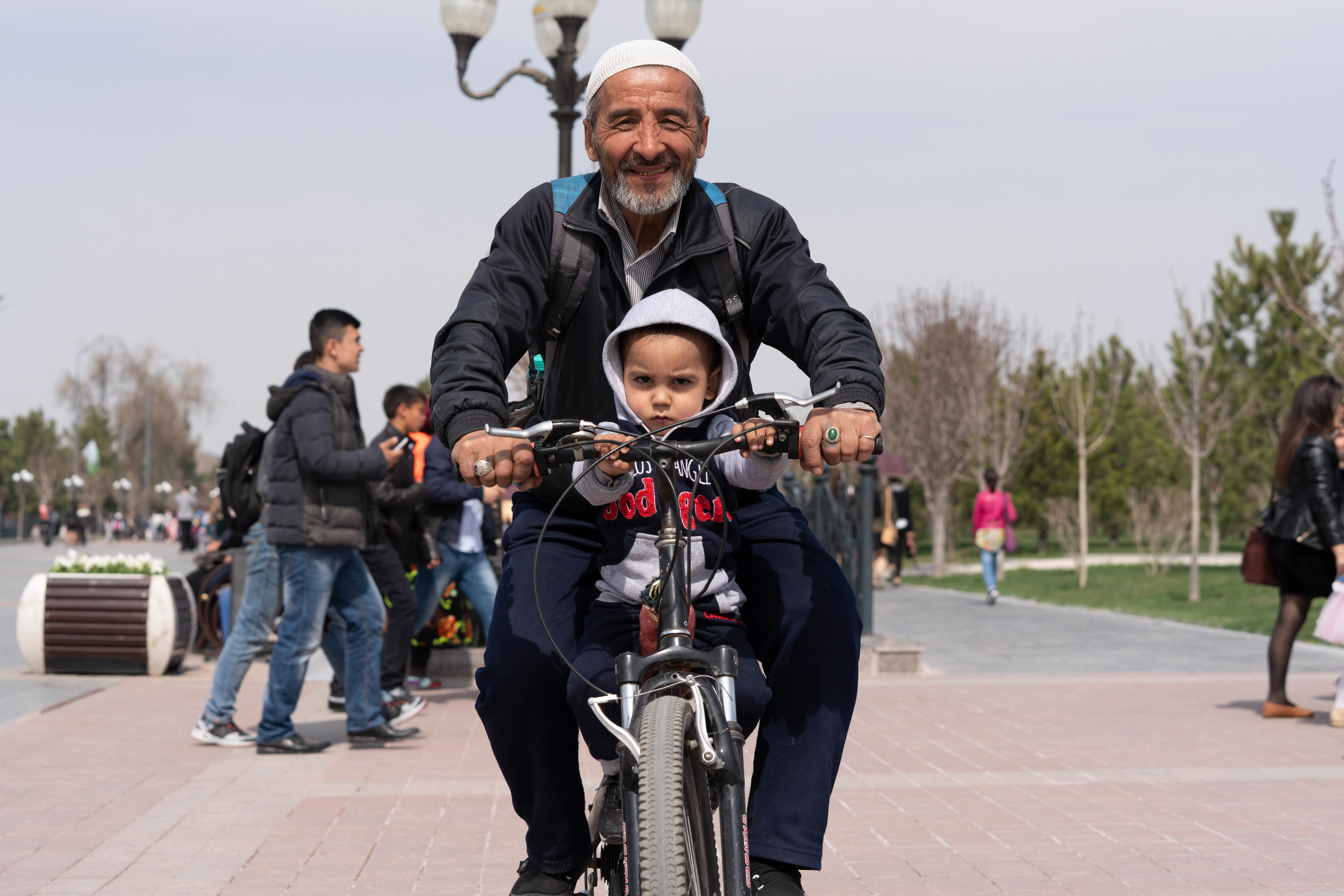
Uzbek Cruisers, Samarkand, Uzbekistan - Sony a7riii, Sony GM 24-70 f2.8 lens.
(f/6.3, 70mm, ISO500, 1/2000sec)
Uzbekistan must be one of the least visited countries. Of course, I don't actually know, and it does have a tourism industry, but I don't know many who've gone there...do you? I snapped this photo in the City of Samarkand. It wasn't my favorite city in the country, as it is probably the most replete with tourists. I prefer regions where people are just living, rather than putting on a show for capitalism. I can recommend many others in this lovely country I prefer more. In my experience, Uzbeks are wont to invite foreigners to stay with them, often on their farm. Upon exchanging money the first time, try not to laugh as $20USD buys wads of their currency. I felt like Scarface, counting out so many bills every time I purchased a bottle of water. Travel is cheap in Uzbekistan, even for a broke guy like me. Unfortunately, English-speakers can be a bit hard to find. Russian is the second language and many locals only speak Uzbek. My Russian is entry-level -- I get by. This man and I didn't try to speak verbally; rather, we smiled at each other, immediately relaxed. He knew I was harmless to him. You can tell that his son was less quick to trust a foreign stranger with a giant camera. Fair.
This photo brings me a lot of stress. It has nothing to do with the child's gaze, nor the memory of the day. Rather, it's the background. I hate it. That lamppost is crooked and in too much of the shot, I don't like the woman's bright fuchsia jacket, and I wish the group of teenagers would pass by already. Even the ground behind them is crooked. None of these elements adds to the photo, yet I love the man and his son, and I nailed focus as well. It's bittersweet, as often photos are. I could go in with Photoshop and change it all, but it's not my style. I must forgive myself since it comes with the territory of being a street-style photographer. So much good here, and so much that hurts my eyes. It is what it is. Perhaps you can make it better?
Original image (SOOC)
❶ Crop
- I brought it in a lot. I wish I could show more of the bike tire, but the people and the rest of the background kills me. Tempted to just show the man and kid and handlebars. Of course, it doesn't work that way either. Unwilling to ever do an unusual crop, I'm stuck. Ugh. Help.
❷ Raise Clarity/Sharpening
- Adding Sharpening (+74) and Clarity (+22) just feels right. I really stuck that focus, and it's a wizened man and a child, so I have more liberty.
➌ Lift Exposure/Shadows/Whites; Drop Black
- Lifted Exposure(+40) / Shadows(+93) / Whites(+10) to reveal more of the image that the RAW captured. For example, the man's jacket was quite dull in the original. Although the detail doesn't really matter too much, it tells more of the story of the main characters, about whom we care. I want also to separate these characters from the background. You know how I feel about the background here.
· Dropped black quite a bit (-65) to counter the lifted shadows.
➌ Raise Vibrance, Dehaze
- I want to make the sky less white, but too much Vibrance brings out the man's backpack, which isn't important to me. I could go in and make some other changes to fix that, but I won't. Good enough. Vibrance (+24), Dehaze (+15).
➍ Add Vignette
- I used to add so much Vignette, my photos looked like bruised bananas. A friend had to intervene, "It's not a blunt weapon." I still struggle. Just a little added here, feathered, highlights lifted a little so as to not to ruin the sky. Best case, people think it's a cheap lens; worst case, the photo looks abused. Really, most people won't notice either way, but I will if you over-vignette. Easy does-it, as with any editing.
May all your spontaneous backgrounds work for you.