Question
Make Font Match Work Better?
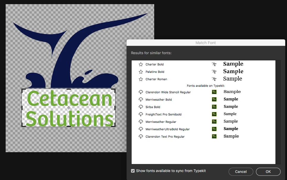
I was trying to do a video lesson on how to use Font Match, but I can't get it to work even with the clearest samples and actual TypeKit fonts. Is there a way to improve the matches? See the attached example (one of many I tried), which is Bree Regular.
PS. I've tried using white fill layers beneath the text and flattening the image so that the text is part of the background layer. It's the same mismatched results as with the transparency grid showing.