Copy link to clipboard
Copied
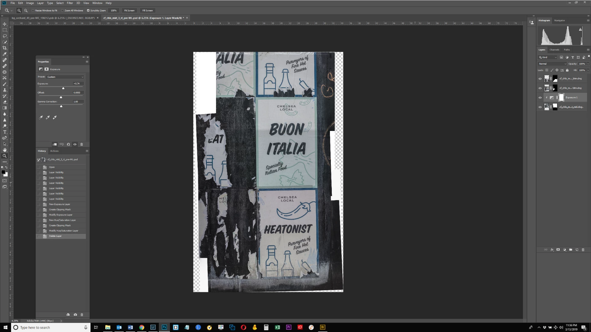
I need to learn how to blend and match colors in an image. In the below screen shot, I tiled several raw files together to create a single image which will be assembled into a still larger image. For now, I want to make the color cast of the 2 bottom posters match. The upper poster has a green cast that I want to alter to match the more neutral, slightly warmer cast of the poster below it. I tried adding a Hue/Saturation adjustment layer but that did not work well. Does anyone have suggestions on how to achieve this goal? Thank you.

Check out this video by COlin Smith.
MATCHING COLORS when COMBINING PHOTOS in PHOTOSHOP - YouTube
Copy link to clipboard
Copied
Color cast or different exopsures? You may be able to use Auto blend layers if they not smart object layers. If the are smar object layers perhaps stack mode blebding. You can also try to match colors before creating your composite. Match color between documents using menu Image>Adjustments>Match Color... .
Copy link to clipboard
Copied
Thanks JJMack. I found instructions on how to use Auto Blend. It said first create a new document and then open all your layers, and bring them into the new document as separate layers. For the blank document, I chose Custom and made the Image Size equivalent to one of the 3 layers (30" x 50"). When I brought the layer into the new document, it appears very large. See screen shots. Why is this? Thanks.
My original document before creating new one for auto blend. Dimensions is 35" x 55".

New document for auto blend with 1 of the 3 layers brought into it. The new document also has dimensions of 35 x 55. Why does the layer appear so big in the new document?

Copy link to clipboard
Copied
Check out this video by COlin Smith.
MATCHING COLORS when COMBINING PHOTOS in PHOTOSHOP - YouTube
Copy link to clipboard
Copied
This worked fairly well, thank you. Before and after shots below. Instead of making the upper poster more like the bottom though, I did the reverse.


Copy link to clipboard
Copied
I like to use the numbers because it takes the guesswork out of it.
So I select the colour sampler tool, and add sample points in the required locations
Drag the Info panel close so you can see what is going on.
Select one of the comic strip windows, and with that select active, add a Curves layer
You'll need to select the colour sampler tool again to be able to see the numbers in the Info panel.
In the curves properties, use the RGB drop down and chose the first channel. In the screen shot below, I have the reds selected. You can see a spike which represents the large area of the same tone, so add a point there.
Then adjust the Output value to match the other location. So in my example, I matched the values for point #3 with point #1.
Repeat that for Green and blue. I was easily able to get them identical, and the numbers don't lie.
Then do the other locations with a new curves layer, but remember to select the window first so that the curve's mask restricts the adjustment to just that area.

Copy link to clipboard
Copied
Hi Trevor this looks really cool and I started fiddling with it. But I have a question: it looks like you merged the 3 layers in my example into one layer (per the screen shot of your Layers panel). Do I need to do that before proceeding? In my screen shots below I am up to the step where I add the Curves Layer (screen shot #1) and then find a point which makes the color better (screen shot #2). This was purely a guess by me moving the curve to where I thought it looked good. Is this the idea? I didn't really understand your criteria for selecting a point - perhaps because I don't understand the Curves graph and what it represents. I probably need to find a tutorial or explanation of the graph so I can fully understand what I'm doing here.


Copy link to clipboard
Copied
I watched a curves tutorial at PHLEARN on youtube, and understand this much better. But there are a couple things I don't understand about your instructions. I'd be most grateful if you could explain, as I really want to master this.
1. when you say "select one of the comic strip windows," you're speaking of one of my 3 layers, right?
2. why does your Layers panel look different from mine? You show one layer that is comprised of all 3 of mine.
3. when I have my Layer selected, it shows one set of values for the Layer. When I select the Curves layer instead, it shows a different set of values for points 1 and 2 which are the points in that Layer. What is the meaning of the differences in these sets of values?
Thank you.
Find more inspiration, events, and resources on the new Adobe Community
Explore Now