Doc_Pit
Inspiring
September 12, 2019
Answered

Need help understanding blend modes

  • September 12, 2019
  • 7 replies
  • 1583 views

In his book The Hidden Power of Blend Modes, Scott Valentine describes the color blend mode (p. 174): “Creates a result color with the luminance of the base color and the hue and saturation of the blend color.  This preserves the gray levels in the image…”


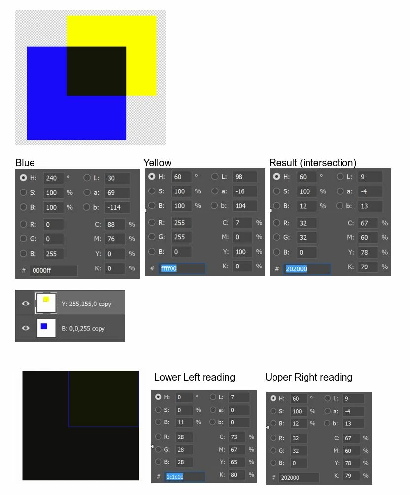
Simple enough.  But I tried the following experiment to test my understanding.  (For the images represented below, Opacity and Fill are at 100% in all cases.)


A pure yellow figure is placed on a transparent layer above a pure blue figure, also on a transparent layer.  Then, the blend mode of the yellow layer (the “blend layer”) is changed from normal to color.  The intersection of the two layers shows the result.


As expected, the resulting color (intersection) maintains “the hue (60) and saturation (100) of the blend color.”  However, it does not  maintain “the luminance of the base color.”  Whether we use Brightness or Lightness (Lab) as a measure, luminance is drastically reduced.


The next two screenshots show the same operation performed using a white rather than a transparent background. 


I would have expected the part of the yellow square which does not intersect to have a hue (60) and saturation (100) to match the original yellow figure on the blend layer but with a luminance to match the white background on the base layer (i.e., virtually the same luminance as the original yellow).  Instead, the non-intersecting part of the yellow square disappears.


If anyone can explain this, I'd like to understand what's going on.  Thanks.


    This topic has been closed for replies.
    Correct answer The Scott Valentine

    Good question! I had to think about it a bit, but the answer comes down to the luminance weights applied by Adobe to the RGB pallette for visual perception.


    The luminance weights are given here:

    0.30*R

    0.59*G

    0.11*B
    So, pure RGB Blue is 0.11*255 = 28 (I'm rounding)

    RGB Yellow is full Red and full Green, so you get 0.3*255 + 0.59*255 = 227


    In your sample of the dark overlap, the result is Red 32, Green 32. Running that through our little set of equations gives us a luminance value of 28. (actually 28.48, but... yeah. rounding)

    That is the same luminance value of RGB Blue by itself.

    Remember that Luminance is an approximation of power.


    So the square you see is simply "REALLY SUPER DARK YELLOW"

    7 replies

    Chuck Uebele
    Community Expert
    Community Expert
    September 13, 2019

    It could be Mark. Here's just a straight test desaturating the primaries in both RGB and L*A*B*. L*A*B* give a much better visual representation of how we preceive color values in grayscale.


    sharp_hands16B8
    Community Expert
    Community Expert
    September 13, 2019

    I wonder how much of this is related to the division of the RGB spectrum (CIE Color Model) Although we numerically divide the individual channels by 0-255, which implies they are equally divided, but the CIE color model is not divided equally. 

    Or possible, as it is turning the the HUE value a number of degrees as a numerical measure is it relatively shifting the luminance value by a corresponding amount?

    The Scott Valentine
    Community Expert
    Community Expert
    September 13, 2019
    It's 100% correct to point that out, Mark. The 2D space representation of RGB is of course not a circle, and the CIE space accounts for luminosity as part of the human visual perception model. RGB doesn’t natively support luminance, just brightness as related to intensity of white light. The weight values are an approximation based on slicing up the map and trying to account for the distance from white at the center to an arbitrary (x, y) color. As you spin around from the white point, that vector changes length in order to maintain uniform luminance (apparent brightness).
    ------------------------------------------------------------Never let your tools get in the way of your art!
    The Scott Valentine
    Community Expert
    The Scott ValentineCommunity ExpertCorrect answer
    Community Expert
    September 12, 2019

    Good question! I had to think about it a bit, but the answer comes down to the luminance weights applied by Adobe to the RGB pallette for visual perception.


    The luminance weights are given here:

    0.30*R

    0.59*G

    0.11*B
    So, pure RGB Blue is 0.11*255 = 28 (I'm rounding)

    RGB Yellow is full Red and full Green, so you get 0.3*255 + 0.59*255 = 227


    In your sample of the dark overlap, the result is Red 32, Green 32. Running that through our little set of equations gives us a luminance value of 28. (actually 28.48, but... yeah. rounding)

    That is the same luminance value of RGB Blue by itself.

    Remember that Luminance is an approximation of power.


    So the square you see is simply "REALLY SUPER DARK YELLOW"

    ------------------------------------------------------------Never let your tools get in the way of your art!
    Chuck Uebele
    Community Expert
    Community Expert
    September 12, 2019

    Scott and I are discussing this, and we are coming to the conclusion that Adobe doesn't use actual luminosity values, but weighted values, so this will throw off what you expect to get. See this article:

    https://insider.kelbyone.com/how-photoshop-translates-rgb-color-to-gray-by-scott-valentine/?fbclid=IwAR3GIkV4T0GsmiOS6fxOtBcDydPZ1ALa7Wc_7i-g2UaxnHODVfa1riAjH20

    Doc_Pit
    Doc_PitAuthor
    Inspiring
    September 13, 2019
    Just want to thank everyone for the responses. Also, thanks to Scott for the book and the article. Both very helpful. This forum is a treasure although the new format is, perhaps, less so. (Might be an "old dog new tricks" problem.) For all the responses, thanks again.
    Trevor.Dennis
    Community Expert
    Community Expert
    September 12, 2019

    Hi Doc, and welcome back to our new 'improved' forum. You'll have to imagine the wink emoji.

    I'll _try_ and work out your blend mode question, but I might fail so fingers crossed.  You have been doing this long enough to have a decent grasp though.


    So you know that 'color' only shows over mid tones. So when I use Hue/Sat set to Colorize with fully saturated red, we'll see nothing over the full white, and full black.


    (Note I am going to post this because I can't see if the image is displaying properly, and it is useless if it doesn't, so I'll edit it right after seeing what is happening — we are finding our way with the new forum 😞 )

    Chuck Uebele
    Community Expert
    Community Expert
    September 12, 2019

    The white portion is easy to explain, as the luminosity of the white bg sets the RGB values all at 255. The other part is a bit odd in that the intersect is so dark. One would think that the intersect would be lighter with the luminosity of the blue. The blend mode use some strange calculations, and don't always make sense. I believe Scott told me he might be updating his book, but I'll see about pinging him and get this thoughts.

    Kevin Stohlmeyer
    Community Expert
    Community Expert
    September 12, 2019

    This is a great tutorial that covers blending modes:

    https://photoshoptrainingchannel.com/blending-modes-explained/


    Have you tried using Hue instead of Color?

    Kevin Stohlmeyer
    Community Expert
    Community Expert
    September 12, 2019
    To better understand what is happening, add a white background color. When you change the blend mode to Color - it affects only objects intersecting the blending layer. Since there is no information below the non-intersecting portion, it reads as 0.