- Home
- Photoshop ecosystem
- Discussions
- Neon light makes ugly halo outline when converted ...
- Neon light makes ugly halo outline when converted ...
Neon light makes ugly halo outline when converted to CMYK printer's profile
Copy link to clipboard
Copied
Hi guys,
I have kind of an urgent question:
I'm working on a newspaper-style exhibition brochure (final version due this Friday, omg!!!). The InDesign document is going to be exported in the specific newspaper color profile (named "WAN-IFRAnewspaper26v5"). I have no problems working with this so far, except with one picture.
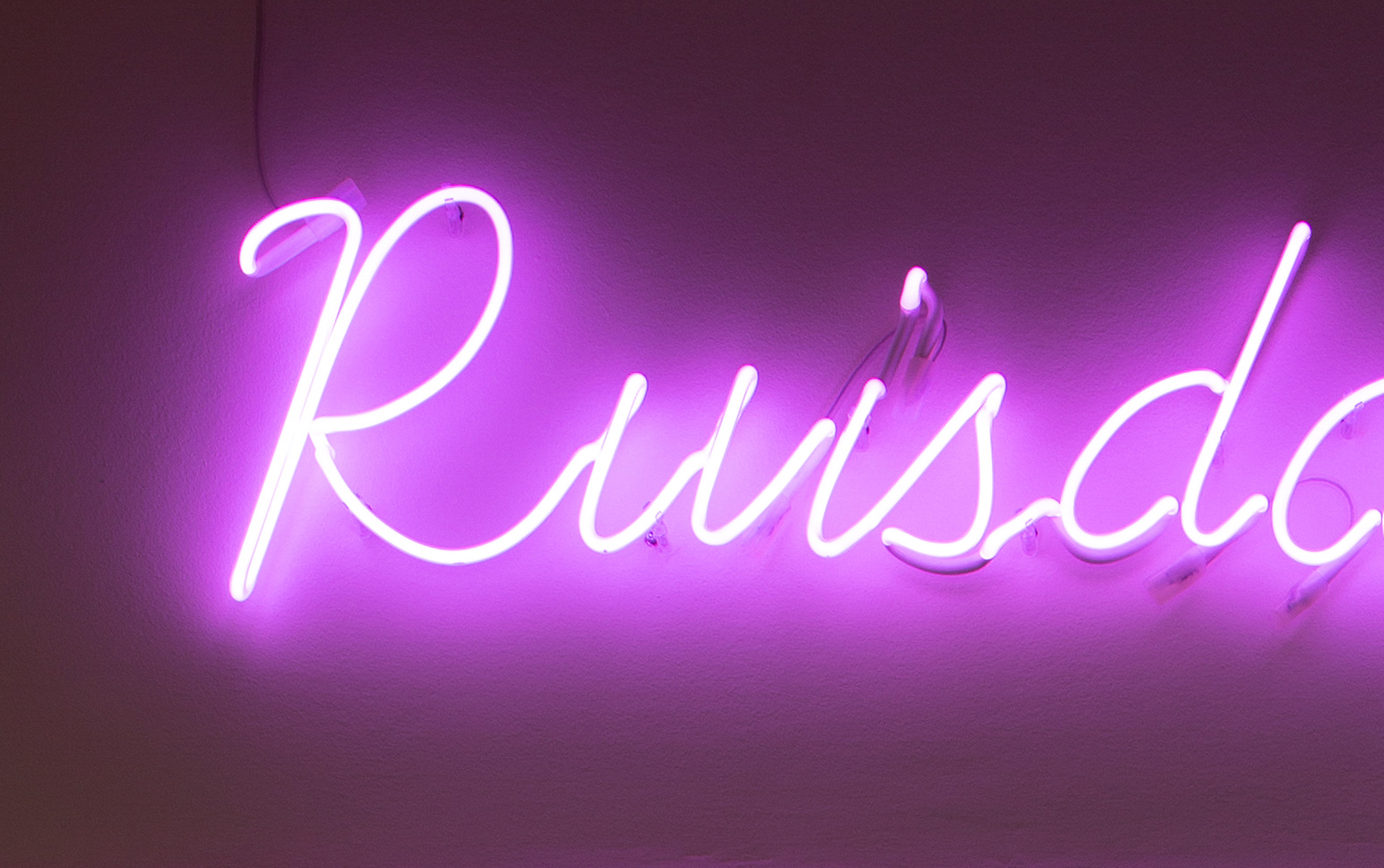
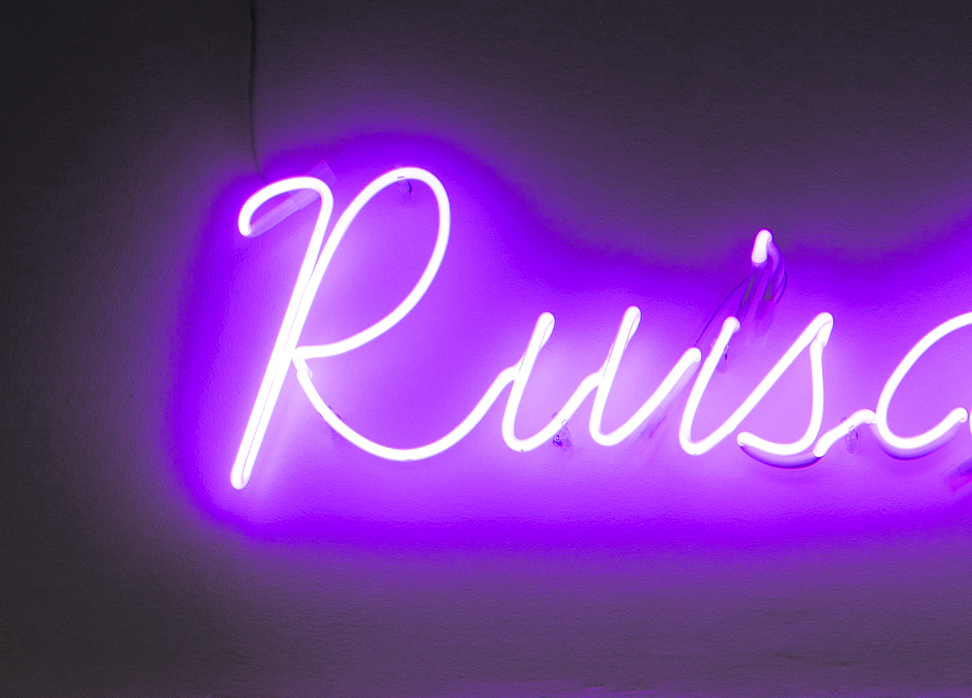
It's a neon sign. Whereas in the original profile, there is a very nice color / light gradient into "the dark", when converted to the printer's profile, there is a very ugly outline-kind-of-thing in the halo of the neon sign. It almost looks like it's a solid surface around the sign. See here:
Original:

Converted version:

Can you help me to make that look at least a little more decent?
I tried using different converting options, and tried to mess with color saturation, lighting etc., but it won't help.
Would be awesome!
Thank you so much,
Tobi
Explore related tutorials & articles
Copy link to clipboard
Copied
Also remember if you are using blend modes you can separate the sliders by holding command (control on pc) and clicking on the slider. This way you can pull each side out and make the gradient smoother.
One REAL cheat way to make it shine is to duplicate the layer with just the light and its radiant glow, fill with white and drop behind. Then you can just play with blend modes and transparency modes to make the color pop. Just be careful about selection edges when done to make sure there isn't a break line showing where those layers intersect with those underneath.
Copy link to clipboard
Copied
One REAL cheat way to make it shine is to duplicate the layer with just the light and its radiant glow, fill with white and drop behind. Then you can just play with blend modes and transparency modes to make the color pop.
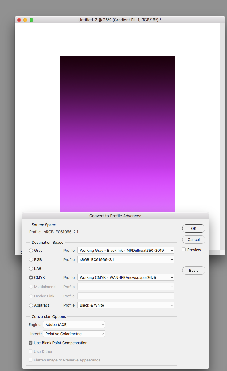
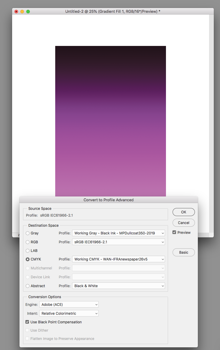
You still have to consider that the banding and posterization the OP is experiencing is happening on the conversion into the small newsprint space. You could get perfectly smooth, saturated blend transitions in RGB mode, which get ruined on a conversion, so while you work you need to have Proof Colors turned on with the Proof Setup set to the destination CMYK profile in order to see the damage that will be done by the future conversion.


Copy link to clipboard
Copied
Agreed.
Not implying anyone specific in this thread, but I'm amazed at how many excellent designers there are out there that don't understand basic color theory reproduction in CMYK. Whenever I receive art in RGB I look at it to determine if there are any problem colors (outside of gamut). If there are many I request the client have their artist do the color conversion prior to being sent so they can see the differences and/or require a press proof.
We match colors really really well, but there are just some that are impossible to hit in CMYK no matter what you do.
-
- 1
- 2

