Copy link to clipboard
Copied
Hello,
I'm retouching and color matching neon colors clothes, and I'm having issues getting the neon orange close to the actual color of the fabric.
In the image, the neon orange looks faded, but in person is an orange bright color that pops out. I used levels, color replace, and hues, but not even close I can't get the similar color.
Need help, please advise.
 1 Correct answer
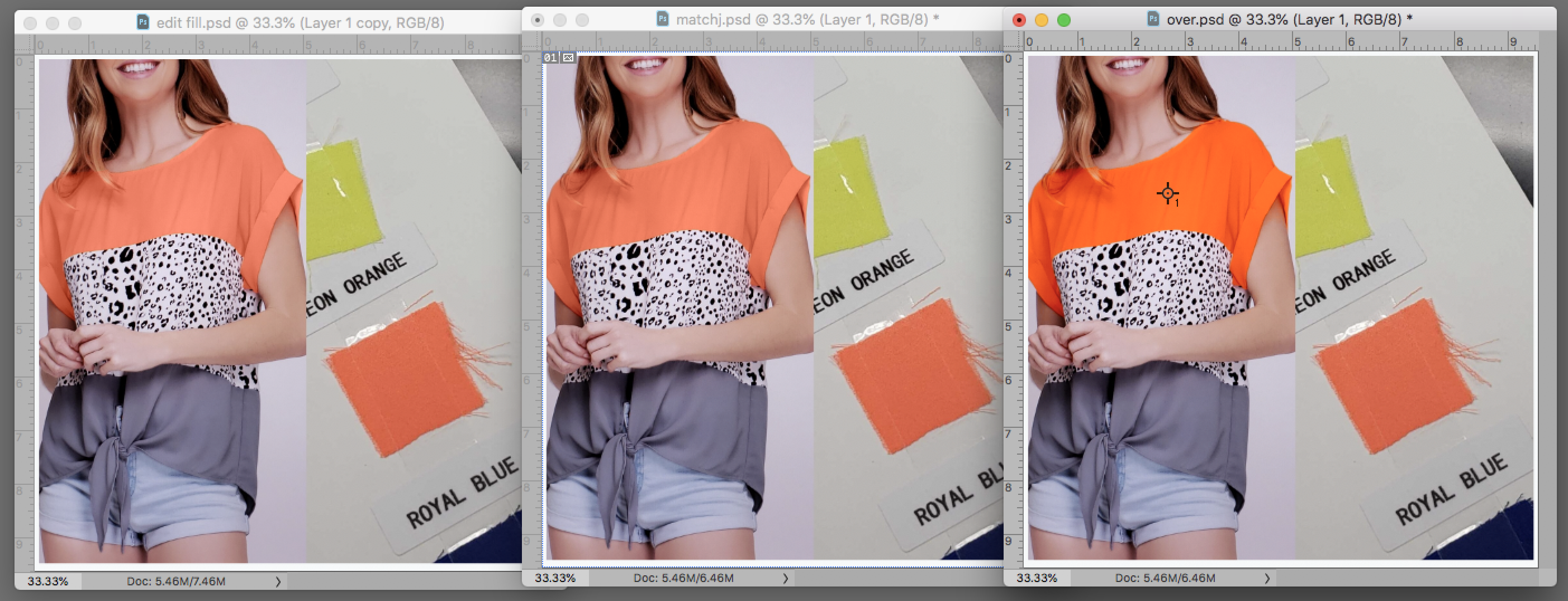
For all three samples the file was changed to Lab Color and a duplicate of the B channel was modified and used as a mask. Then returned to RGB.
Image 1: Sampled the reference color as Foreground color. Edit > Fill with Foreground Color. Blending mode set to Color.
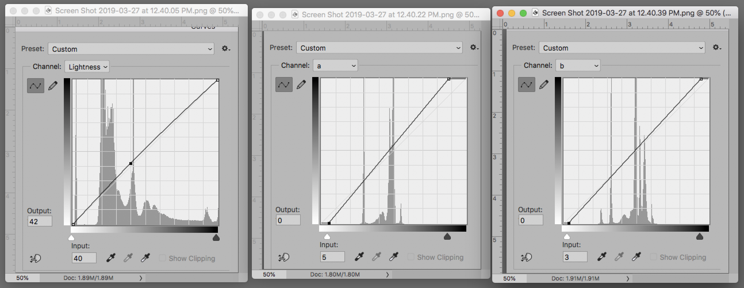
Image 2. Used Image 1 and changed the Mode to Lab Color. Matched the swatch Lab values exactly using the Curves shown.
Image 3. Increased the. Lab values very slightly by moving the. a and the b end points laterally to increase the ver
...Explore related tutorials & articles
Copy link to clipboard
Copied
Can you share a screenshot of what you're trying to do with us?
Adobe Certified Professional
Copy link to clipboard
Copied
Here is the image shot in a studio, and next to it is a piece of fabric (took the pic with my phone).
Copy link to clipboard
Copied


For all three samples the file was changed to Lab Color and a duplicate of the B channel was modified and used as a mask. Then returned to RGB.
Image 1: Sampled the reference color as Foreground color. Edit > Fill with Foreground Color. Blending mode set to Color.
Image 2. Used Image 1 and changed the Mode to Lab Color. Matched the swatch Lab values exactly using the Curves shown.
Image 3. Increased the. Lab values very slightly by moving the. a and the b end points laterally to increase the vertical slope.
Flattened the layers before returning to RGB. Image 3 no longer matches the swatch but seems more fluorescent. You must not overdo this because it will shift strongly red.
EDIT: Please see my previous post regarding reproducing the image in print.
Copy link to clipboard
Copied
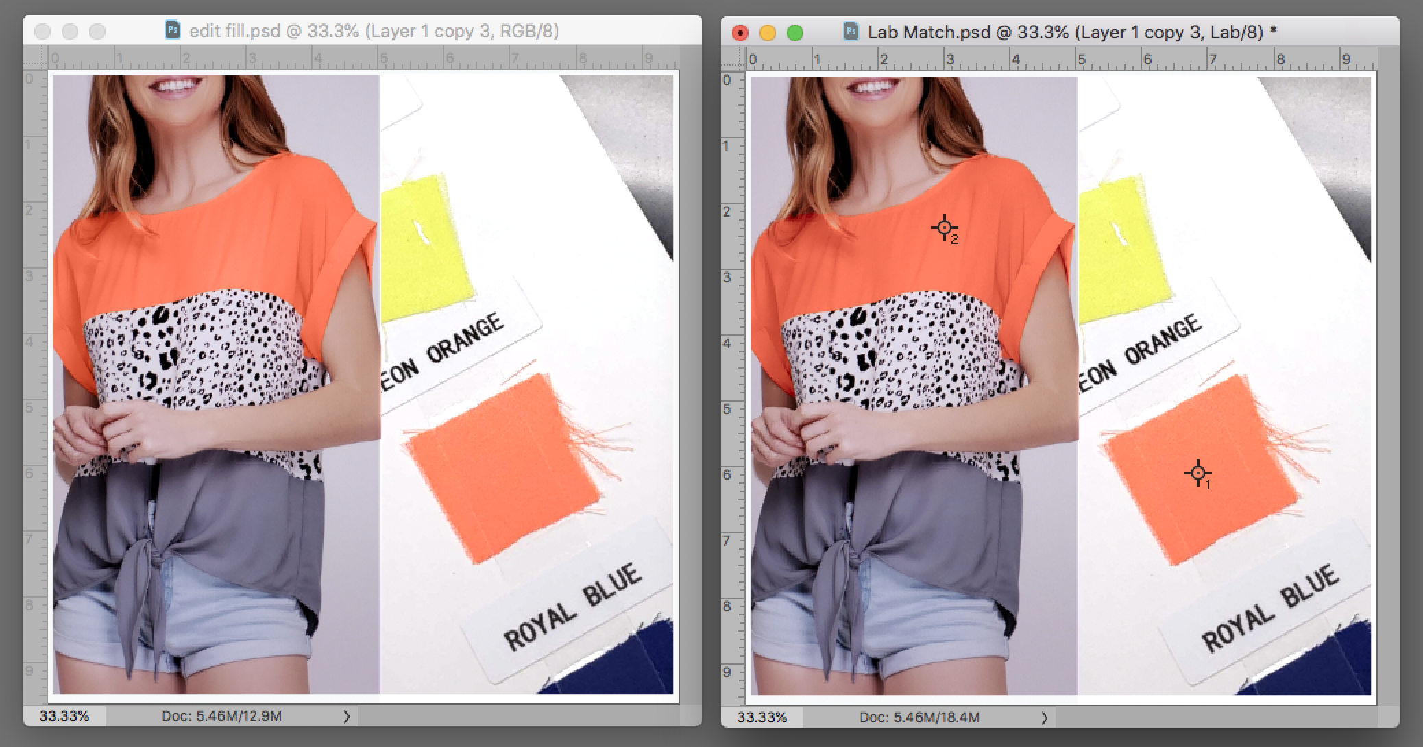
A second look.
If the catalog page alone was changed to while paper, affecting the reference swatch:*
Image 1. The adjusted Color Swatch. Edit > Fill with the Blending mode set to Color
Image 2. Moving Image 1 into Lab Color adjusted to boost saturation
* Keying white balance can create a significant color and color balance changes in the image. Shown below, the Curves highlight eyedropper was changed to near white and clicked on the white shirt. No other change was made.
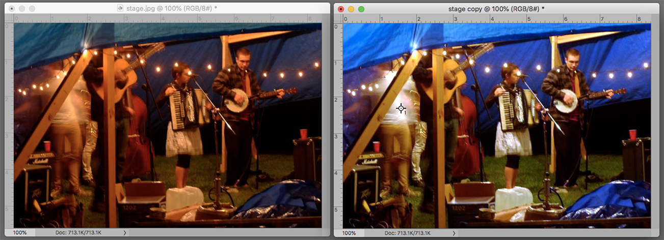
Copy link to clipboard
Copied
Would be helpful to know what you are doing with this image, so we know if you are matching to RGB or CMYK so we can best recommend how to proceed. I suspect you are looking for a simple and quick method since you did not provide that in your original post.
Get the color from your digital camera shot good (by doping a white balance as suggested by other posts), You can aftwerwards eye drop sample and make a Solid color adjustment layer set to color. You can add a curves on top with a small tweak to luminoscity of needed
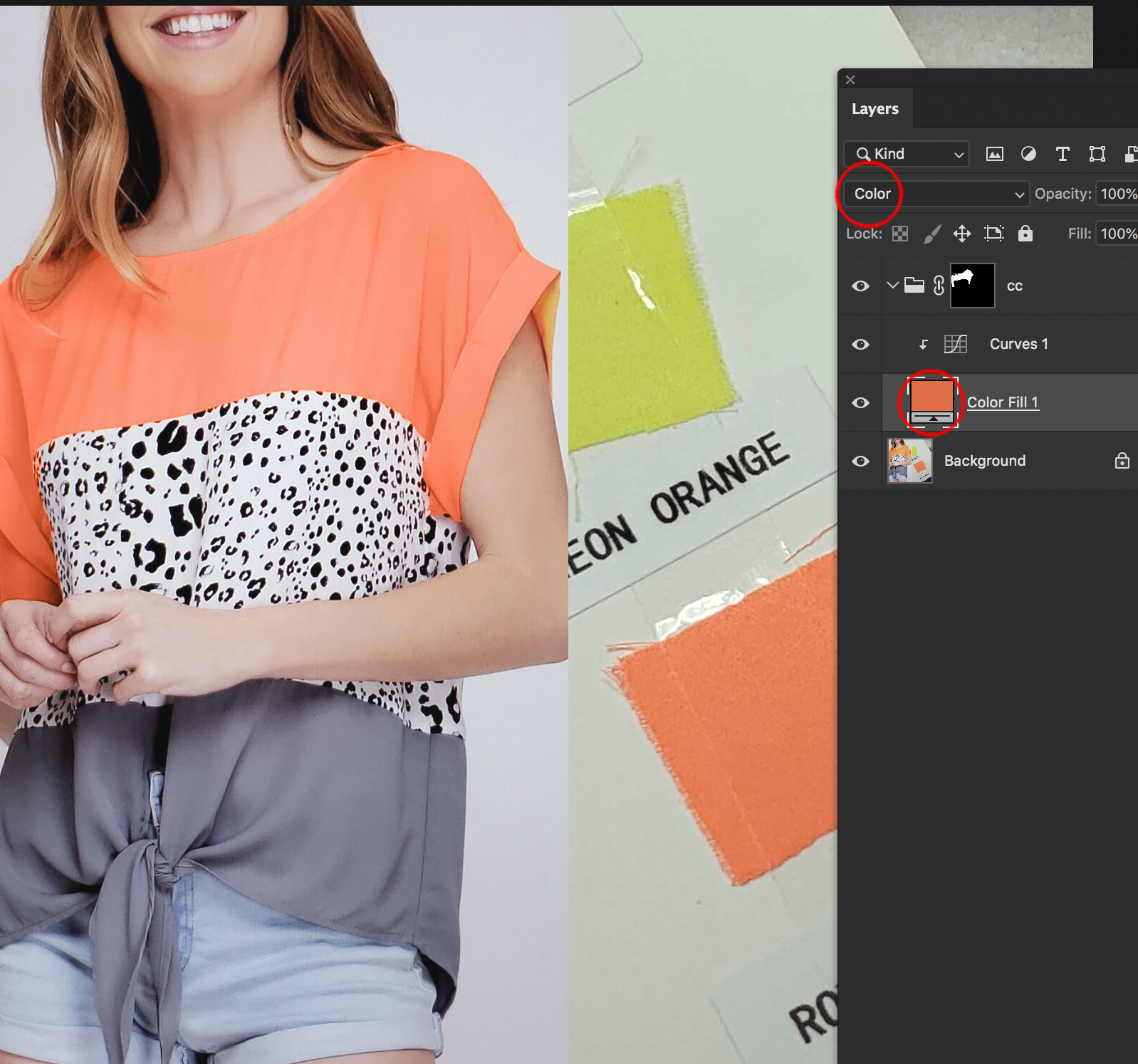
Copy link to clipboard
Copied
Imitating fluorescence in an image is often a matter of increasing Saturation (Image > Adjustments > Hue/Saturation)* to an extreme degree after making a Selection of the orange area. (Google Images: "Fluorescent Orange" or "Fluorescent fabric" will show typical results and you may use the same RGB values to attain them.) While you may accept the compromise presented on a computer monitor, the color is far outside what may be achieved with normal four-color inks. If you are preparing this image for print, I suggest that you discuss running a fifth color on press following the instructions of your lithographer.
*If Saturation it inadequate, changing the Mode to Lab Color will offer even greater saturation options."
Copy link to clipboard
Copied
It sounds like you've reached the gamut limit of whatever color space you're working in. You can convert to a larger color space to be able to work with more saturated colors - but ultimately your limitation is the final output color space.
This is the most saturated orange you get in sRGB. This is also the gamut limit for most monitors, since they have a native color space pretty close to sRGB. There are larger color spaces, like Adobe RGB or ProPhoto - but on screen it's still clipped to sRGB:

That doesn't look too bad - but if you want a lighter or darker shade you're in trouble. This is still at the sRGB gamut limit, the most saturated you get from that particular orange:


And that, I suspect, is more like your situation with a real dress on a live person.
In short - consider your final output color space. That's what you have to work with. Nothing you can do about it - but that said, with skill and practice you can usually compensate so that it works in practice. Remember, it won't be seen next to the original.
Copy link to clipboard
Copied
I think Norman is doing a splendid job here, demonstrating what I said above:
that said, with skill and practice you can usually compensate so that it works in practice. Remember, it won't be seen next to the original.
Stop trying to push absolute saturation. It will only take you so far. Work on making it credible instead.
Copy link to clipboard
Copied
I agree. To my eye, the color on the clothes (in the Dropbox image) just looks like it has a little more yellow in it.
Copy link to clipboard
Copied
ponytail1414, the lime swatch in the original is actually cool yellow (Lab a-14, b+64) , so anything on that printed page is suspect. Agree?
Copy link to clipboard
Copied
Aha yes, I see that.
Copy link to clipboard
Copied
Thank you so much everyone. Aye, Norman help so so much. Of course, Mike's strategy works too. Now, I follow up both styles from Norman and Mike, and I did use the hue to change a little bit from Orange to Coral.
The fabric is more Coral than Orange. The name Neon Orange tricked me because is more like Neon Coral.
Like Norman said, when I went back to RGB or tried to saved JPEG, it losses its neon/brightess/fluoresce, so I open it in Lightroom to export without losing any quality.
Now I see Neon Orange/Coral everywhere...my eyes.
Here is the original then edit. During the shoot it was used a gray card, still, killed the color. It came out good, it match to the fabric in person. Thanks to you guys.


