Copy link to clipboard
Copied
Why does Photoshop treat image P3 and Display P3 as the same when it comes to the Profile Mismatch warning? Or, to put another way, why doesn't Photoshop flag a mismatch when opening an image tagged with image P3 when the Working RGB space in the Color Settings is set with Display P3, or vice versa?
Method to Recreate:
1. Create 3 files tagged w/ 3 different P3 profiles: image P3, Display P3 and DCI-P3 (as the control) and save.
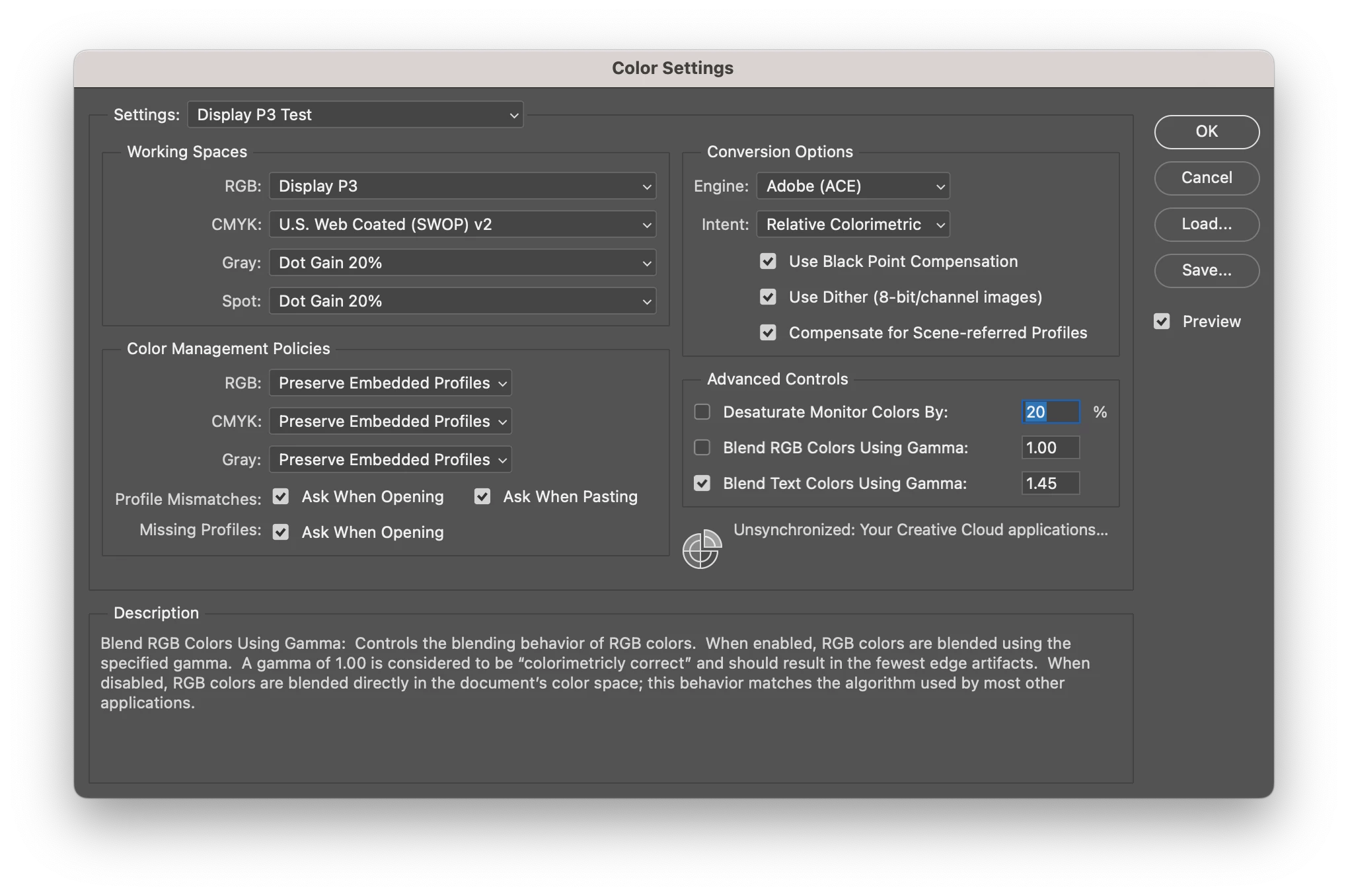
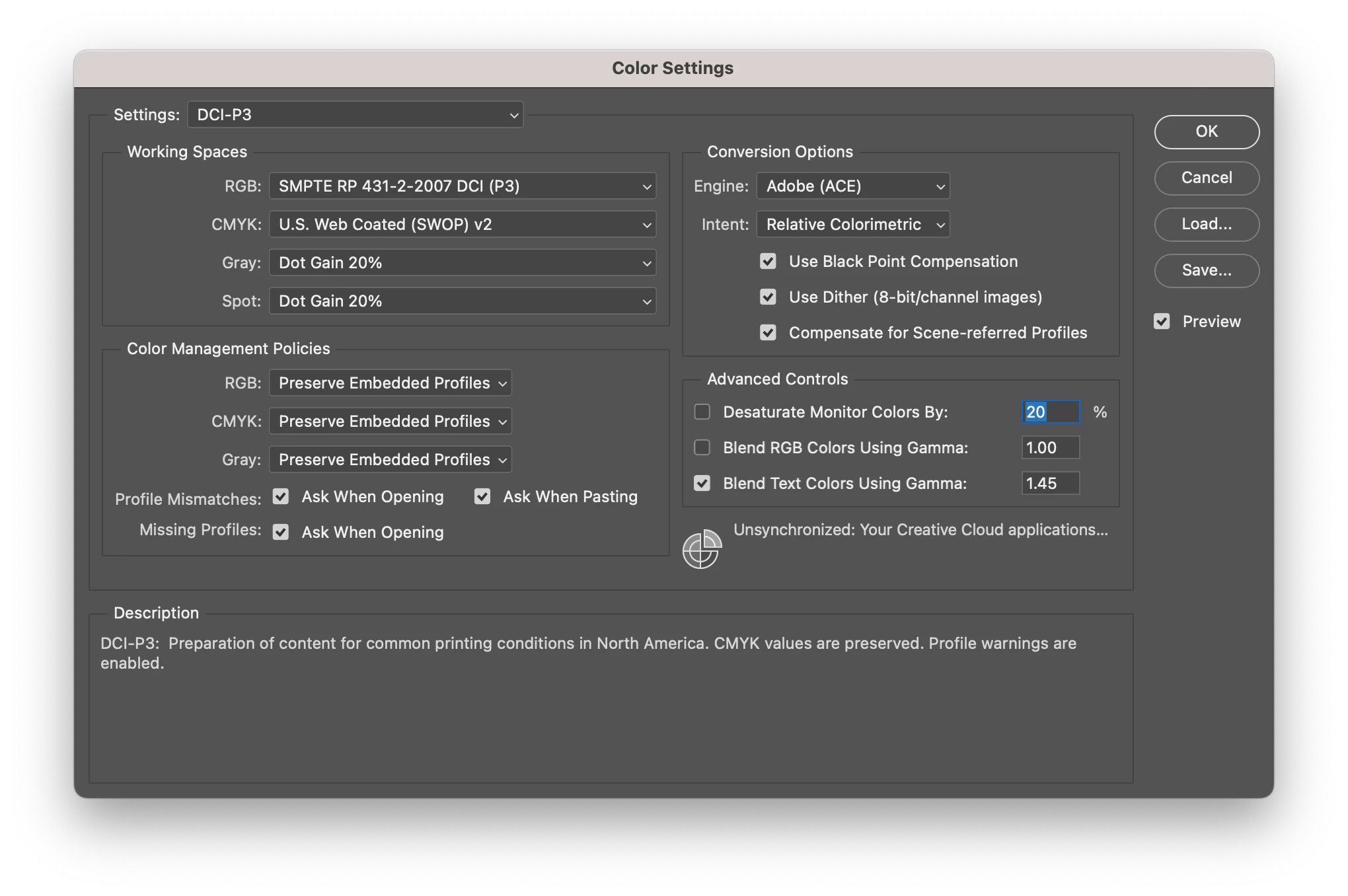
2. Set the Working RGB Space in the Color Settings to image P3 and ensure Ask when Opening is selected under Profile Mismatches.
3. Open each file and observe the warnings.
4. Repeat steps 2 & 3 twice, substituting the other two profiles under step 2 accordingly, changing nothing else.
Result:
When Working RGB Space is:
DCI-P3 » image P3 & Display P3 mismatch warning; DCI-P3 √OK
image P3 » image P3 √OK; Display P3 √OK?, DCI-P3 mismatch warning
Display P3 » image P3 √OK?; Display P3 √OK, DCI-P3 mismatch warning
Screen shots of 3 settings attached, along with the images themselves. Tested on MacOS Ventura with both Photoshop 2022 and 2023 with various file formats and all produced the same result.
Display P3 Settings
DCI-P3 Settings
image P3 Settings
Image P3.png
Display P3.png
DCI-P3.png
There are different preset "modes" you can set for the display in MacOS, equivalent to calibration targets when you use a calibrator. But the standard general purpose setting would be D65, which is also the white point in Image P3.
The primaries are in any case identical, and both use the special sRGB IEC61966-2.1 tone response curve (not a regular gamma function). So in most practical scenarios, they will be identical.
Originally, DCI-P3 is a standard for digital cinema projectors, and Disp
...Copy link to clipboard
Copied
They are identical: P3 primaries, sRGB tone curve, D65 white point.
There is nothing to convert. It's just the name.
If you're working with Image P3 as document profile, and Display P3 as monitor profile, you are in fact working without any color management whatsoever. If the two profiles are the same, nothing happens, and the net effect is that the document RGB numbers are passed on to the display unchanged. Which is the definition of "no color management". It doesn't even matter what the profile is - if they're the same, nothing happens.
Copy link to clipboard
Copied
Ahh... looks like Display P3 was updated 1/1/22, and I'm assuming rolled out with Ventura, so it now matches image P3's D50. The prior version of Display P3 (introduced 6/18/15) was D65 under under Monteray.
Copy link to clipboard
Copied
There are different preset "modes" you can set for the display in MacOS, equivalent to calibration targets when you use a calibrator. But the standard general purpose setting would be D65, which is also the white point in Image P3.
The primaries are in any case identical, and both use the special sRGB IEC61966-2.1 tone response curve (not a regular gamma function). So in most practical scenarios, they will be identical.
Originally, DCI-P3 is a standard for digital cinema projectors, and Display P3/Image P3 is a modified adaptation for use on computer displays. The original DCI-P3 has a greener white point.
In any case, it might be peripheral point, but I still think it's worth being aware of: a workflow relying on these two profiles is basically not color managed. Worth keeping in the back of your head. It will always look fine inside an Apple ecosystem, but you could get in trouble when moving outside it.
Copy link to clipboard
Copied
In any case, it might be peripheral point, but I still think it's worth being aware of: a workflow relying on these two profiles is basically not color managed. Worth keeping in the back of your head. It will always look fine inside an Apple ecosystem, but you could get in trouble when moving outside it.
Understood... these particular images aren't intented to leave "our" ecosystem. 😉