JeffreyW
Known Participant
January 2, 2017
Answered

ooking for tips or guidance for creating a poster

  • January 2, 2017
  • 4 replies
  • 5671 views

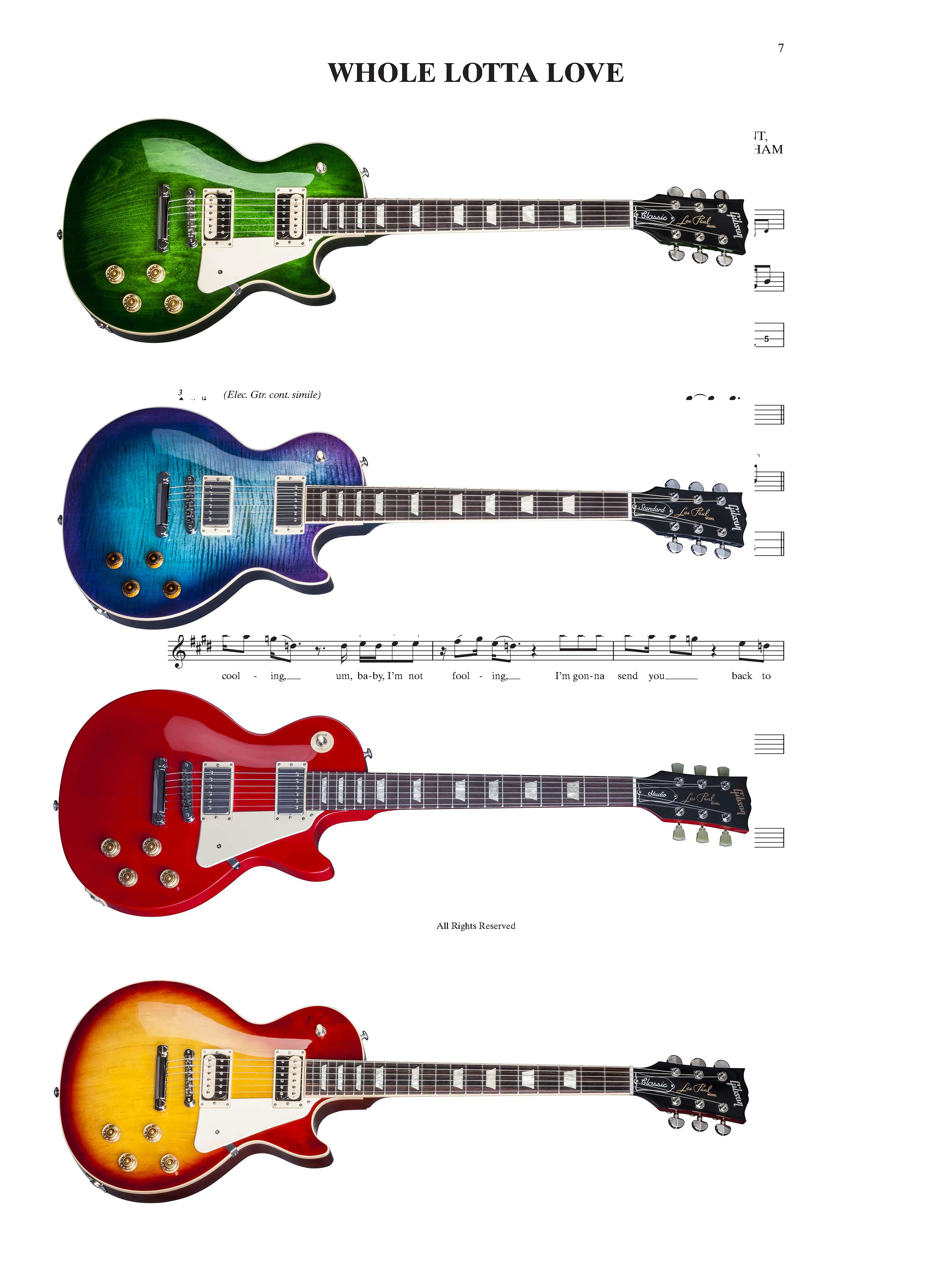
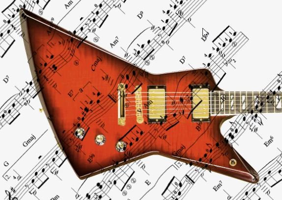
I am looking to create a 24x36 poster in PS for my daughter in which I want to paint around 5 Les Paul guitars (all different colors) with guitar tabs for songs as the background. My question is how do I make sure I set the guitars at a proper image size that will scale to the poster size of 24x36?

I'm creating each Les Paul guitar as it's own layer and then placing the layers in the poster. Once I have them all set I'll them merge the layers for printing. I just want to make sure the guitars are at the proper image size within the poster (not too big and more importantly, not too small).

I would appreciate any feedback.

Thx,

Jeff

This topic has been closed for replies.
Correct answer Trevor.Dennis

Here's the mock up. Two things to note:

1) I didn't cut the guitars out yet as they still have their white background (but for the final poster I will cut the guitars out of their background)

2) I sized the 'Whole Lotta Love' tab to 200% x 200%. Obviously when I cut the guitars out from their background more of the tab will show

Quick question - when I have the final design, should I merge all layers and flatten?

Thx again


JeffreyW wrote:

Quick question - when I have the final design, should I merge all layers and flatten?

Thx again

Definitely not.  Leave all layers intact, and export to PDF using the High Quality Print preset.  I am not going to say much about colour as it is not my area of expertise.  I give my artwork to a friend printer as sRGB, and he converts to CMYK and does a test print for me.

Some points:

The white backgrounds are incredibly easy to remove just using the Magic wand, which is all I used for my post #18.

The sheet music gives you a lot of possibilities being black on white.  You could overlay multiple layers all with their blend mode set to Darken, and the white would be transparent, like this

You could chose to distort the music over the guitars using a displacement map.  This is VERY quick and dirty, but gives you the idea

The bottom line is you dream it up, and if it is doable, we'll tell you how.

4 replies

Trevor.Dennis
Community Expert
Community Expert
January 2, 2017

I am also not sure what a guitar tab is, but Google tells me that it might be an illustration of strings and frets with finger positions.  As others have said, this is your design, so I don't know what you are asking. Will you create the guitars with Photoshop, or use photographs?  How big will each guitar appear on the poster?

Because it is impossible not to throw at least some sort of idea at you, I thought of the entire background with the LP wood grain and dark gradient outside.  If this is indeed what a tab looks like, I have inlaid a large tab into the background. We can answer specific questions btw.

JeffreyW
JeffreyWAuthor
Known Participant
January 2, 2017

Trevor,

Thx for the reply.

I plan on using the guitar tab (inserted below) as the background.

Then I am going to paint 5 Les Paul guitars (like below - changing the color each time) and stack them one above the other with some space between each guitar (I plan on using guides to help space them). As you asked, how big should each guitar appear on the poster? I assume after I'm done painting each guitar I can free transform each guitar to the same appropriate size on the poster? I'm assuming it's WYSIWYG as what I see on screen (image size wise) is what will be printed out for the final image. Just want to make sure the image size for the guitars are correct before printing the poster.

Thx

Trevor.Dennis
Community Expert
Trevor.DennisCommunity ExpertCorrect answer
Community Expert
January 4, 2017

Here's the mock up. Two things to note:

1) I didn't cut the guitars out yet as they still have their white background (but for the final poster I will cut the guitars out of their background)

2) I sized the 'Whole Lotta Love' tab to 200% x 200%. Obviously when I cut the guitars out from their background more of the tab will show

Quick question - when I have the final design, should I merge all layers and flatten?

Thx again


JeffreyW wrote:

Quick question - when I have the final design, should I merge all layers and flatten?

Thx again

Definitely not.  Leave all layers intact, and export to PDF using the High Quality Print preset.  I am not going to say much about colour as it is not my area of expertise.  I give my artwork to a friend printer as sRGB, and he converts to CMYK and does a test print for me.

Some points:

The white backgrounds are incredibly easy to remove just using the Magic wand, which is all I used for my post #18.

The sheet music gives you a lot of possibilities being black on white.  You could overlay multiple layers all with their blend mode set to Darken, and the white would be transparent, like this

You could chose to distort the music over the guitars using a displacement map.  This is VERY quick and dirty, but gives you the idea

The bottom line is you dream it up, and if it is doable, we'll tell you how.

davescm
Community Expert
Community Expert
January 2, 2017

Hi Jeffrey

You will be viewing a 24x36 inch poster from around 3 feet al least. At that distance good eyes can resolve about 200dpi * Anything more you won't see.

So in practice :

If the guitars are photographic images, then the image will already be at a resolution. Drop them into your poster as smart objects without sharpening and scale them to the size you need. Sharpen the final image before printing.

If you are drawing/painting the guitars - either work in illustrator which will do this as scalable vectors (i.e. they will look smooth at any size) or if you are working with pixels in Photoshop, paint them at your poster size and use 200dpi. That way you should be fine.

* see this link on image resolution

http://www.northlight-images.co.uk/what-print-resolution-works-for-what-viewing-distance/

Dave

JJMack
Community Expert
Community Expert
January 2, 2017

When I divide 24" and 36"  by 12'" I get 2' by 3' don't you?

JJMack
postrophe
Inspiring
January 2, 2017

Hi

Right, but some time it can be confusing.

I dont think the Op what to create a postal Stamp, I still think the Op want to create a "poster"  ( 24" X 36").

Or (2 feet X 3 feet).

Anyway, without knowing/seeing the Op images, hard to say if all images will fit the master PS file.

Pierre

JJMack
Community Expert
Community Expert
January 2, 2017

Yes I can not type and I hit the Shift key when I shoul not have and  type " instead or '................ and some printers could print 19.4 MP in 2"x3" paper ny mot 77.7MP

JJMack
JJMack
Community Expert
Community Expert
January 2, 2017

The poster is your composition. There is no right or wrong size.  I don't even know what guitar tabs for songs are. Just remember a 2' x 3' posters does not need to have a have a 300DPI print resolution. If you plan on having many layers creating the documemt with a 150 to 200dpi resolution will reduce the number of Pixels Photoshop will have to deal with. Photoshop will perform better dealing with fewer pixels. The canvas size 2' x 3' at 300DPI is 77.7MP a 2" x 3" 150DPI canvas size is 19.4MP  the is 1/4 the size as the 300DPI canvas.

JJMack
postrophe
Inspiring
January 2, 2017

Hi

JJ, I think the Op is talking about a  24 inch x 36 inch poster.

Pierre