What caused the spacing problem? The cause was the optics of linear perspective, as taught to drawing/painting students: In a single-point perspective composition, objects appear smaller as their distance from the viewer increases, and that also applies to the spaces between objects.
That effect is very visible in your example because the camera was much closer to the bottom of the wall than the top, so naturally, the posters further up have much less spacing between their horizontal borders.
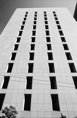
Lightroom did nothing wrong because the merge result is perfectly consistent with if the scene has been captured in a single shot, like the example below. I shot this example on film many years ago, before any digital trickery was possible, but you still see the same linear perspective diminishing spacing effect with the windows: The windows and spacing near the top appear much smaller than for the windows near the bottom, even though all of the windows are actually the same size.
The only good way to avoid this in camera is if you can place the camera far enough from the wall that everything is about the same distance from the camera. But we all know that isn’t always possible. I couldn’t get much further away from the building in my photo, because there was another building behind me across the street. In a case like your poster example, often the best I can do is stand back as far as I can and hold the camera as far above my head as I can, using the hinged camera screen to preview the composition. That lessens the amount of distortion that needs to be fixed later.
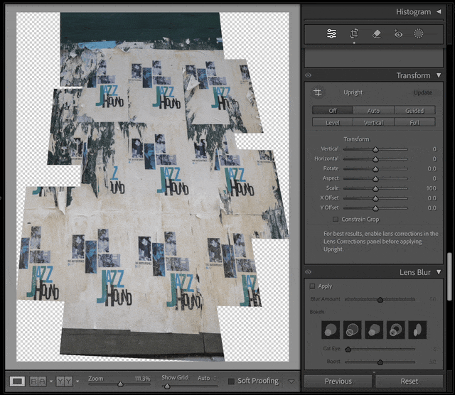
OK, so how do we fix it? This is something I prefer to handle in Lightroom or Camera Raw, right after doing the pano merge. The Perspective Crop tool in Photoshop is fine for what it is, but it’s limited. Instead, the demo below shows the Transform panel in Lightroom Classic where I loaded up and cropped your screen shot.
First I use the Guided Upright tool to draw four guides to tell Lightroom Classic which angles should be squared, just like the Perspective Crop tool. But I use Guided Upright only as the starting point, because after that, I use many different Transform options to tune the perspective and proportions further until it looks a lot more flat and consistent. The Vertical option is what really helps, because Vertical and Horizontal do a sort of 3D rotation of the plane. (Sometimes you can skip Guided Upright and just use Horizontal and Vertical.) I also use the Scale, X Offset, and Y Offset options to re-center the un-distorted composition. After you’re happy with this, you can switch to the Crop tool to re-crop the image if you need to.