Copy link to clipboard
Copied
So I've just gone ahead and installed the new 2019 version of Photoshop on my computer and while the new updates are nice and all the home screen that I had used to go back to previous projects is starting to disturb me.
This is how its looking for me right now. There's no bug or error its just I hate how the "Get a feel for Photoshop" and "Find out what's new in photoshop" is just there and my recents are lodged to be way to far below the screen bezel meaning that I can't look at (1) the file name and (2) projects further than the recent four that I had been working on. Not saying that the feature is useless, but I find very little need for these features at current state.
It's also the same with Illustrator but with "Create a new Logo" or something like that.
Please help me get rid of that cause honestly it bothers me.
It's not broken. It's just a mater of how you have it set. I prefer to have it set to Home, but if it was set to Learn, and changed back to Home, it would still have your recent files.
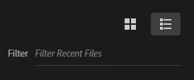
I'm guessing that you know you can set Home to thumbs or list
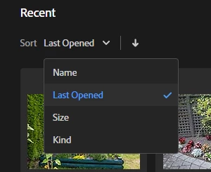
...and have several sort options
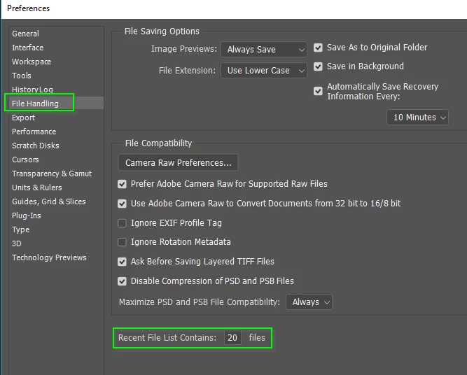
You can adjust how many files the recent files list contains in Preferences
I don't know any way of editing the recent files list, or even where that list is located, but it easy to repopulate it, as you have found.
Copy link to clipboard
Copied
Disable the home screen in Preferences, and use File > Open Recent instead. You can also set number of recent items in prefs.
Copy link to clipboard
Copied
That would be the other way to do it but with such a small screen and the amount of projects that I would have to potnetially take on I don't want to disable home screen; it's simply just too useful for me.
It would be great to know though it there was a way to just get rid of them
Copy link to clipboard
Copied
Dag, I really like the Home screen. It is useful having the tumbnails for reopening files.
Copy link to clipboard
Copied
Yeah this is exactly how I want it to look and not with the unwanted tips there every time I want to do something. I can only see 4 thumbnails and can't even see the document title!
Copy link to clipboard
Copied
Trevor.Dennis wrote
Dag, I really like the Home screen. It is useful having the tumbnails for reopening files.
Trevor, are those photos the results of all the gardening that’s been going on at your house? It’s lovely!
Copy link to clipboard
Copied
It seems this can catch any of us out, as I was having a similar issue a couple of days ago, where my start up screen was telling me my Lightroom library was empty. I don't use Lightroom, so I was also 'disturbed'. I worked out that there are start screen tabs, Home, Learn and LR Photos. I was in the latter and you are in Learn so we both need to select Home. I was actually really quite relieved to be rid of the LR screen, as I didn't like it!
Copy link to clipboard
Copied
I don't know if I'm the only one that has this but my home screen is what look like that. And my recents are not shown properly. I just need a way to get rid of that upper part, keep the recents area in the home screen and not though file>open recent.
Copy link to clipboard
Copied
Well I found the dumbest temporal fix for this which was to just open a bunch of files and it would magically fill the page, and of course if I clear the recent files then it just does the thing again.
Would really like to find if there can be a permanent fix to this though.
Copy link to clipboard
Copied
It's not broken. It's just a mater of how you have it set. I prefer to have it set to Home, but if it was set to Learn, and changed back to Home, it would still have your recent files.
I'm guessing that you know you can set Home to thumbs or list
...and have several sort options
You can adjust how many files the recent files list contains in Preferences
I don't know any way of editing the recent files list, or even where that list is located, but it easy to repopulate it, as you have found.
Copy link to clipboard
Copied
jjh81562842 wrote
There's no bug or error its just I hate how the "Get a feel for Photoshop" and "Find out what's new in photoshop" is just there
It's also the same with Illustrator but with "Create a new Logo" or something like that.
The welcome message changes, apparently. There’s a thread in the InDesign forum where not only are people showing what their screen says, they are making up potential new ones.
In this thread I see : “Welcome back to Photoshop” and “Put your project in focus today”.