• Global community
    • Language:
      • Deutsch
      • English
      • Español
      • Français
      • Português
  • 日本語コミュニティ
    Dedicated community for Japanese speakers
  • 한국 커뮤니티
    Dedicated community for Korean speakers
Exit
1

Photoshop Kerning Issue

Community Beginner ,
May 19, 2023 May 19, 2023

Copy link to clipboard

Copied

Hello,

I am working on a project in Photoshop and I ran into an issue involving the kerning. I am using the fonts, Cooper Std and Avenir and I noticed when typing out the letters (f & i) in lowercase they are close together in comparison to other letters. I then proceeded to utilize the kerning tab to create spacing in between the letters (f & i) but it seems to be not working. I was wondering does anyone know how to reset/fix this issue? I attached a screen shot below for reference. Any help would be appreciated, thank you.

TOPICS
macOS

Views

837

Translate

Translate

Report

Report
Community guidelines
Be kind and respectful, give credit to the original source of content, and search for duplicates before posting. Learn more
community guidelines

correct answers 2 Correct answers

Community Expert , May 19, 2023 May 19, 2023


I noticed when typing out the letters (f & i) in lowercase they are close together in comparison to other letters.

By @dukeo31845930


Instead of kerning, it is probably ligatures.


Here is the fi with ligaturures on:

janee_0-1684547184481.png


Here is the fi with ligatures off:

Character panel menu > Open Type > Standard Ligatures

janee_1-1684547492120.png


Consider keeping ligatures on, as they are proper in typography.


Ligatures with Nigel French:

 https://www.linkedin.com/learning/type-tips/getting-the-most-from-discretionary-liigatures

...

Votes

Translate

Translate
Community Expert , May 19, 2023 May 19, 2023

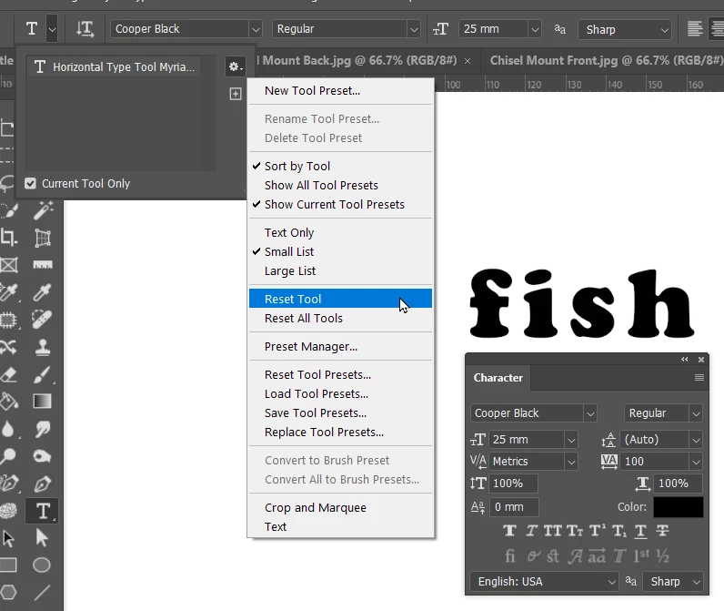
Try resetting the Type tool.

image.png

Votes

Translate

Translate
Adobe
Community Expert ,
May 19, 2023 May 19, 2023

Copy link to clipboard

Copied


I noticed when typing out the letters (f & i) in lowercase they are close together in comparison to other letters.

By @dukeo31845930


Instead of kerning, it is probably ligatures.


Here is the fi with ligaturures on:

janee_0-1684547184481.png


Here is the fi with ligatures off:

Character panel menu > Open Type > Standard Ligatures

janee_1-1684547492120.png


Consider keeping ligatures on, as they are proper in typography.


Ligatures with Nigel French:

 https://www.linkedin.com/learning/type-tips/getting-the-most-from-discretionary-liigatures


Jane


Votes

Translate

Translate

Report

Report
Community guidelines
Be kind and respectful, give credit to the original source of content, and search for duplicates before posting. Learn more
community guidelines
Community Beginner ,
May 20, 2023 May 20, 2023

Copy link to clipboard

Copied

LATEST

Thank you for your response, this greatly helped. Much appreciated.

Votes

Translate

Translate

Report

Report
Community guidelines
Be kind and respectful, give credit to the original source of content, and search for duplicates before posting. Learn more
community guidelines
Community Expert ,
May 19, 2023 May 19, 2023

Copy link to clipboard

Copied

Try resetting the Type tool.

image.png

Votes

Translate

Translate

Report

Report
Community guidelines
Be kind and respectful, give credit to the original source of content, and search for duplicates before posting. Learn more
community guidelines
Community Beginner ,
May 20, 2023 May 20, 2023

Copy link to clipboard

Copied

Thank you for your response. Much appreciated.

Votes

Translate

Translate

Report

Report
Community guidelines
Be kind and respectful, give credit to the original source of content, and search for duplicates before posting. Learn more
community guidelines