Answered
Photoshop PDF exports color differently
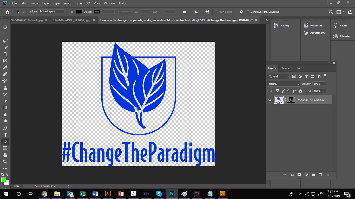
I am not a Photoshop pro by any means so this will be probably easy to answer.
I turned my logo into a vector, then exported it as a PDF for my printer to run the job. The colors in my exported PDF are much more dull than the Photoshop artwork.
I tried exporting in both RGB and CMYK and this didn't change it. I also clicked "view" and checked "proof colors" to see what the export would look like, and of course its dull. How do I get my export to stay true to color?
See images below:
ARTWORK
EXPORT