Answered
Photoshopping a silver gradient image
Hi,
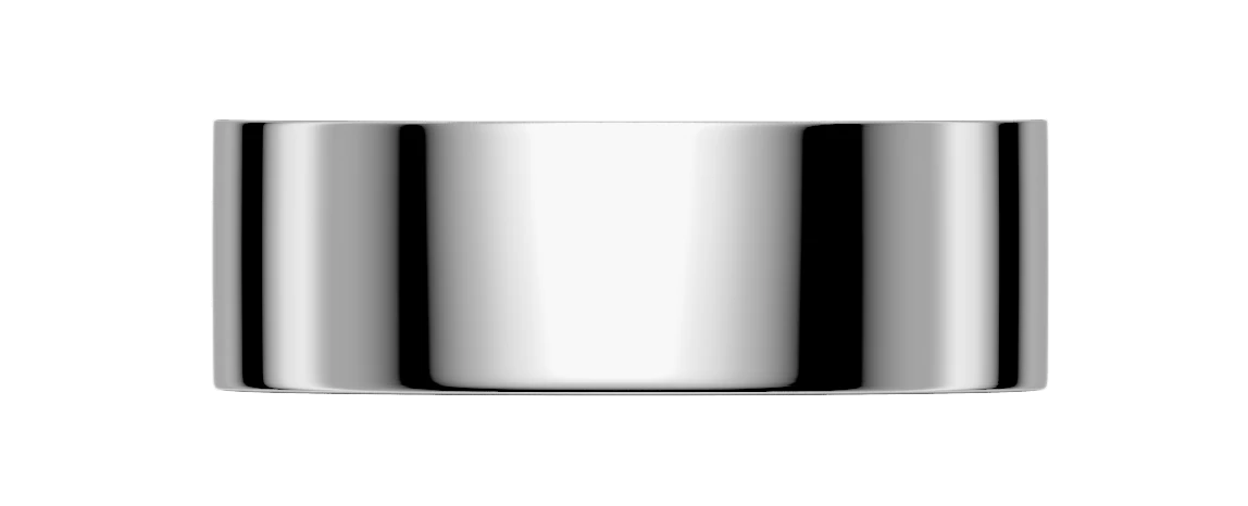
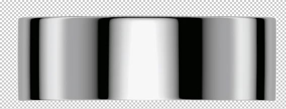
I'd like to use the chrome image (1st attachment) to create the look of a shiny silver cosmetic cap for a paper mockup I'm creating.
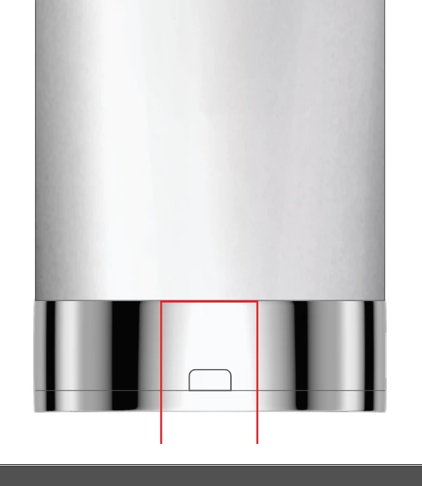
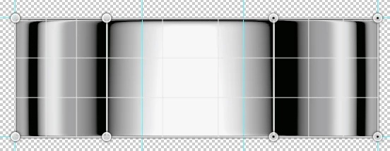
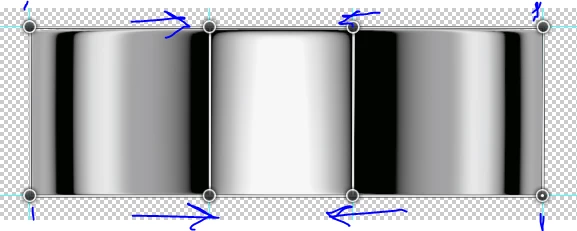
However, as you'll see in the second attachment, the black bars on this silver gradient are too far to the right and left. I need them to be closer to the center, where the red lines are. I've copying them and moving them in and manipulating them to be a little thinner, but it doesn't look right and natural. Can anyone offer any guidance as to how to create black lines farther into the center and still have it look natural? Thanks!