 Adobe Community
- Home
- Photoshop ecosystem
- Discussions
- Prints are too dark printing from photoshop on ult...
- Prints are too dark printing from photoshop on ult...

Copy link to clipboard
Copied
I look forward to any help solving my dilemma. I am trying to print photos on epsons ultra premium glossy photo paper using photoshop. Here are the steps I've taken so far. Every time with these steps the image comes out less vibrant, dull really and slightly darker.
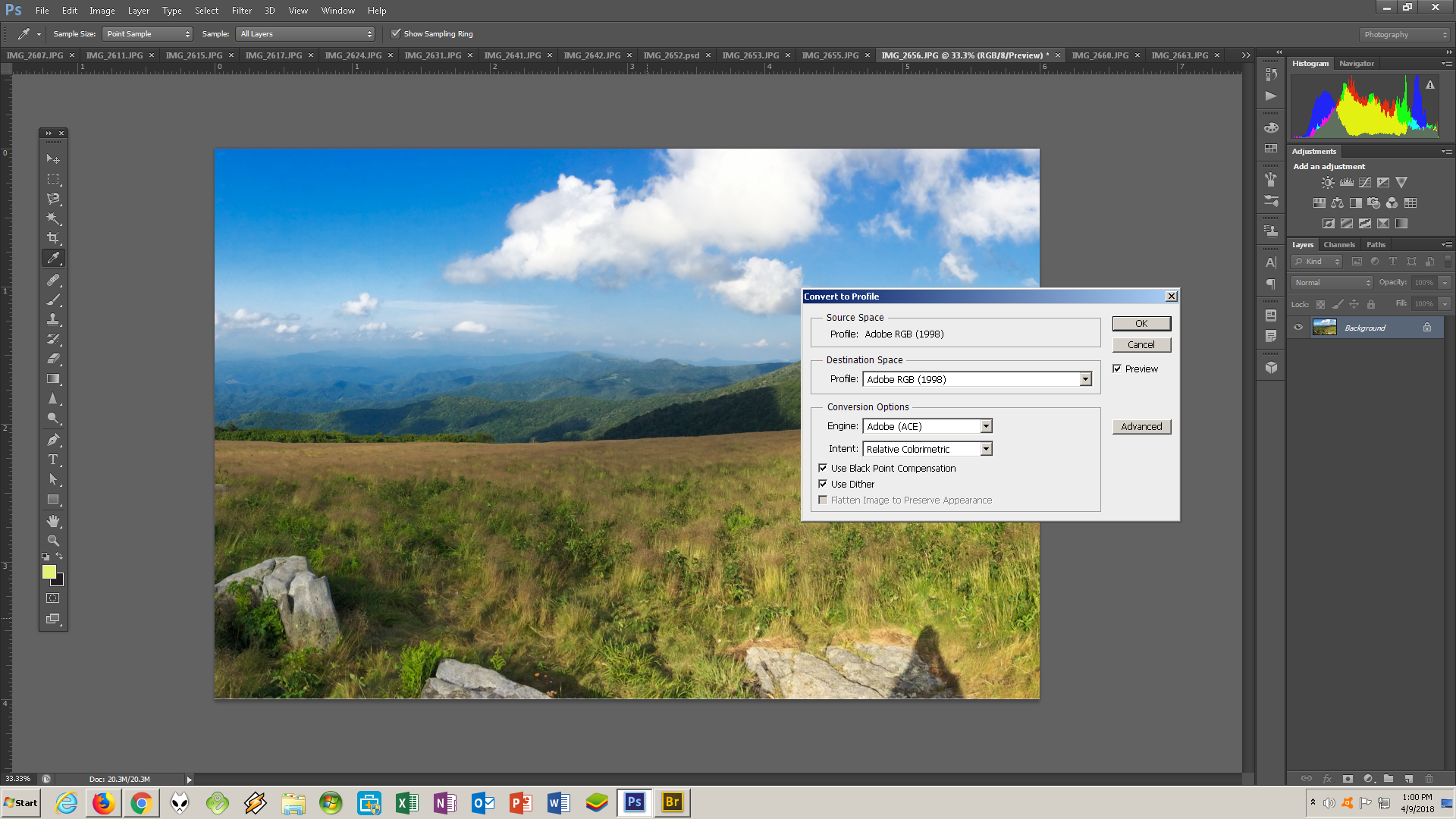
color settings:

converted to profile, (I read in places to be sure to do this step. Before it said srgb in the print settings. Now that I converted it says adobe rgb 1998 in the print settings).
Photoshop Print Settings:

Print settings:

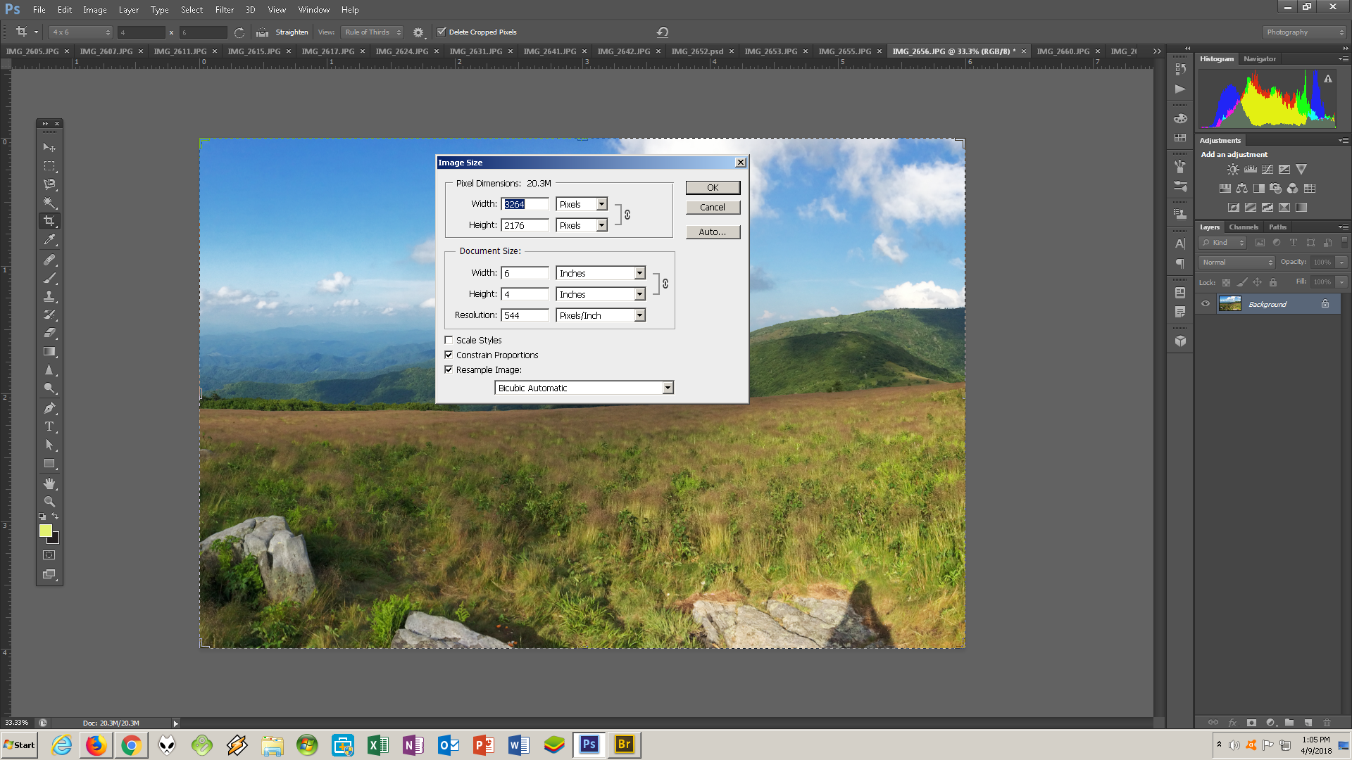
Also the image is resized before I did any of this:


 1 Correct answer

How is your monitor calibrated?
Make sure you are viewing the print in appropriate/optimal light - then adjust your monitor white point so that it visually matches paper white.
This is an absolute reference - you cannot change the color and brightness of paper, but you can adjust the monitor accordingly. This is all affected by your whole working environment, ambient light, print viewing light, application interface and so on. So it's a strictly visual process. Just get monitor white to match pa
...Explore related tutorials & articles
 10
Replies
10
10
Replies
10
Copy link to clipboard
Copied
How is your monitor calibrated?
Make sure you are viewing the print in appropriate/optimal light - then adjust your monitor white point so that it visually matches paper white.
This is an absolute reference - you cannot change the color and brightness of paper, but you can adjust the monitor accordingly. This is all affected by your whole working environment, ambient light, print viewing light, application interface and so on. So it's a strictly visual process. Just get monitor white to match paper white, nevermind the numbers.
Next look at monitor black point. The black point is underrated. It has a profound impact on your whole perception of contrast and "punch". Monitor manufacturers boast of contrast ranges exceeding 1000:1, even 2000:1. As if that was a good thing. It really isn't, because a print on high-grade glossy paper will at best reach a contrast range of 300:1 - but normally less.
That means you will be disappointed when you see the final print. Get the monitor to show a realistic black point, then you can work from that.
Copy link to clipboard
Copied
Sorry to sound dumb but how do I change white point and black point. I used huey pro by xrite for the calibration. I'm not sure how to do what you're describing.
As a side note I printed on epson watercolor paper and it came out beautifully. It looks like the monitor. But the photo prints look different as I described above. I don't know if this new info would change anything.
Copy link to clipboard
Copied
If there's no setting for this in the calibration software, just do it with the monitor's OSD controls. There's no particular value you need to get at - whatever looks right is right. Just try to "see" paper white on screen. Once it looks right, run the calibration again. The profile made by the calibrator needs to describe the current, actual response of the monitor.
Simply put: if the print is too dark, your monitor is too bright. Assuming it works as it should, of course, and the profiles are good. I'm not saying there's nothing wrong with your print output. I'm not familiar with that printer (although all your settings look good from what I can see).
Copy link to clipboard
Copied
I want to thank you. I changed the brightness of the screen to match a white piece of paper as close as possible to the human eye. I then recalibrated like you said. The photos are printing much more accurate now. I only notice a tiny bit of color difference such as blues and greens not quite the same color but darn close. I'm happy with the outcome! I also will turn off that embedded profile thing.
Thanks so much!!
Copy link to clipboard
Copied
You'll get there.
Saturated deep blues are easily out of print gamut and can be problematic. I don't know what inks this printer has, but a standard combination of cyan and magenta inks can't reproduce the deep blues you get on screen. Not much you can do about that, except compensate as best you can.
You can also try Relative Colorimetric vs. Perceptual rendering intents and see which looks better.The former hard clips out of gamut colors, the latter does some remapping near the clipping point.
Also it can be useful to soft proof to the print profile. This is mostly useful if you have a wide gamut monitor that covers almost all of the print color space. With a standard gamut monitor it will be clipped to sRGB - but you should be able to see the blue clipping mentioned above.
Copy link to clipboard
Copied
I use cone color inks instead of oems. Which honestly they print identical to epsons in my oppinion and you can't beat the price! I also don't have a wide gamut monitor. It is nice to know that those colors are problematic. Overall I'm happy with the results and I am very picky!

Copy link to clipboard
Copied
Another aspect to consider: Looks like you are starting with a cymk image. Which is way less color gamut than a adobe RGB. Can you go back to original file? Once a image has been converted to a CMYK image, the color data has been thrown away. Even if you convert back to RGB the color information was already thrown away. Also printing in perceptual is usually always better for photos.
Copy link to clipboard
Copied
The original file is a jpg image
Copy link to clipboard
Copied
It is a jpg file however I forgot to mention when I open it in Photoshop it tells me this: the embedded document color profile does not match the current working run space. Embedded srgb working Adobe run 1998. it give me 3 choices: use embedded profile instead. Convert to working space. Discard don't color manage. I've been choosing convert document to working rgb.
Is this correct?
Copy link to clipboard
Copied
mel18 wrote
when I open it in Photoshop it tells me this: the embedded document color profile does not match the current working run space.
You can just ignore that. The embedded document profile is supposed to override the working space - they don't need to match. It's not a problem and the message completely unnecessary. I just have it permanently disabled (which thankfully you can).
If the file is sRGB you gain nothing by converting to Adobe RGB. Just print it as it is.

 AdChoices