- Home
- Photoshop ecosystem
- Discussions
- PS 2020 Problems with Bevel & Emboss
- PS 2020 Problems with Bevel & Emboss
Copy link to clipboard
Copied
Dear Community,
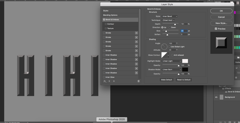
I unsucessfully try to create an effect o text "sinking" into the page, but forms still appear to "come out". Any idea why? Take a look at the screenshot below, please:
 1 Correct answer
What are the complete Layer Sytles you applied?
Is a Color Overlay involved?
Explore related tutorials & articles
Copy link to clipboard
Copied
Have you tried 135˚ or a little less?
In general it is »customary« to assume a lightsource to the upper left, so yours may be a bit low.
Copy link to clipboard
Copied
Unfortunately, it did not work...
Copy link to clipboard
Copied
You know that you changed the Direction to »Up« from »Down« in the previous screenshot?
Copy link to clipboard
Copied
I did, but it doesn't matter which option I choose — "Up" or "Down" — because the form is always convex. And I desperately want it concave!
Copy link to clipboard
Copied
»but it doesn't matter which option I choose«
What are you talking about?
Of course it makes a difference.
Copy link to clipboard
Copied
But your text is not "carved"...
Copy link to clipboard
Copied
Then by all means explain what you actually mean by »carved« and »convex«.
Copy link to clipboard
Copied
Image below might be desscribed as "carved"...
Copy link to clipboard
Copied
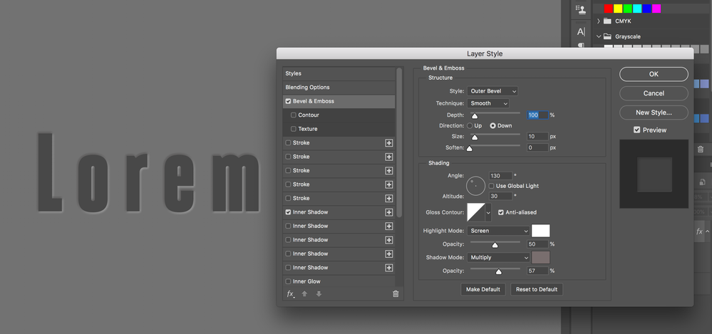
In that case you may want to try Outer Bevel and an Inner Shadow.
Copy link to clipboard
Copied
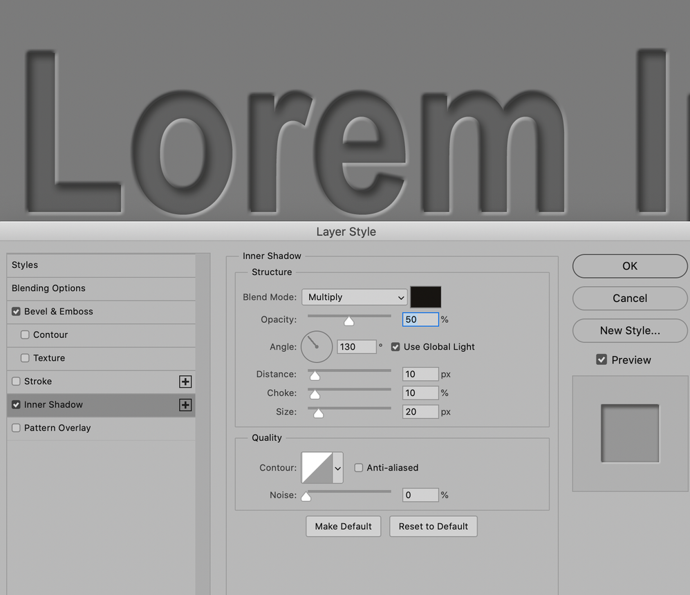
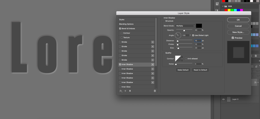
Thank you. Now it's finally getting better. However, Inner Shadow effect (meaning: the very shadow inside the letter) is invisible. Would you show me your settings?
Copy link to clipboard
Copied
Copy link to clipboard
Copied
Unfortunately, it still doesn't work, even though I changed the settings.
Copy link to clipboard
Copied
What are the complete Layer Sytles you applied?
Is a Color Overlay involved?
Copy link to clipboard
Copied
This image's emboss changes from up to down.
Depending on factors like how much contrast you have...
.....Often, no matter which option you choose, if you stare at the text for a few seconds, the emboss will change from up to down, or from down to up. Even if you focus on a single letter, within 10 seconds, the emboss will change up to down or down to up.
I look at the bright side: the viewer gets to see both up and down within seconds...
.....It is true that sometimes you need one or the other, otherwise your whole collage is thrown off.
@amirdread
Check out my art; you've never seen this art before!
https://www.BugArt.NYC
Copy link to clipboard
Copied
You are absolutely correct. Depending on factors like how much contrast you have...
.....Often, no matter which option you choose, if you stare at the text for a few seconds, the emboss will change from up to down, or from down to up. Even if you focus on a single letter, within 10 seconds, the emboss will change up to down or down to up.
I look at the bright side: the viewer gets to see both up and down within seconds...
.....It is true that sometimes you need one or the other, otherwise your whole collage is thrown off.
@amirdread
Check out my art; you've never seen this art before!
https://www.BugArt.NYC
Copy link to clipboard
Copied
In addition to c_p's good advice, you might read this similar thread from 2018:
https://community.adobe.com/t5/photoshop/text-engraved-in-wood-effect/td-p/10224557
~ Jane
Find more inspiration, events, and resources on the new Adobe Community
Explore Now


