• Global community
    • Language:
      • Deutsch
      • English
      • Español
      • Français
      • Português
  • 日本語コミュニティ
    Dedicated community for Japanese speakers
  • 한국 커뮤니티
    Dedicated community for Korean speakers
Exit
0

Question about Color Blending Mode

Explorer ,
Sep 12, 2021 Sep 12, 2021

Copy link to clipboard

Copied

I have a question about the color blend mode, I saw a post asking a similar question but there were some differences and I didn't understand the answer given. So I have a grayscale image that I want to add color to. I create a new layer above the base grayscale layer and begin coloring, and the result is generally more washed out looking than what I'd like, kind of how it looks when you see an WW2 photo that's been colorized.


Now when I use the eyedropper on the resulting color, I find that the Saturation and Brightness values are different than the color I had initially selected to paint with, and the Brightness is much higher than the value of the underlying grayscale (The closer the underlying values are to black, the smaller this difference is).


I'm just curious as to why this is, since in the manual it says: Color - Creates a result color with the luminance of the base color and the hue and saturation of the blend color. This preserves the gray levels in the image and is useful for coloring monochrome images and for tinting color images.


Gray levels seem to be changed and saturation is different than that of the blend color I'm painting with. Anyway I hope someone can give me some insight, thanks.

TOPICS
Windows

Views

942

Translate

Translate

Report

Report
Community guidelines
Be kind and respectful, give credit to the original source of content, and search for duplicates before posting. Learn more
community guidelines

correct answers 2 Correct answers

Community Expert , Sep 13, 2021 Sep 13, 2021

@jjaccoma  

Hi, Brightness as displayed in HSB is not the same as Lightness or Luminosity as used in HSL.

See the difference here between HSB model and the HSV/HSL model. 

https://www.google.co.uk/url?sa=t&source=web&rct=j&url=https://en.m.wikipedia.org/wiki/HSL_and_HSV&ved=2ahUKEwi-5fPdtPvyAhXYEcAKHdEYCc0QmhN6BAgFEAI&usg=AOvVaw3cFAe3Ob61URm9pNhblI5B

Dave

Votes

Translate

Translate
Community Expert , Sep 13, 2021 Sep 13, 2021

Indeed. HSB/HSL is relative to whatever color space is used. HSB/HSL will only be consistent within a document, or documents in the same color space. Remember, all the standard color spaces have different tone response curves, and different gamuts.


The Color blend mode is the inverse of Luminosity - and luminosity in Photoshop is a somewhat elusive concept. It is actually based on a formula for R:G:B. I can't recall the exact numbers, but green is weighted the most, then red, then blue in dimi

...

Votes

Translate

Translate
Adobe
Community Expert ,
Sep 12, 2021 Sep 12, 2021

Copy link to clipboard

Copied

Since you are painting on a separate layer, can you confirm you have set the layer blend mode to color and not the brush.

If so can you show a screenshot including the layers panel, options bar and document with zoom set to 100%

Dave

Votes

Translate

Translate

Report

Report
Community guidelines
Be kind and respectful, give credit to the original source of content, and search for duplicates before posting. Learn more
community guidelines
Explorer ,
Sep 12, 2021 Sep 12, 2021

Copy link to clipboard

Copied


Hey thanks for the reply, sorry for the late response I didn't get a notification. Here you go, as you can see brush is set to normal, layer is set to color.

jjaccoma_3-1631491512408.png


Votes

Translate

Translate

Report

Report
Community guidelines
Be kind and respectful, give credit to the original source of content, and search for duplicates before posting. Learn more
community guidelines
Community Expert ,
Sep 12, 2021 Sep 12, 2021

Copy link to clipboard

Copied

The Color blend mode depends on the underlying tonal value.  It will have no effect over full black, and full white.

I made this to demonstrate, and have actually surprised myself because I'd thought 50% grey would show the best sturation.  In actual fact, the #3 block is the nearest, and that is 79/256 = 30% grey (or would you call that 70% grey?)

image.png 


Votes

Translate

Translate

Report

Report
Community guidelines
Be kind and respectful, give credit to the original source of content, and search for duplicates before posting. Learn more
community guidelines
Explorer ,
Sep 12, 2021 Sep 12, 2021

Copy link to clipboard

Copied

Thanks for making this diagram that's very helpful to see it laid out like that. So why is it that when you use the eyedropper on #4 block let's say, the red portion's brightness value is way higher than the grey portion? 


I always thought of the brightness value as being the true value of whatever you eyedropped but now I see looking at the grayscale sliders (K) in the color window, that this is a separate thing.


Still when using the grayscale sliders you get some fairly large jumps when comparing the swatches in blocks 2, 3 and 4.


Let me know if this doesn't make any sense I can try and ask the question differently.

Votes

Translate

Translate

Report

Report
Community guidelines
Be kind and respectful, give credit to the original source of content, and search for duplicates before posting. Learn more
community guidelines
Community Expert ,
Sep 13, 2021 Sep 13, 2021

Copy link to clipboard

Copied

@jjaccoma  

Hi, Brightness as displayed in HSB is not the same as Lightness or Luminosity as used in HSL.

See the difference here between HSB model and the HSV/HSL model. 

https://www.google.co.uk/url?sa=t&source=web&rct=j&url=https://en.m.wikipedia.org/wiki/HSL_and_HSV&v...

Dave

Votes

Translate

Translate

Report

Report
Community guidelines
Be kind and respectful, give credit to the original source of content, and search for duplicates before posting. Learn more
community guidelines
Community Expert ,
Sep 13, 2021 Sep 13, 2021

Copy link to clipboard

Copied

Indeed. HSB/HSL is relative to whatever color space is used. HSB/HSL will only be consistent within a document, or documents in the same color space. Remember, all the standard color spaces have different tone response curves, and different gamuts.


The Color blend mode is the inverse of Luminosity - and luminosity in Photoshop is a somewhat elusive concept. It is actually based on a formula for R:G:B. I can't recall the exact numbers, but green is weighted the most, then red, then blue in diminishing proportion.


I suppose the reason it's done this way is for visual consistency, but I don't know. I would think using Lab L would be more firmly grounded in a reference, but they're not doing that for some reason. Instead they're using the R:G:B formula.


Anyway, don't expect consistent numbers.


The K number is something else again. That's translated into your working gray. Again, all the grayscale profiles have different tone response curves. I'd recommend changing working gray to Gray Gamma 2.2 which will be more consistent with Adobe RGB, sGray ditto for sRGB, or Gray Gamma 1.8 for ProPhoto.


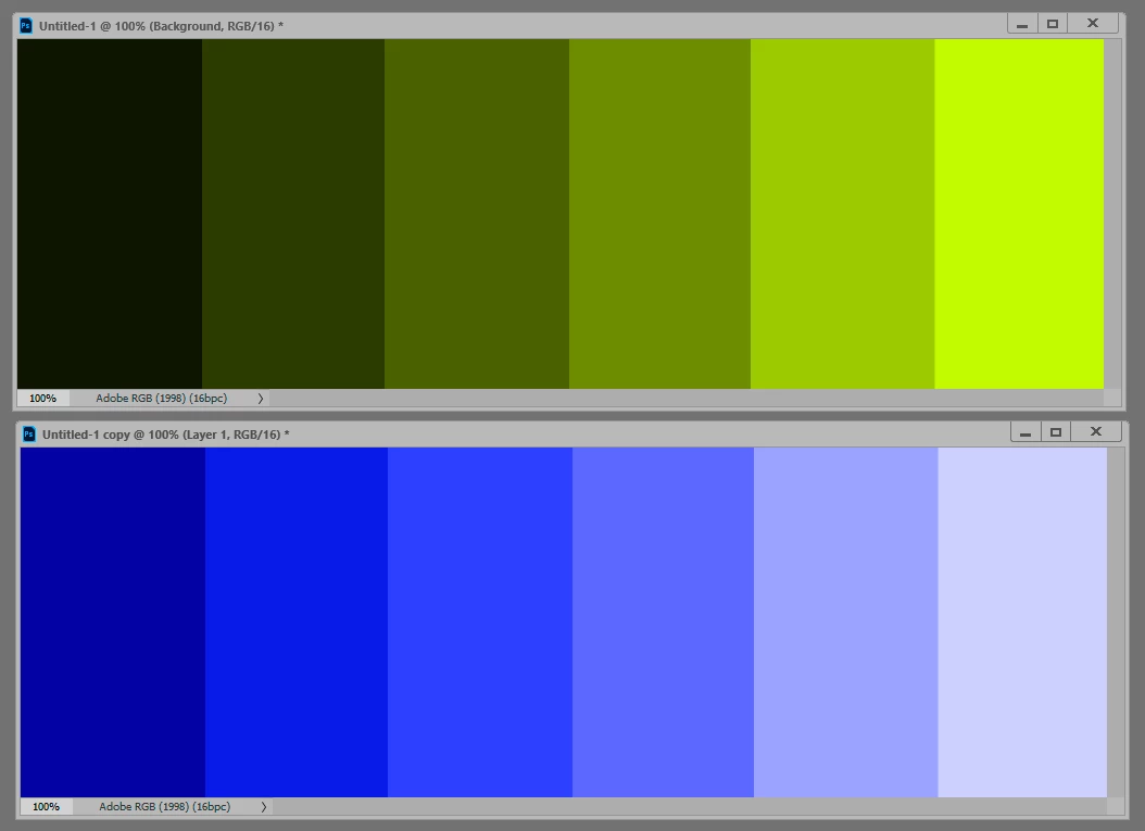
Maximum saturation will not be for 50% in any case. It will be wherever that color has its natural inherent brightness:

saturation.png

Votes

Translate

Translate

Report

Report
Community guidelines
Be kind and respectful, give credit to the original source of content, and search for duplicates before posting. Learn more
community guidelines
Explorer ,
Sep 13, 2021 Sep 13, 2021

Copy link to clipboard

Copied

Thanks for both of your replies, they're very informative, I never knew anything about this. It's interesting to see how the brightest green is the most saturated while for blue it's the darker value. 


I'll see if changing the grayscale profile makes a noticeable difference, but I guess it's just something to get used to, that using the color blend mode may not give me the result I would expect. I can just paint over it, try a different blending mode, or adjust my underlying values to get closer to what I want.

Votes

Translate

Translate

Report

Report
Community guidelines
Be kind and respectful, give credit to the original source of content, and search for duplicates before posting. Learn more
community guidelines
LEGEND ,
Sep 13, 2021 Sep 13, 2021

Copy link to clipboard

Copied

Pet Peeve concerning the misuse of the term Luminance/Luminosity (which has been in Photoshop and other applications for years but doesn’t make it a correct term). Luminosity is a measure of the total radiant energy from a body. It has nothing to do with what a human observer perceives but rather describes the total radiant energy, such as watts/second of a source (the surface of a radiating object like a display). In Photoshop, the layer mode called luminosity is not what's happening here (I was told its something like the "Luma" which is an old TV RGB transform)
Lightness is a perceptually scaled component of color, the axis seen in Lab (Lstar) from light to dark. It IS the L in HSL. 
Author “Color Management for Photographers" & "Photoshop CC Color Management/pluralsight"

Votes

Translate

Translate

Report

Report
Community guidelines
Be kind and respectful, give credit to the original source of content, and search for duplicates before posting. Learn more
community guidelines
Community Expert ,
Sep 13, 2021 Sep 13, 2021

Copy link to clipboard

Copied

I still can't understand why the Luminosity blend mode is not Lab L. It would seem the obvious choice, right? For many years I just automatically assumed it was, until I specifically checked and saw the (slight but significant) difference.


As for HSB and HSL, I've never trusted those as anything solid. But if HSL really uses Lab L, that's something at least.

Votes

Translate

Translate

Report

Report
Community guidelines
Be kind and respectful, give credit to the original source of content, and search for duplicates before posting. Learn more
community guidelines
Community Expert ,
Sep 14, 2021 Sep 14, 2021

Copy link to clipboard

Copied

Dag, going off at a tiny tangent, I thought this recent Captain Disillusion video was kind of fun.

Votes

Translate

Translate

Report

Report
Community guidelines
Be kind and respectful, give credit to the original source of content, and search for duplicates before posting. Learn more
community guidelines
Community Expert ,
Sep 14, 2021 Sep 14, 2021

Copy link to clipboard

Copied

LATEST

Yeah, not bad actually. Probably not targeted at my age segment, but what the heck... 😉


I like this quote at the end:

"just don't overdo it...and you'll be fine"


Votes

Translate

Translate

Report

Report
Community guidelines
Be kind and respectful, give credit to the original source of content, and search for duplicates before posting. Learn more
community guidelines