- Home
- Photoshop ecosystem
- Discussions
- Remove the white of the scanned paper
- Remove the white of the scanned paper
Remove the white of the scanned paper
Copy link to clipboard
Copied
Explore related tutorials & articles
Copy link to clipboard
Copied
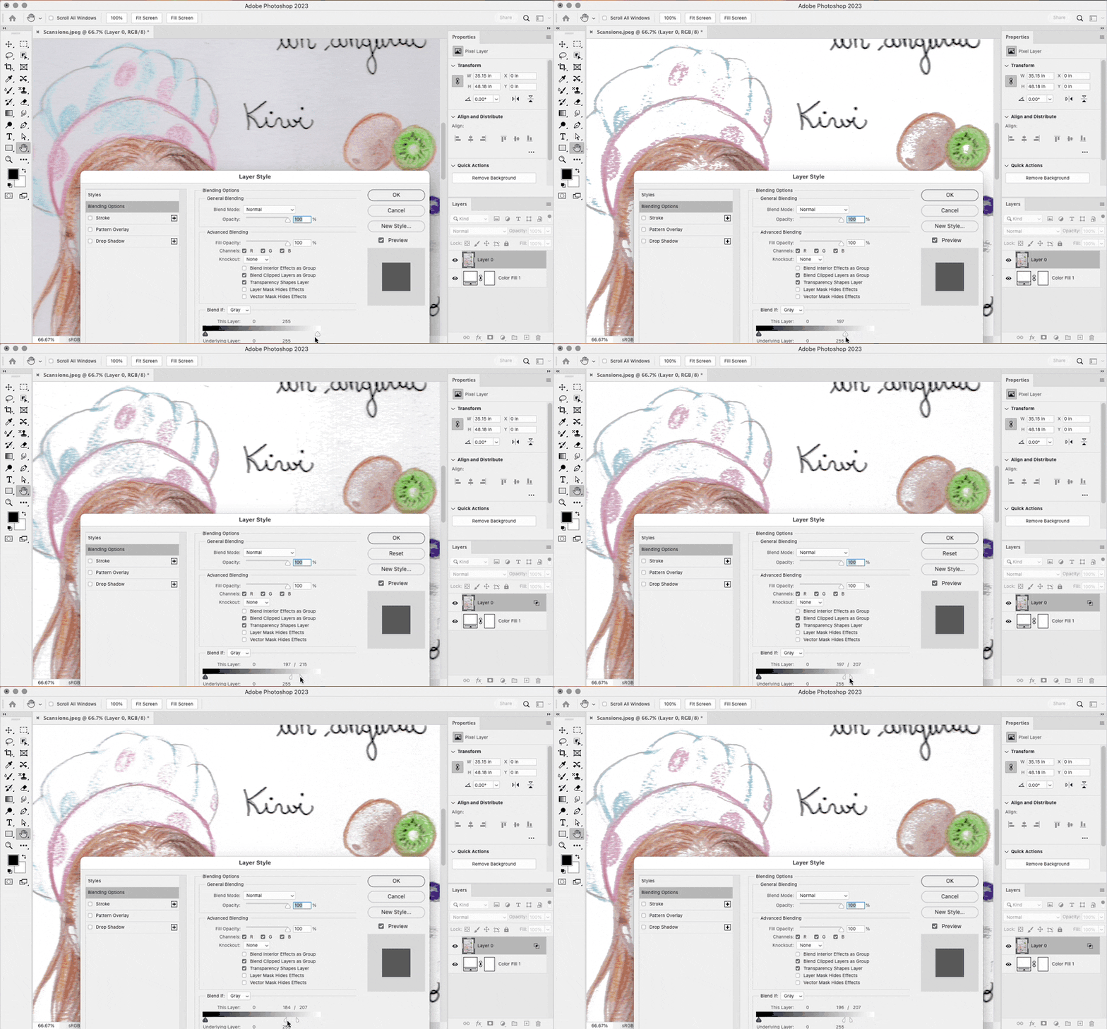
Have a look at "Blend if" – here's an excellent online tutorial:
https://www.youtube.com/watch?app=desktop&v=bte8bBY57U8
Copy link to clipboard
Copied
There's probably no need for any masking or selection here.
- fix the uneven lighting.
- set the white point.
That's most likely all it takes (and the final result will look better and more credible).
Copy link to clipboard
Copied
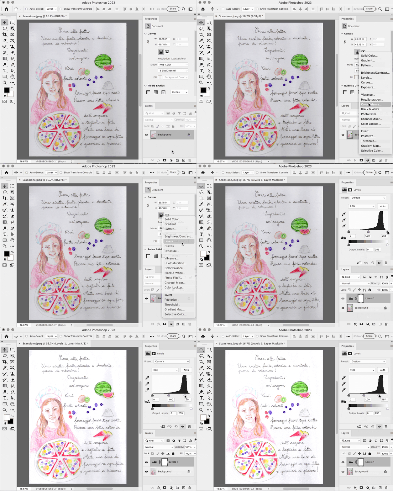
A quick way is to apply Levels and reduce the white point, as shown.
Derek’s BlendIf suggestion will be better if you need to feather the adjustment. It will be easier to preview BlendIf if you either add a white layer behind the scan, or disable the checkerboard transparency background.
But you see that both have a problem in that the light gray paper tones, especially in the wrinkles, are shared by some of the lighter tones in the drawing, so white point adjustments using Levels and BlendIf both end up removing some tones in the drawing. To solve this, re-scan trying a higher exposure, and also, put a book or other weight on the scanner lid to remove the wrinkles from the paper during the scan.
Copy link to clipboard
Copied
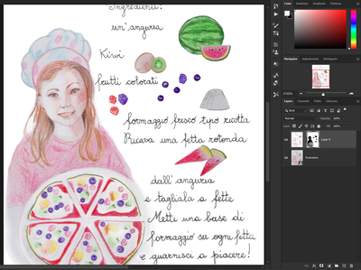
This is great fun, @Pier27218397vq74! To add to the other excellent suggestions, as a quick text for myself, I started with the “blend if” using a white fill layer behind your original scan. Then, I saved that result to a new file and flattened the layers, adding the original scan below. I used a layer mask to bring back in the detail and colors on the fruits and used a soft brush around the chef and pizza, which could certainly be blended more to look better with some time.
Find more inspiration, events, and resources on the new Adobe Community
Explore Now


