- Home
- Photoshop ecosystem
- Discussions
- Re: Replicating 1960s magazine print look
- Re: Replicating 1960s magazine print look
Replicating 1960s magazine print look
Copy link to clipboard
Copied
I'm a little lost on how to go about replicating this effect in Photoshop. I'm working on a project that needs an authentic midcentury look, and I'm trying to reverse engineer the magazine print photo look of the early/mid 60's. I know it's a lot to ask, but if someone's successfully done something like this before and could post a quick step-by-step of a few helpful tricks, I'd be super grateful. Or if there's a tutorial or template I've missed in my searching, I'll be happy to check it out. Google just hasn't turned up anything at all that quite tackles this particular look, and I haven't yet found any convincing templates.
I'm looking to reproduce those really grainy gradients and shadows, the slightly posterized and saturated look of the printed colors, etc.
Explore related tutorials & articles
Copy link to clipboard
Copied
I would start with these vintage Color Lookup Tables to apply the tone of the image:
https://exchange.adobe.com/apps/cc/100359/100-vintage-retro-luts
Then apply some grain using a filter to add noise.
Ignore the masking below - its just to show before/after results.
Copy link to clipboard
Copied
@Joel Dizzle forgot to mention you should definitely check out https://creativemarket.com - they have a ton of retro/vintage mid-mod textures, LUT and other downloadable add-ons that can definitely help.
Copy link to clipboard
Copied
What is the final output?
Device/monitor?
Print? What output method?
Copy link to clipboard
Copied
Ah, I didn't mention that. This project is going to print, but I don't have a lot of information about that stage of it yet. I gather it's going to be a fairly high quality print with faithful reproduction of the graphics we submit.
Copy link to clipboard
Copied
I wonder if working in CMYK would help.
Copy link to clipboard
Copied
First reduce the dynamic range to the typical 5-stop dynamic range of a color transparency.
Then blur it a bit to reflect the poorer overall resolution of older photographic equipment and film.
Add a color cast to the shadows, and exaggerate cyans and reds. (orange skin tones, anyone?)
Copy link to clipboard
Copied
The grain in the 50s and 60s was due to rather low res printing dots.
So I would recommend to add noise. You can do it with a noise filter or even in Camera Raw. You can also blur a little.
Ilf you have a high res image you can also test Halftone screen filter but the minimal dot size is 4 pixels.
Fast and unperfect example combining several rechniques
from this
To this
Hope it helps
Copy link to clipboard
Copied
Grain/noise is OK, however I strongly disagree with adding any type of halftime screen to the file when the final output is a halftime print. This is why I originally asked what the output method was.
Copy link to clipboard
Copied
@Stephen Marsh I agree that a halftone screen added to the image would perhaps clash with the printer's screening.
I hope this helps
neil barstow, colourmanagement net - adobe forum volunteer - co-author: 'getting colour right'
google me "neil barstow colourmanagement" for lots of free articles on colour management
Copy link to clipboard
Copied
Many years ago, I recall, there was an elaborate hoax where someone simulated a magazine review of a non-existent music keyboard, which many took as real. One thing they did was to put faint, blurred, reversed left to right text in the image, to look like printing on the other side bleeding through.
Copy link to clipboard
Copied
I just recently looked through some "prestige" coffe-table books from the 80s and early 90s, and all I could focus on was the appalling quality of the photos. I had simply forgotten. Back then we simply assumed that was how it should be.
Everything was off. Color reproduction, contrast, detail and sharpness. You'd never get away with it today. Equipment and procedures are so much better today.
I was being kind in my example above. In reality it would probably have looked worse.
Copy link to clipboard
Copied
Really late in replying to this! Thank you for your initial response to this thread; it got me started in the right direction and drew my attention to some aspects of these prints that I hadn't noticed. I have to say I absolutely adore the appalling quality of the photos in old magazines and books lol (right now I'm remembering ads in old early-90s video game magazines and those delightfully dated home remodeling / woodworking books that tried so hard to take really neat and clean photos of a guy with an almost-mullet).
Copy link to clipboard
Copied
Could you please provide one of the images you want to edit thusly?
Copy link to clipboard
Copied
Cross-posting to my own thread from another one, since I know someone else will have the same question and come across this thread eventually. This approach worked fantastically for a project.
I found a few risograph templates that gave a somewhat convincing effect - this one in particular came in handy, with some modifications. I disabled any halftone effects and used a film grain effect. The trick is to deepen the shadows and overall contrast and then bring up the value of the shadows; then add film grain over a very subtle gaussian blur, and push the oranges / reds, especially in skin tones.
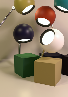
I quickly mocked up this scene in Blender from the Lytegem ad above that I found in a compendium of 60's ads:
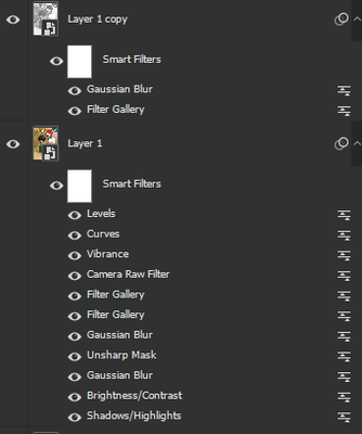
and then processed it with these filters:
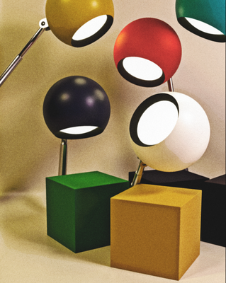
to get this:
The "filter gallery" filters (going upward) on the lower layer are Dry Brush and Cutout, respectively. The camera raw filter is where a lot of the color grading and noise happens. The top layer is an overlay layer at around 35% opacity, with a film grain and about 1px blur applied.
I understand that in some circles it's downright heresy to call this effect attractive, let alone pursue it, but if you find yourself in a situation where you actually need to recreate the effect, some of these risograph templates come pretty close.
Copy link to clipboard
Copied
I have been looking to replicate this 60's era look for so long, and you have nailed it right on the head. Would love to see a video of the process!
Find more inspiration, events, and resources on the new Adobe Community
Explore Now


