RGB vs sRGB
Copy link to clipboard
Copied
After doing some research online I'm not entirely sure which is best for shooting/printing fine art photography with the intention to print large scale images. Anyone who has a clear point of view on this I appreciate your perspective.
julie
Explore related tutorials & articles
Copy link to clipboard
Copied
What I meant to say - they are not comparable. If you really mean Adobe RGB, please say so. "RGB" is a generic term that does not belong here.
(I'm not editing my posts from now because you apparently read this by mail, not the web interface. So edits get confusing).
Copy link to clipboard
Copied
Well I would not recommend Adobe 1998 as the color space of choice for the absolute best quality images for Large fine art prints.he correct answer is...it depends on the printing process. sRGB for sure is too small a color space to provide much in the way of saturated colors. Most print processes have a larger gamut. sRGB is the web standard, so save that for your website. Adobe RGB is a good middle of the road color space created by Chris Cox and that's what he made it for. Good for print publications and some smaller gamut printers.
I have a new Epson that when using fine art paper can hit most of the gamut of ProPhoto color space, so that is the color space I use for fine Art prints. If you own the printer, can color manage it and print exclusively through it then you should pick a color profile that is slightly larger than the gamut of the printer and do a perceptual transform when printing.
If your print process is unknown. Ask the provider of your prints to provide a printer profile. You can then easily compare color space profiles with that printer profile using ColorSync on the Mac (if you have one)
If yor monitor gamut is too small to view that color space, and there's money in your budget to get a brighter / better display, do that and you can view the color space your printing in. The new Apple display is excellent for this purpose, but there may be others that can perform well at that brightness level.
Copy link to clipboard
Copied
From everything I've ever read and seen, the very best inkjet printers, using the very finest papers, can print some colors that are slightly outside Adobe RGB.
Whether that's significant in practice, is an open question. It might be for scientific and forensic purposes, but for general photography I don't think it is. We are talking about very small differences in already very saturated colors.
Good color is not about absolute saturation. More is not necessarily better. Good color is about relationships, internal consistency, and, yes, realism.
Copy link to clipboard
Copied
As I said there are printers that can come very close to ProPhoto RGB. (I own one) Certain paper manufacturers provide profiles that can show just how close they can get also. Might be time to look further into that gamut thing.
We are talking "fine Art" here no mention of "oversaturating" color. The purpose of having a large gamut to print within is that it provides the "oportunity" for brighter colors. An image printed on a large gamut printer doesn't necessairly use all of it.
That would depend on the image. Comparison Printing to a large gamut print and a large container RGB space vs a smaller gamut printer and a smaller gamut container RGB space can be dramatic only of the image colors require a large gamut to reproduce.
Copy link to clipboard
Copied
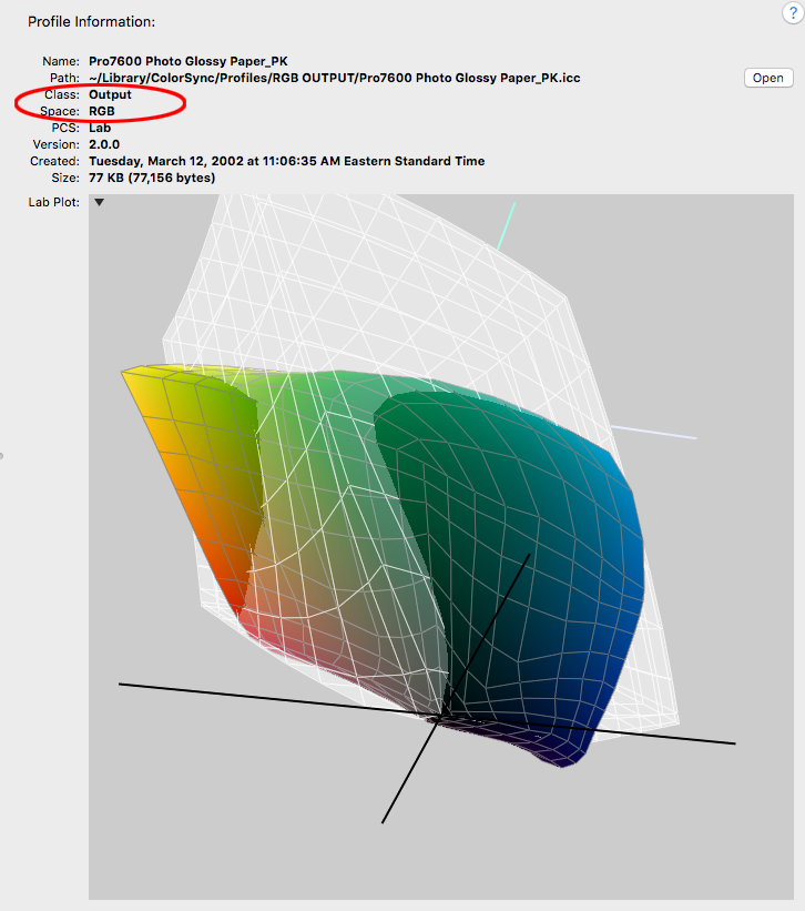
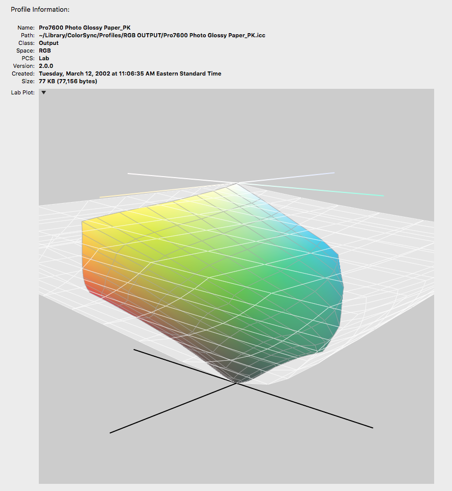
Comparing 3D plots of an RGB output class profile with the AdobeRGB display class profile make it seem like there are still significant areas out-of-gamut to AdobeRGB.
Here is a plot comparison of a glossy paper RGB output profile for my large format Epson (CcMmYKk) with AdobeRGB (the white plot):

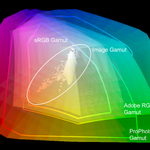
Compared to ProPhoto RGB:

Copy link to clipboard
Copied
Bob_Hallam wrote
get a brighter / better display, do that and you can view the color space your printing in.
You don't want a brighter display. You want it to reproduce paper white. For most normal viewing conditions, that's around 90 - 120 cd/m² display brightness. Color space doesn't enter into that.
A wide gamut display can, for all practical purposes, display anything you can get in print.
Copy link to clipboard
Copied
Seems very argumentative D Fosse.
Regardless...I'll explain further. The nits brightness in a display is the "only" thing that expands the gamut of the display given the same black point. Change the brightness and the gamut size increases.
Copy link to clipboard
Copied
It's not argumentative - it's common sense. It stands on its own merits.
If your monitor white point matches paper white, and your monitor black point matches max ink - given a specific print viewing light - then it necessarily follows that what you see is what you get. The rest is handled by color management. But you need to define the endpoints, white and black.
If your monitor is too bright, your prints will be too dark.
You could argue that you can compensate by increasing the print viewing light. But that's not really a solution if you need to go up to unrealistic levels. See it as others will see it.
There's no reason to overcomplicate it. This is a very simple principle that has the huge advantage that it works.
Copy link to clipboard
Copied
Well it's incorrect sorry. Increase brightness on a display and you have a larger gamut, do the test.
I see you have shown that ProPhoto is the correct container space for large gamut printers as I stated above. It's easier to test and show, than it its to argue here. If you disagree, just prove your point with data. No need to do this here.
Copy link to clipboard
Copied
If a fractionally larger monitor gamut overrides all other considerations in matching screen to print, then I won't argue. Personally I put that pretty far down on the list of priorities.
Anyway, reading this thread from the beginning, it's a confusing mixture of a lot of unrelated issues all jumbled up into one. I'm not even sure the OP got anything sensible out of it. I suggest we let this one go, and if anyone has further questions start a new thread.
Copy link to clipboard
Copied
Anyway, reading this thread from the beginning, it's a confusing mixture of a lot of unrelated issues all jumbled up into one.
Looking at the OPS's 2nd post, the question seemed to be about RGB profile gamuts and how they relate to printing, so the gamut discussion does seem relevant.
Most of us edit in a chosen display RGB editing space, rather than a limited monitor profile. So I agree with you on the monitor gamut, a hardware calibrator, should create a profile that defines the monitor's gamut no matter what the brightness—if I change the brightness of my display, I have to recalibrate and generate a new monitor profile.
What makes gamuts conceptually difficult is the popular idea that they are like nesting russian dolls—"CMYK always sits inside of RGB"—but in reality they intersect, sometimes in unexpected ways. Working in a small space like sRGB puts additional gamut limits on CMYK press profiles. When that happens in a noticeable way, it's usually the CMYK space that gets blamed for the missing gamut because it is assumed to be smaller than (rather than intersecting with) sRGB.
Copy link to clipboard
Copied
Working in a small space like sRGB puts additional gamut limits on CMYK press profiles. When that happens in a noticeable way, it's usually the CMYK space that gets blamed for the missing gamut because it is assumed to be smaller (rather than intersecting) with sRGB.
Correct, and we all seem to agree on that. So if there's a conclusion to the OP's question, it's that you basically have a choice between Adobe RGB and ProPhoto. They both have their upsides and downsides, so that's an open choice. But they will both work in a print context, whereas sRGB will be a significant limiting factor.
We also agree that to have a full visual preview of what the final print will look like, you need a wide gamut monitor.
Copy link to clipboard
Copied
The one thing left to mention is the actual gamut of the image itself, an image may only contain content that fits inside say sRGB, despite the fact that in theory Adobe RGB or wider gamut profiles may be required to contain the theoretical maximum colour from capture or to hold colour for a specific colour region of the printer gamut. Isn't colour fun!
Copy link to clipboard
Copied
An excellent and easily overlooked point! I hinted at it above, but didn't spell it out ![]()
Copy link to clipboard
Copied
an image may only contain content that fits inside say sRGB,
To me that's the argument for always using a space like ProPhoto.
If you take the ProPhoto image that happens to use color that is also inside of the sRGB gamut, and compare the output numbers of going directly from ProPhoto to a CMYK press profile vs. converting to sRGB first and then to the press profile, the output CMYK numbers will be the same. There's no downside in using ProPhoto for an image with little or no saturation.
Same goes for inkjet where the destination would normally be an output class RGB profile like the Pro7600 Photo Glossy_PK I'm showing in #55.
Copy link to clipboard
Copied
It comes down to what and where you print the images. There are two workflows: 1.) closed loop ( you print internally on your printer ), and 2.) open loop ( you send the images out to be printed on someone else's printer ). In both cases, you could use an experimental file copied and tagged with each of the RGB profiles and print them. Then, there is the paper which will also affect the print, so you will want to print on whatever paper you think works best for your particular photos. If you are going open-loop, your print vendor will have a recommendation on which RGB to use, my guess it is not sRGB.

