 Adobe Community
- Home
- Photoshop ecosystem
- Discussions
- Something for the weekend - Part 32 - The Inn!
- Something for the weekend - Part 32 - The Inn!
Something for the weekend - Part 32 - The Inn!

Copy link to clipboard
Copied
Hi
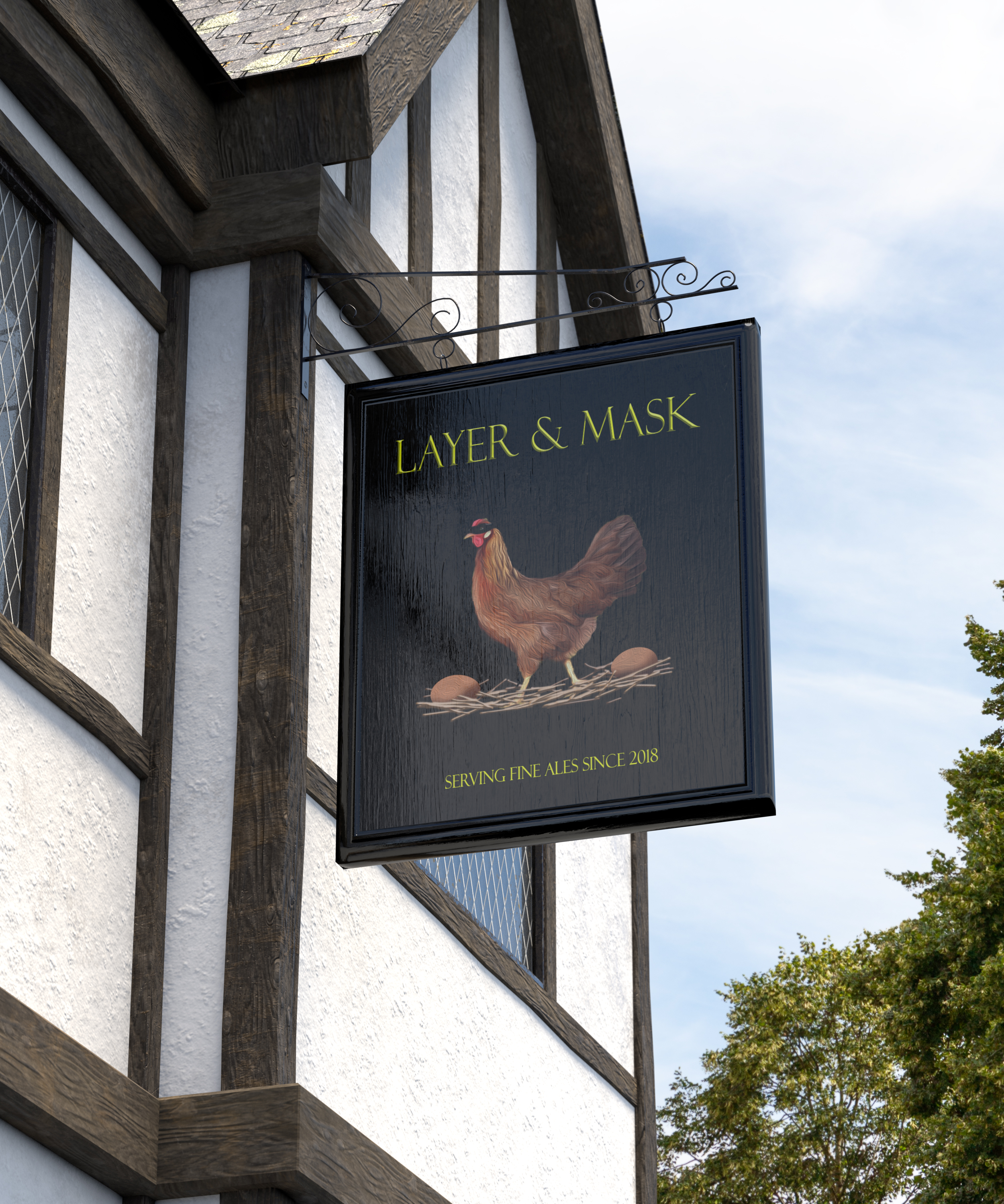
Last week's alley challenge brought some great entries so, for this week, I thought we deserved to relax. In these forums we have the lounge but what we really need is a full blown Photoshop pub.
Of course, every pub needs a name and all traditional pubs need a sign. Pub signs in Britain have been around since the 14th century when King Richard decreed that landlords should erect signs outside their premises or forfeit their ale! These days, the signs tend to bear the name of the pub/inn and can be simple graphics or very detailed paintings. A quick google search will show many examples.
So for this week's challenge, can you name the Photoshop pub and give it a suitable sign. I've kicked us off with the "Layer & Mask" but I'm sure you can do better.
As always, anything goes as long as it meets the forum rules on decency, copyright etc.
Anyone is welcome to have a go - whether you are a complete beginner or a Photoshop expert.
There are no prizes - just the chance to practice, show off, or bring a bit of humour and fun.
When posting back your edited images please use jpeg and downsize to 1200px on the long side.
To download the image below in jpeg format with ICC color profile (sRGB) and without the forum scaling artefacts , right click and then use Save Image As /Save Target As (or similar depending on your browser).
Have fun
Dave


Explore related tutorials & articles
 75
Replies
75
75
Replies
75
Copy link to clipboard
Copied
Hi
Rista I love the "Mouse and Feather". It's in keeping with the Photyoshop theme and is that the feather that used to be on the old CS box?
Semaphoric - you have me scratching my head trying to think of a town!
Ussnorway - we'll have to see what Trevor makes of that one 
Keep them coming.
Dave
Copy link to clipboard
Copied
Dave thank you!
The feather was the CS2 Icon before those became drab, boring and indistinguishable.

Copy link to clipboard
Copied
The history of . . .
![]()
Copy link to clipboard
Copied
I happened to have looked up that page a few weeks ago. That's why I thought of using the pretty feather yesterday
Copy link to clipboard
Copied
I couldn't resist doing one more.
Copy link to clipboard
Copied
That's clever !
Dave
Copy link to clipboard
Copied
Took forever, but here it is (I have LOTS to learn about animation!):
Copy link to clipboard
Copied
Hi
Semaphoric that is an excellent idea and very well executed.
Chana - that pub needs a name. How about "The Four Amigos".
Pierre - you've set an additional challenge there. I'll have a go later.
Dave

Copy link to clipboard
Copied
You are right! Will do!
Copy link to clipboard
Copied
Hi Dave
Pierre - you've set an additional challenge there. I'll have a go later.
I was imagining an old aged Pub sign in Britain or anywhere. One could do a Google search for "beer barrel" and see what I mean.
I was imagining an old aged "beer barrel" with full wood grain (cut in half) maybe nailed to another plank of wood, with an Adobe carved logo, with maybe a sub-tilte/name like : Brain Barrel, Adobe Barrel, Adobe Juice, Adobe Pub, Beer in mind, Manchester Adobe Club, etc...
Pierre
Copy link to clipboard
Copied
Hi
I didn't have time for anthing too intricate, the normal day beckons, but a 3D sign it is.
Full disclosure - I did not do this in Photoshop - I went back to the model and made a replacement sign there.
Dave

Copy link to clipboard
Copied
Oh, very clever, Dave!

Copy link to clipboard
Copied
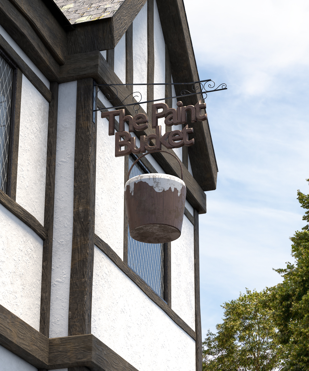
It's no good. I am going to have to call time on this. Marvin is 100% Photoshop and took me ages. The pub sign took 30 minutes half of which was with Illustrator. The environment is hopeless, and that is after taking two days out to learn some more about perspective. On the plus side, I have greatly expanded my knowledge of perspective and learned some cool tips and tricks to make it easier, and that's without using the recent Lazy Nezumi tool.

Wow Dave. Just seen your paint bucket after refreshing this page. That is outstanding, and not at all easy without 3D. I love the over-spilling paint. Great work matey, and a cool idea.
Copy link to clipboard
Copied
Trevor.Dennis wrote
It's no good. I am going to have to call time on this. Marvin is 100% Photoshop and took me ages. The pub sign took 30 minutes half of which was with Illustrator. The environment is hopeless, and that is after taking two days out to learn some more about perspective. On the plus side, I have greatly expanded my knowledge of perspective and learned some cool tips and tricks to make it easier, and that's without using the recent Lazy Nezumi tool.
Trevor, that's great! Can you say something about your process? How did you make Marvin?
Copy link to clipboard
Copied
Wow Trevor - not only a new sign, but a whole new bar. If you get a few minutes let us know how you illustrated Marvin.
Dave
Copy link to clipboard
Copied
davescm wrote
Wow Trevor - not only a new sign, but a whole new bar. If you get a few minutes let us know how you illustrated Marvin.
Dave
Marvin was made a facet at a time, which I believe is how 3D objects are created. I drew the outlines with either Pen or Lasso tools, and filled with different shades of grey on a new layer. Then applied the textures — mostly with Eye Candy 7. The body and head were made square on, and then made into a Smart Object which was FT'd to give perspective. It is obviously a lot easier to build stuff square to canvas, and double clicking the SO takes you back to that state for mods and edits.
The body depth was simply done with a rounded rectangle, FT'd and placed with the upper radius just above the top of the body. The curved upper was done free hand with manual shading. All other depth was simply affected with shading. Paint or fill a new layer with black > Gaussian Blur > clip to the layer behind it. The same trick I used on the bridge for outer highlights. Click to load the selection, and stroke > centre on new layer. Blur, reload the selection > invert and delete the spill.
I had to flatten as I worked because it turned to custard on two separate occasions. A large group refused to Duplicate to another document, and making the same layers into a SO, the SO then would not open in a new document to edit it. I'm guessing there was a bad layer in there, but I didn't have the time to track it down, so I just flattened/merged the problem group. On the plus side, the lag I was experiencing with big projects on my new 7900X system, seems to have gone away, and I have no idea why. I must be to do with an update whether to Windows 10, the GPU or whatever.
As we said back up the thread, spraying on the splatter helped to make him look real, and I wish I'd put a lot more on him. I used my favourite Skin & Hair brushes by Castrochew, but there are some excellent splatter / texture brushes in Kyle's megapack. If you use the Brush tool, then get Kyle's megapack. It has a zillion presets, and several of them are pure gold.
https://www.adobe.com/nz/products/photoshop/brushes.html?promoid=XKMMHH6G&mv=other
So that's about it. It was fiddly, and took a bit of time, and I can see a few problems with it now, but I have a stack of work that I HAVE to get on with.

I mentioned taking time out to brush up on perspective. That was completely rereading Earnest Norling's Perspective made Easy, and a more recently published Perspective Drawing Handbook Both freely available as PDF files. Note, when I say recent, PME was published in 1939, and PDH in 1964 (or thereabouts). The Student Art Guide is very good, and has easy to follow video tutorials (without sound).
https://www.studentartguide.com/articles/one-point-perspective-drawing
I actually learned some cool tips from that, like how to divide up using perspective. Really interesting stuff. This was all driven by my refusing to believe an apparent truism of single point perspective, that being that even if the vanishing point is offset on the horizon, lateral lines will still be parallel to the bottom of the canvas. I was convinced that offsetting the vanishing point, would turn it into two point perspective, but I couldn't work out where the second vanishing point would be. So that was two days to convince me that half a dozen lines were correctly orientated. Crazy, but these threads are all about learning.
One more guide worth a watch, but for different reasons, is this collaboration between illustrators Tyler Eldin, and Matt Laskowski. This is more about giving you some tools rather than how various perspective models work, and I learned some very cool tips from it, some of it completely unrelated. For instance, if you build a complex compound path, and want to save it as a custom path/shape, then setting the path option to Exclude overlapping, lets you merge without the interior paths disappearing. Making custom paths is a neat aid as you can quickly drag out and position as many as you need. That includes grids, and 360° radials that you can place on vanishing points. Being paths, they can live outside the canvas and extend onto it. You can FT to make bigger if needed. This is even better now we can control path colour, plus paths can be made very fine so as not to obscure your drawing.
Guides can also live outside the canvas of course, which lets us set up a two point perspective like this. If you want to mirror the vanishing points, start with a centre guide, and zero the grid to it. You can then place the two vanishing point guides using the rulers.
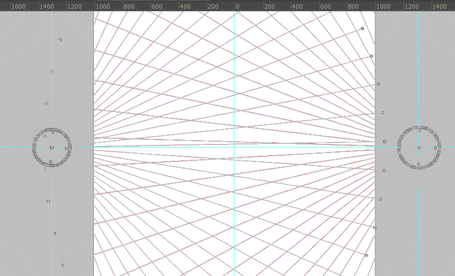
You can see I have used a slight variation of Matt's radial perspective lines. It gets very busy at the centre, which makes precise positioning difficult, so knocking out the centre and placing crosshairs in it, takes care of this. This is another application of Exclude Overlap when merging. The default would erase the crosshairs. You need the circle btw.
One last tip that occurred to me when reading through the comments. Someone asked about removing the sketch lines after doing the final line work. The poster had missed the point of using layers, but if you did find yourself in that position, as well as the brush tool set to overlay trick, you could also set the layer to Hard Light which would knock out the mid tones. I suspect that would clean up the layer in a single stroke, so to speak.
Right, stuff to do.
Copy link to clipboard
Copied
Will try again tomorrow. Sigh.
Copy link to clipboard
Copied
Good reads on perspective, Trevor. You should have posted them in the recent Question on Perspective thread, Off-topic question about perspective. Back when I was in college (or, as you, Dave, and Terri would say "University"  ), I saw an excellent book about perspective in the campus bookstore. I didn't buy it then, and can't find it now - it would help if I had noted the author, title, or publisher
  .
.

Copy link to clipboard
Copied
That brought me right back to high school. I haven't used my brain that way in a very long time.
Copy link to clipboard
Copied
Thanks for posting some info on your illustration Trevor. I saw it briefly last night but had a good read through this morning.
Interesting links on perspective. One of the things that really hits my eye is a composite where the perspective is out. Matching perspective and camera angle for a 3D and 2D composite can be a real pain, particularly when there are lens distortions in the 2D image thrown in for good measure. But it is always worth it for realism. If in Photoshop you can use vanishing point to set up the 3D camera. Other 3D apps have similar functions but I've not used any that don't need a degree of tweaking afterwards to get a match.
As for paint splashing and art....I had better keep out of that one !
It is great to see this week's SFTW discussion still going strong. It's not too late if anyone wants to have a go.
Dave
Copy link to clipboard
Copied
Hi
I like "The Paint Bucket". I wonder about the inside wall's decoration. 🙂
Pierre
Copy link to clipboard
Copied
pierrec86934804 wrote
........ I wonder about the inside wall's decoration. 🙂
We might have to make that the subject of a future SFTW thread
Dave
Copy link to clipboard
Copied
Hi
Of course, "paint bucket throwing" is just an annual event. 😉
Pierre
Copy link to clipboard
Copied
pierrec86934804 wrote
Hi Of course, "paint bucket throwing" is just an annual event. 😉
Pierre
Well we obviously had to look after what is basically a flat out challenge, so now you have to sit through this.
If you get towards the end, and wonder what is the point, check out the strata in the radial spokes he drags out, and the swirls he makes by tilting the canvas with a vast amount of very wet paint on it. It's somewhere between marbling, if that is the correct term, where you float paint on water and comb it, and an artist's version of Damascus Steel. It all suddenly makes sense at this stage, but I'd love to see the finished product against a plain background. So weird, but still valid IMO.

Dag is the nearest we have to an art expert. I wonder what he thinks of it?

Copy link to clipboard
Copied
Trevor.Dennis wrote
Dag is the nearest we have to an art expert. I wonder what he thinks of it?
Nearest? 
It's a Jackson Pollock rip-off, obviously, one of the most ripped-off artists in history next to Victor Vasarely and Piet Mondrian.
Jackson Pollock is also one of the most misunderstood. People keep asking what it means. It doesn't mean anything - it's just dripping paint. But nobody has ever managed to infuse automobile paint (that's what he used) with such meditative, zen-like qualities. No, not zen-like - it is zen, the very essence of it.
Very busy these days so can't contribute here, but I still love watching these threads

 AdChoices