Known Participant
January 17, 2022
Answered

The color of the image varies when viewed from the mobile phone

  • January 17, 2022
  • 3 replies
  • 356 views

Hello,
I'm trying to put the perfume bottle on another background as shown in the image below:


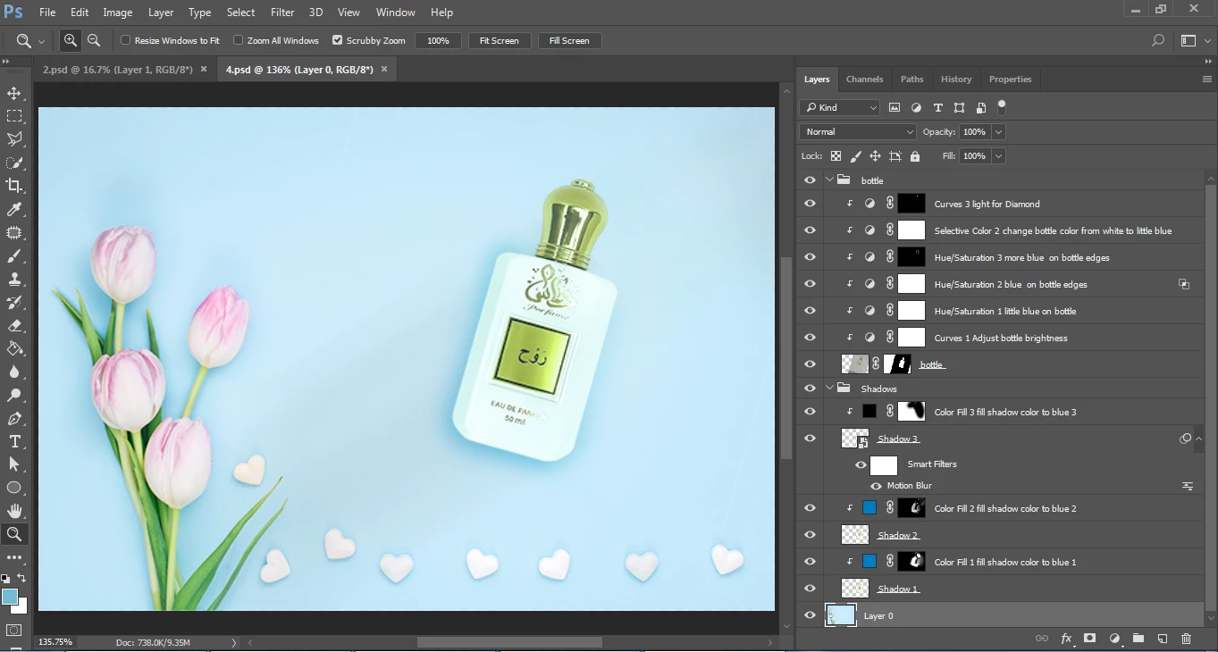
(By the way, sorry for the mess in the image and the layers that may not be necessary to repeat, because I am a beginner and learning design)


But the problem I am facing is that the image on the computer is good and somewhat acceptable,

But when I review it from my mobile The color of the bottle tends to turn green and a little faded,

And then the Composition seems to be inconsistent, And it appears on the edges of the bottle cap The green color is not present in the image when viewed on a computer.


Any Ideas 
Thank you all

This topic has been closed for replies.
Correct answer D Fosse

This is why color management was invented.


With a properly calibrated and profiled desktop monitor, the image will always be correctly represented on screen, assuming the file has an embedded color profile (sRGB, Adobe RGB etc) that unambiguously defines the colors.


Just as the embedded document profile defines the image colors, a calibrator will write a monitor profile that defines the monitor color space. Between these two profiles, the RGB numbers are fully corrected as they are sent to screen, and so the on screen image is very accurate.


Phones at best only have partial color management, but they don't support the full and complete variety. You can't use a calibrator on a phone. There is only basic and generic correction for the screen. You can never expect a phone to be entirely accurate.


But even on a desktop system, a lot of applications don't support color management at all. Set up correctly, you can always trust Photoshop as the reference.

3 replies

NB, colourmanagement
Community Expert
Community Expert
January 19, 2022

Try making the file in the P3 colourspace (or converting and saving with the profile embedded for your web test on iPhone), generally, recent handheld devices from the big manufacturers seem to pretty reliably use the 'display P3' colourspace. 

here's an example :

this testimage is in P3 colourspace

open the link in your iPhone's Safari browser**

this testimage is in Adobe RGB (1998) colourspace 

open it in Photoshop

IF your computers screen is well calibrated, the match should be pretty good. My Eizo Coloredge matches my phone acceptably.

From what I am seeing, mobile devices seem to actually be more consistent in appearance than screens. 


**Be aware of Apple's True Tone setting on the iPhone [in Settings / Display & Brightness] which alters appearance based on environment. In many cases it seems good idea and can make the phone more pleasant to look at - but it can throw off colour accuracy. . 


I hope this helps
neil barstow, colourmanagement net :: adobe forum volunteer
google me "neil barstow colourmanagement" for lots of free articles on colour management
[please only use the blue reply button at the top of the page, this maintains the original thread title and chronological order of posts]

Mylenium
Legend
January 17, 2022

Mr. Fosse pretty much laid out the limitations and caveats. For a web-based workflow it is pretty much still the best option to just use monitor that is reasonably "neutral", i.e. that has been calibrated to a good standard RGB profile or has little deviation with a factory profile and then tune your work to look good on that without getting deep into color management, just using the monitor profile as the proof preview setting. Everything else eludes your control, anyway. You can only hope that an image tweaked to such a setup will look good enough on other devices.


Mylenium

D Fosse
Community Expert
D FosseCommunity ExpertCorrect answer
Community Expert
January 17, 2022

This is why color management was invented.


With a properly calibrated and profiled desktop monitor, the image will always be correctly represented on screen, assuming the file has an embedded color profile (sRGB, Adobe RGB etc) that unambiguously defines the colors.


Just as the embedded document profile defines the image colors, a calibrator will write a monitor profile that defines the monitor color space. Between these two profiles, the RGB numbers are fully corrected as they are sent to screen, and so the on screen image is very accurate.


Phones at best only have partial color management, but they don't support the full and complete variety. You can't use a calibrator on a phone. There is only basic and generic correction for the screen. You can never expect a phone to be entirely accurate.


But even on a desktop system, a lot of applications don't support color management at all. Set up correctly, you can always trust Photoshop as the reference.