Participant
August 5, 2025
Answered

unwanted spacing appears while using text tate-chu-yoko fuction

  • August 5, 2025
  • 1 reply
  • 161 views

I was trying to insert a paragraph of Chinese text vertically in Photoshop, and it contains some Arabic numbers. When I use Standard Vertical Roman Alignment (標準垂直羅馬字對齊方式), two lines of text aligned very well. ("十" is a Chinese character, and line leading was reduced for easier comparsion between two lines.)


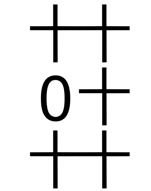
However, since I don't want a two-digit number taking two full-width character's height, I used tate‑chu‑yoko (直排內橫排) for two-digit numbers.

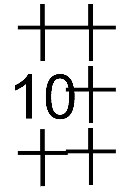
As you can see in the screenshot, the characters after the Arabic number did not align with characters in other lines, meaning extra spacing somehow appeared after the number. 


Not all fonts are having this problem, but still quite a number of fonts I use are having this problem. I googled a bit and someone suggest that this was caused by the verticle height parameter of the font used, but I just wonder why the height of the numbers are correct when I use Standard Vertical Roman Alignment, but not tate‑chu‑yoko?


Manually adjusting the text spacing one by one can make them align with each other, but it is time consuming as I need to use many different fonts (with different level of spacing cause by this problem).


Anyone know how to solve this problem??

(Photoshop v26 Windows)

Correct answer creative explorer

@sam_5349 With Vertical Roman Alignment setting, Photoshop treats every character—whether it's a Chinese character or a number—as if it's a tall, full-width block. This makes everything line up neatly because each character takes up the exact same amount of vertical space. Tate-chu-yoko Alignment setting tells Photoshop to squeeze two or more numbers into the same space as a single Chinese character. Not all fonts are designed to do this correctly. The font file might not tell Photoshop exactly how much space to leave before or after the numbers, causing extra, unwanted space to appear and throwing off the alignment. It's like trying to fit two small items into a box meant for one, but the box doesn't have clear markings, so the items don't sit in the middle, leaving a gap on one side. The best way to fix this is to use a font that is specifically made for East Asian languages. These fonts have the built-in instructions to tell Photoshop exactly how to handle tate-chu-yoko so the spacing stays consistent.


The most effective and time-saving solution is to change the font. Since you've noted that not all fonts have this problem, you should prioritize using fonts that are known to work well with East Asian typographic features like tate-chu-yoko. Look for fonts specifically designed for Chinese, Japanese, and Korean (CJK) typography. These fonts are more likely to have the necessary vertical metrics and kerning information to handle tate-chu-yoko correctly. Adobe's Source Han Sans or Source Han Serif fonts are excellent examples. OpenType fonts often contain more detailed and robust typographic features, including advanced vertical metrics, which are crucial for resolving this kind of alignment issue.

1 reply

creative explorer
Community Expert
creative explorerCommunity ExpertCorrect answer
Community Expert
August 9, 2025

@sam_5349 With Vertical Roman Alignment setting, Photoshop treats every character—whether it's a Chinese character or a number—as if it's a tall, full-width block. This makes everything line up neatly because each character takes up the exact same amount of vertical space. Tate-chu-yoko Alignment setting tells Photoshop to squeeze two or more numbers into the same space as a single Chinese character. Not all fonts are designed to do this correctly. The font file might not tell Photoshop exactly how much space to leave before or after the numbers, causing extra, unwanted space to appear and throwing off the alignment. It's like trying to fit two small items into a box meant for one, but the box doesn't have clear markings, so the items don't sit in the middle, leaving a gap on one side. The best way to fix this is to use a font that is specifically made for East Asian languages. These fonts have the built-in instructions to tell Photoshop exactly how to handle tate-chu-yoko so the spacing stays consistent.


The most effective and time-saving solution is to change the font. Since you've noted that not all fonts have this problem, you should prioritize using fonts that are known to work well with East Asian typographic features like tate-chu-yoko. Look for fonts specifically designed for Chinese, Japanese, and Korean (CJK) typography. These fonts are more likely to have the necessary vertical metrics and kerning information to handle tate-chu-yoko correctly. Adobe's Source Han Sans or Source Han Serif fonts are excellent examples. OpenType fonts often contain more detailed and robust typographic features, including advanced vertical metrics, which are crucial for resolving this kind of alignment issue.

m
sam_5349Author
Participant
August 10, 2025

Thank you for your detailed explaination!