- Home
- Photoshop ecosystem
- Discussions
- Re: Why are colors on computer screen different th...
- Re: Why are colors on computer screen different th...
Why are colors on computer screen different than phone screen?
Copy link to clipboard
Copied
This is not technically a Photoshop issue, but it's related to images, so I hope that someone can help. I created a pdf document that was subsequently turned into a Google doc. When I shared the document, it looked fine on my computer screen, but on the phone screen it had a fluorescent look to it. The original pdf was RGB, so it's not that I saved it as CMYK because I know that would cause this issue. Does anyone know how I can avoid this problem in the future?
Explore related tutorials & articles
Copy link to clipboard
Copied
It's not the color mode (RGB), but the color space that matters. sRGB is a common color space. So if you save a PDF, use the "Smallest File Size" setting. It's optimized for Web and Phone where bandwidth matters, and will save in that most common color space for devices.
Gary Ballard has some excellent tutorials on Color Management.
Gene
Copy link to clipboard
Copied
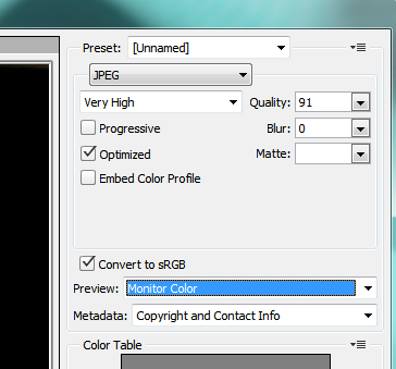
As Gene said your not using color management so your image will look different. The color space best suited to the web is sRGB. What you need to do is set the save for web dialog up something like this
Terri
Copy link to clipboard
Copied
To Save as PDF its much the same, use low or no compression and check the embed profile in the save dialog

Here layers is checked but that's not necessary
Terri
Copy link to clipboard
Copied
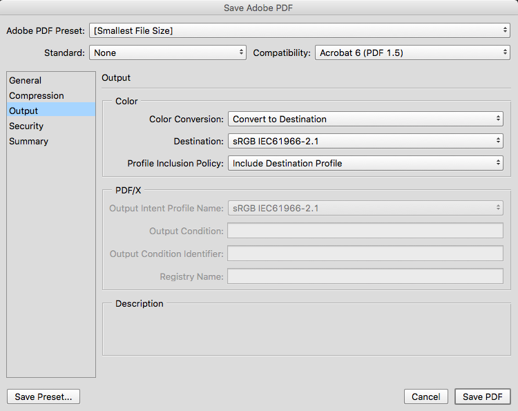
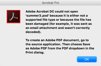
If it's PDF he wants, then the file format should be "Photoshop PDF". Odd enough, Acrobat will not directly convert a PSD to PDF, Terri.
I forgot the screenshot for the Photoshop PDF setting, here it is.
Photoshop PDF's "smallest size" optimizes for web and converts to sRGB.
Copy link to clipboard
Copied
Yes indeed, Acrobat won't, you have to use Photoshop PDF.
Copy link to clipboard
Copied
Yes this is important if your working color space is not already sRGB. I always forget other people aren't always using sRGB as my work is almost exclusively for online sources.
Some basic extra info is here:
Photoshop Help | Color-managing documents for online viewing
Copy link to clipboard
Copied
Thanks! Just so I understand, will the sRGB work for both phone and normal computer screen? I am making a document that will be used for both platforms.
Copy link to clipboard
Copied
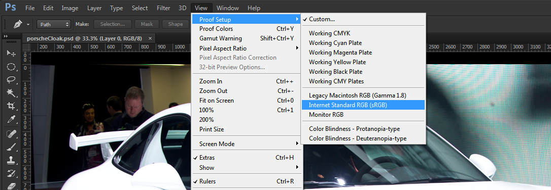
Yes sRGB is the color space phone screens are adjusted for and your computer can use an sRGB profile. If you don't want to use sRGB on your computer Photoshop can simulate for you what sRGB will look like through Proof Setup
Copy link to clipboard
Copied
If you set your color settings(under edit menu) up like this the screen and phone should look pretty similar.
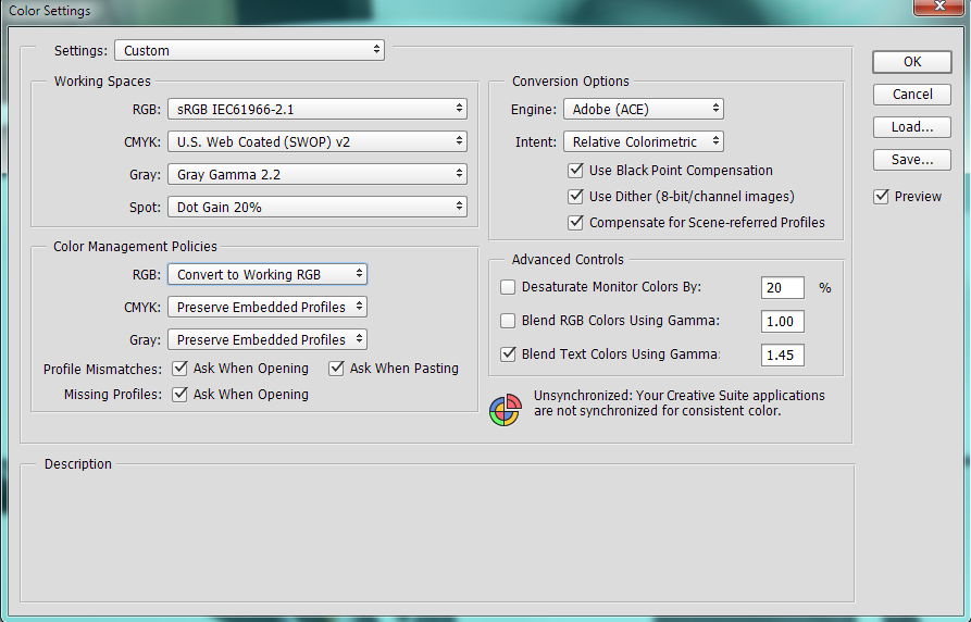
Not everyone thinks convert to working space is a great idea for a generic setting which is why I have those
boxes about asking checked
Terri
Copy link to clipboard
Copied
What a funny conversation.
Unless the mobile device is color calibrated, no matter even if the viewing app supports color management (most do not on mobile), this discussion is a bit up in the air. Mobile devices' screens are all over the place in terms of colours, saturation, brightness, and quality. And as far as I am aware, Google Drive (docs) are not color managed either - and Android kernels are not suited for color calibration either, I believe?
And my first question to the OP would be: is your computer screen color calibrated? If not, then the discussion sort-of stops right there. You would have no baseline to compare with: the device's colours might actually be closer to "true". You cannot know for certain.
Copy link to clipboard
Copied
Herbert,
I think you are going to confuse the OP here.
First you say the mobile device needs to be calibrated and then you say Android devices are not suited to color calibration. So what is the OP supposed to make of that except be bemused. In fact Android kernels can now be calibrated but unless you are ultra fussy there is no need .
Android color management is finally possible, thanks to new Datacolor app
Mobile devices support sRGB out of the box. I'm not saying a three year old device will still support its full calibration and if the default screen settings are altered it most certainly will not. But new devices do and you have to approach this problem as if that is your target device.
The above is an excellent article of this very topic
You say if the OP's screen is not calibrated he is wasting his time and that's simply not true. Not everyone is like you and I and fork out for a 300 dollar X-Rite. The reality is most new computer monitors are setup to cover the sRGB color space and provided they are used at their default settings, even with a factory icc , most do a pretty good job of it. You surely don't think that everyone surfin the web has a calibrated screen? So according to your argument web designers should be wasting their time designing with the sRGB colors in mind. I fully concur that this is not currently the perfect solution but its all we have at this point in the game and if you disagree technically, rather that theoretically with what Gene and I have suggested post your alternative and we can debate it.
Terri
Copy link to clipboard
Copied
I think Herbert makes a valid point. Let's not overthink this.
If people wish to see correct colors, they need to take steps to ensure that they do.Some scenarios and configurations just cannot be trusted, and there's nothing wrong in pointing that out.
I keep hearing the argument that most people have systems that are all over the map anyway, so why bother. My position is that's their problem, and it's not my obligation to accommodate their lack of a proper setup.
But that doesn't mean they shouldn't be helped along the way if they need it. And then they need to be told what the real situation is.
Copy link to clipboard
Copied
I wasn't intending to be critical of Herbert, his argument is sound, but this OP is looking for a practical answer and all we can do is provide information about how to do this right now. It would be lovely if everybody in the world had nicely calibrated screens, but we all know that's not going to happen anytime soon, unless of course hardware calibration becomes available to monitor manufactures for 15-20 dollars, but until that happens we just have to work with these compromise solutions.
Terri
Copy link to clipboard
Copied
No argument there.
Still, I always found it odd that people will happily spend hundreds of $ on HDs, more RAM, faster CPUs - and still complain that a $200 calibrator is so expensive that they can't afford it.
So let's face it, it's not about the price. What it is I don't know, but it's something else.
Copy link to clipboard
Copied
I think the answer to that is not everyone is as fussy about color as you and I ![]()
I reckon with mass production monitors with built in colorimeters would be economic to make, but the manufacturers would have a tough time selling the feature to consumers who don't know about color management. I bought a high end video camera a few years back-went totally mad and spent a fortune. A friend of mine in Japan later told me the feature that added 400 dollars to my camera cost Panasonic all of 20 dollars to make-so it shows it can be done.
Terri
Copy link to clipboard
Copied
Did you do some research on this topic? You also misread what I wrote.
First: yes, I am aware of Xrite True Color and SpyderGallery. Do you have experience with either one? I have a Nexus 7 tablet, and a Spyder 4 Pro. Both products merely calibrate the colours within specific photo viewers. SpyderGallery ONLY displays calibrated images inside its own viewing app - that is it. Same for Xrite: only certain viewing apps are supported, no other software.
Which means Android and iOS themselves (the OS) are unaffected by these apps. They are hardly worth the trouble, since the OS and its screen colours are not corrected at all. That is what I meant.
What is more, SpyderGallery does not even function with the spyder 5 - and is listed under the discontinued section on Datacolor's website.
In short, the tablet OS itself (true for both iOS and Android) does not support colour management.
Second, as your referred article alludes to, the best we can do is to either take care of the conversion on the desktop side and convert to sRGB (since colour profiles are ignored on mobile**), or forego the use any colour management at all, and keep testing on the target device(s).
In both cases we just have to accept colour changes depending on the device, and the screen. Many a discussion has taken place between proponents of either workflow. I am not going to reiterate the points in favour of, or against either approach. It depends on your situation, and the output intention (for example, GUI elements for an app a developer requires, or images for viewing, etc.).
However, one thing is clear: if you fail to colour calibrate your own screen, you have no foundation to build upon. Anyone as a self-respecting (semi-professional) creative owes it to him/herself to hardware colour calibrate their screen(s) they work on. And get the hardware which can actually handle a reasonable colour gamut. I am often amazed by students of mine who insist on designing on cheap uncalibrated laptop screens, and then complain about their colours being all wrong when the work is viewed on other screens!
D Fosse is correct in his estimation: if you want good colour, you start by investing a bit of money, purchase a Spyder, x-Rite, etc., and you adapt to a colour managed workflow in your work. You should be able to trust the colours you see on your screen while you design at the very least.
Anyway... In a nutshell: the OP did not answer the question whether his/her screen is colour calibrated. That would be a good starting point. And no matter what, colours are going to look much more bright and fluorescent on a phone screen, because that is the display intention of phone screens: extremely bright, and saturated - that is how those screens are designed to be, because users must be able to read the screens in full sunlight.
Which is entirely expected behaviour. As you say, Terri, he can convert the colours to sRGB, but that will not make the image any less fluorescent looking (well, perhaps a bit): blame the overly saturated and bright screen. It is just the way it is.
---------
**Although I am uncertain about mobile browsers and the current state of things in this regard.
Copy link to clipboard
Copied
what laptop are you using ? i had the same problem before and solved by this How to calibrate your laptop screen without any physical calibrator(Lenovo Y50) [NEW] - YouTube . It's work. Your welcome
Copy link to clipboard
Copied
I guess you have received good answers already. So this is more of a comment.
Almost every screen may be a little different. As monitors are can be calibrated....
Example I was working in an agency and my monitor was using the truest colors and then I spoke with one of our web designers and he had this bright neon stuff going on with his screen. I asked him why and he said he liked it. I almost shook my head and laughed. How can you be a web designer and work on a screen where it is calibrated to show the colors in this bright neon fashion! Gag... My eyes were bleeding.
The best thing to do in my opinion is to calibrate your monitor the best you can. Granted at times there may be noticeable differences.... but hopefully not as drastic as the neon stuff my co-worker had going on (honestly that really blew my mind as I am not sure how he could design a website and choose colors for it with having that big mess).
If anything I hope that my story made you smile.
Copy link to clipboard
Copied
I too have the same problem but in adobe illustrator. That whenever I export a file in JPEG/PDF format and send to others via any medium(Whatsapp/mail) I get an which is very bright (fluorescent look).Can anyone help me with it...Searching for answer for a long time but couldn't find any. Anyone having the answer?
Copy link to clipboard
Copied
Pdf is not a good standard for images and Jpeg is just crappy... ime you are much better off placing your artwork in Adobe Lightroom cloud then share that as a link or there are other 3rd party options around if you don't want to use Adobe
Copy link to clipboard
Copied
designer...So can you pleaseee say some other option
Copy link to clipboard
Copied
Herbery2001 wrote:
"one thing is clear: if you fail to colour calibrate your own screen, you have no foundation to build upon. Anyone as a self-respecting (semi-professional) creative owes it to him/herself to hardware colour calibrate their screen(s) they work on. And get the hardware which can actually handle a reasonable colour gamut. I am often amazed by students of mine who insist on designing on cheap uncalibrated laptop screens, and then complain about their colours being all wrong when the work is viewed on other screens!
D Fosse is correct in his estimation: if you want good colour, you start by investing a bit of money, purchase a Spyder, x-Rite, etc., and you adapt to a colour managed workflow in your work. You should be able to trust the colours you see on your screen while you design at the very least."
absolutely right about the need for screen calibration (I'm actually finding phone screens seem pretty consistently P3 colourspace now which would account for some increase in saturation when sRGB image are sent). As to devices - I'd go for the Xrite i1 display Pro, seems better than Spyder according to those I trust who have tested. And as a serious user, I'd add basICColor display 6 too (it works with Spyder or i1) , but, then, that’s just me.
I hope this helps
neil barstow, colourmanagement net :: adobe forum volunteer
google me "neil barstow colourmanagement" for lots of free articles on colour management
[please only use the blue reply button at the top of the page, this maintains the original thread title and chronological order of posts]
Find more inspiration, events, and resources on the new Adobe Community
Explore Now


