Copy link to clipboard
Copied
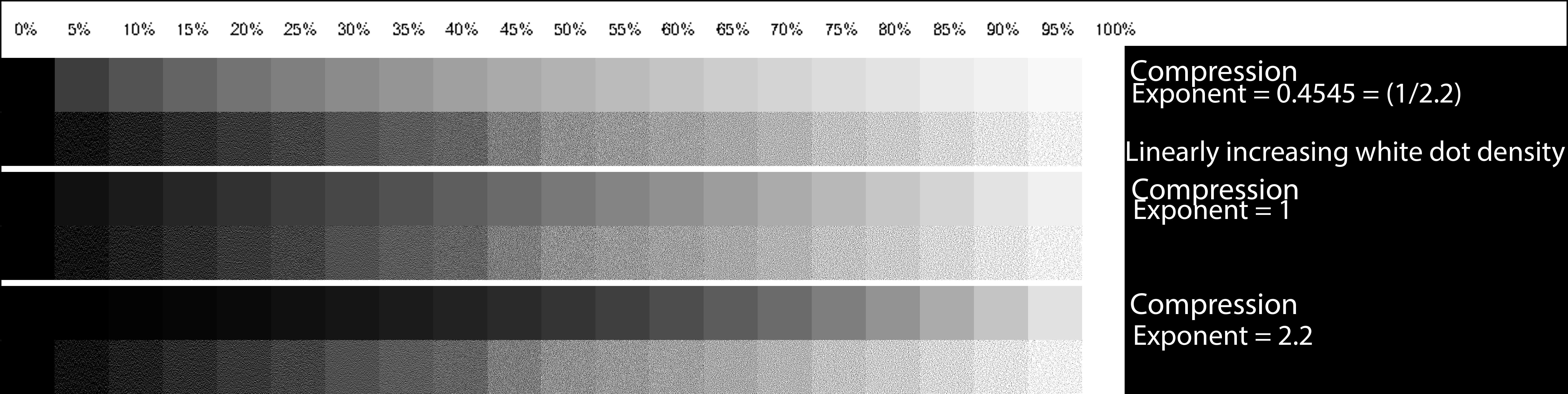
I created a test image with tiles of increasing luminance side by side with tiles with black and white pixels of linearly increasing white pixel density. The gamma compression factor is changed for each group of tiles. When I view this image in Photoshop, I expected to see a luminance match to the black and white pixel tiles on my monitor when gamma compression was 0..4545 (1/2.2) but the nearest visual match is with gamma = 1.0. When I print the image out however, the visually matching set is with gamma = 2.2.
My monitor is calibrated to gamma = 2.2, 6500K white point. I did try recalibrating to gamma = 1.0 and the result was ugly but the visually matching set was still at the same gamma = 1.0.
I printed the test image with Photoshop two ways. One with Photoshop managing colours and one with the printer managing the colours.
This test image is Adobe RGB 1998 but I got similar results with sRGB test images.
I am working on a project that requires two layers of image. A background layer printed on white paper and a translucent layer printed on a digital transparency. The resultant image after light goes through the two layers is the product of the linear light amplitude of each layer for each pixel. This means that gamma compression needs to be taken into account so I need to understand gamma compression really well. When I see such a major difference in a simple monochrome image between my expectation, the image on the monitor and the printed image, it makes me wonder if my understanding of gamma compression is correct.
Would Adobe really make such a huge blunder and not remove the gamma correction before displaying it on the screen? As I see it, either they have indeed made that blunder, or else my understanding is wrong.
I presume that if other people look at my test image on their monitors they will see the same as I do, that the closest matching image is with Gamma = 1.
Can I ask readers please, which of the gammas is closest for your monitor setup? If you print the file, which set matches the dot
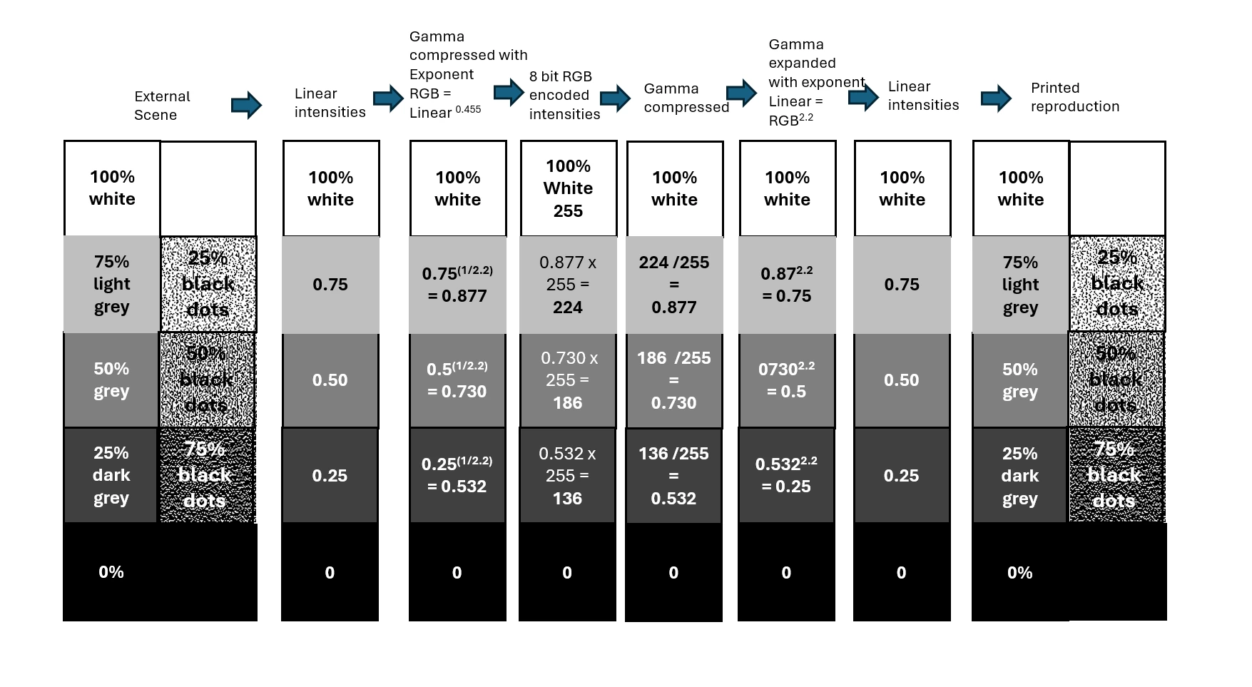
Here is my understanding of how Gamma compression and expansion should work:
Copy link to clipboard
Copied
Gamma encoded image > inverse gamma in monitor = gamma 1.0
In a properly color managed process this is all remapped in high precision, so that the net visual result is always linear (gamma 1.0).
Without color management it's not entirely accurate, but most displays are fairly close to (inverse) 2.2 natively, so that a 2.2 encoded file will look roughly right. A gamma 1.8 file (e.g. ProPhoto) will look too dark.
Copy link to clipboard
Copied
Your method looks flawed.
You have produced swatch values on your chart you have calculated to be at a specific gamma curve. However, your document is in Adobe RGB which already encodes those values using a transfer curve of 2.2 In other words the swatches you have labelled as gamma 1.0 are actually using values encoded in the document using a 2.2 transfer curve. Your middle value of 128 corresponds to a Luminance value of 54. So the 'gamma 1.0' values should look closest to the dot swatches.
Photoshop, like any other colour managed application uses values in the document and translates them to the values that need to be sent to the screen using both the document profile and the monitor profile. It does not matter whether the monitor is calibrated to the same curve or not, provided that the profile installed in the operating system correctly describes the monitor in its current state. That is the purpose of colour management. Remember though that, if anything is changed on the monitor, a profile matching that change must be loaded in the operating system, and Photoshop must be closed and restarted in order to pick up that new display profile.
Similarly, the printer profile used by Photoshop must match the paper, ink and media settings that were used when the profile was made. If any settings are changed then the profile is invalid. Provided that the currect media, ink, driver settings and profile are selected then your chart should match closely what you see on the screen with View > Proof Colours and the printer profile selected.
So here, I see that the closest on the monitor is the gamma 1.0 strip. I say closest as it is not a match. The 128 grey value, corresponding to L 54 is next to a dot swatch with a median value of 142.63 which I would expect to be lower. As a result the dot patch looks closest but not exactly the same.
When I print out the chart, using a print profile I created for the Canson paper I use, I see exactly the same. The closest match is the 1.0 strip. That is what I would expect, I want my prints to look as I see them on my display. So to answer the question in your title, I suspect your printer profile does not accurately reflect the paper, ink and media settings of your printer.
Dave
Copy link to clipboard
Copied
Thanks so much Dave for putting the time in to explain this to me. What you say makes perfect sense. There must be something wrong with my prints. The thing is, I am also using Canson paper (Canson Infinity PhotoGloss Premium RC 270 gsm - Gloss) and I downloaded the printer profile from the Canson Website for my Epson SC P900 printer. I have told the printer that I am using Photo Glossy paper (It doesn't have a Canson specific setting, only Epson ones) so it should be good.
Do you mind if I ask what specific paper and printer you used?
This is a photo
Copy link to clipboard
Copied
I made two more test prints. Both on plain white paper.
The first is printed with Photoshop with printer managing colours and it shows the same problem.
The second is printed from the Windows Pghotos App and it is much different. You can see that the Gamma = 1 is now a much better match to the image on the screen. This is especially true for the coloured swatches.
So the problem is some setting in Photoshop.
Copy link to clipboard
Copied
Hi,
I used an Epson SC-P5000 printer to print on Canson Baryta Photographique II paper.
I use Photoshop manages colours, setting the printer profile to the profile I created for this printer and paper using an i1Pro Spectrophotometer and Argyll CMS profiling software. The rendering intent was Relative Colorimetric and Black Point compensation was checked.
In the printer driver, I selected Premium Lustre Photo Paper as the media (which is the same media setting I used when I made the profile) and, very importantly, under mode set 'Off (No Color Adjustment)'. Turning colour management off in the printer driver is extremely important when using Photoshop manages colours. If it is on then the document will be passed through a colour management process twice.
That was it.
In your position, I would check with Canson their recommendation for the correct media setting for your printer & paper when using their profile. Set Photoshop manages colours and then ensure that you are not double profiling by going into 'print settings' and ensuring that colour management is off in the Epson driver.
Dave
Copy link to clipboard
Copied
I just checked Canson's website and for their P900 Profile for their Photogloss Premium RC paper they recommend setting the P900 media setting to 'Premium Glossy 250' and ensuring that Photo Black ink is used. On my P9000 that is listed under photo papers as 'Premium Glossy Photo Paper (250)'.
https://www.canson-infinity.com/en/icc-profiles?fp=488
Dave
Copy link to clipboard
Copied
After many hours working on this and about 30 test prints, lots of reinstalling software on 3 different computers I found out something very strange. If I dowload the image that I posted in my first post here it prints just fine. It's only when I print the file that I have here on my computer that the screen image doesn't match the printed image.
I can't figure out why there is a difference but I have attached the file to this post. I will download it again just to confirm that there is a problem.
Copy link to clipboard
Copied
Yes. This file attached to the previous post has the problem.
Copy link to clipboard
Copied
When I tried to download that file you linked in your last post, it gave me a file with no embedded colour profile. Opening that in Photoshop gave me the option to allocate a colour profile of my choice or not to colour manage it. If choosing the latter it will use the default working space of Photoshop on the PC which opened it, which of course can vary between PCs depending on what the user has set as the default in colour settings. A file should always have a colour profile embedded. You cannot test for colour issues using a file without an embedded profile as it will give inconsistent results across devices and applications.
Dave
Copy link to clipboard
Copied
Yes. I should have mentioned that I assigned an Adobe 1998 colour profile when I opened it in Photoshop. The application I used to generate it (Matlab) does not have the functionality to embed colour profiles.
Copy link to clipboard
Copied
Hi,
I took that image and assigned the Adobe RGB profile. The only other thing I did before printing was change the ppi in Image > Image size from 72ppi to 360ppi, without resampling so that only the metadata ppi value was changed and the image pixels were untouched, to save paper.
The results were the same as before, the printed output matched the on screen preview and, as expected, the gamma 1.0 strip was the closest match on both.
Dave
Copy link to clipboard
Copied
Thank you so much for your time Dave (and money, ink and paper don't come cheap these days) . There are two strange things about this. The first thing is that the image in the second file I uploaded is at 360dpi, not 72dpi and the second is that even though my original image did not have a Color profile, when I downloaded the file it did actually have a profile (Adobe 1998 RGB). I must have loaded it into Photoshop and assigned that profile to it and saved it again. Are you sure that you didn't actually download the original file again?
Copy link to clipboard
Copied
You were partly right. I had clicked on your link but mistakenly downloaded the preview image not the file being previewed. I now have the correct version.
The result though is the same as before. On both screen and print the gamma 1.0 strip looks the closest.
It all points to taking a close look at your print driver media settings. Make sure your media settings match those used when the ICC profile was made, and ensure you are not double profiling. One other thought, because your test strip contains fine dot patterns, make sure your print driver is set to it's highest quality (on the P5000 that is 2880 x 1440 dpi. )
Dave
Copy link to clipboard
Copied
I think I have the process straight now. Does it work as I have shown in my diagrams below?
Michael
BTW: I set the quality to 1440 x 1440. I saw that recommended on a printer YouTube video by Keith Cooper. He said it's best not to go beyond that.
Copy link to clipboard
Copied
Your second diagram has one unnecessary step and misses out an essential step.
To get a linear appearance on a printed media does not involve linear data being sent to the printer driver (or to the display).
Printer ink on paper is not linear and although LED displays are close they are not exact. The printer profile (or display profile) is made by measuring what the actual output will be when values are sent to the printer (or display). So the process steps are in your second diagram are Adobe tagged RGB file > Converted output values (using the printer profile/display profile) > Printer driver conversion to ink dots (not required for display) > Linear Ink apperance on paper (Linear LED appearance).
That is why it is essential to use a printer profile, or display profile, that actually maps the behavior of the particular output device in its current state.
While I would agree that 2880 is not essential for photographs, for the sharp black and white pixel intensities that you are using for your fine pixel test pattern then the more dots you use, the better.
Dave
Copy link to clipboard
Copied
Is this better?
Copy link to clipboard
Copied
The document space (Adobe RGB) is converted to the Printer/Display space by the colour management system. Internally, my understanding is that the conversion uses the CIE Lab colour space which is device independent but is not totally linear, but I have no access to the actual calculations used.
In reality that does not matter as the system takes values in the document space (Adobe RGB in this case) and converts them, using the printer/display profile, to those required to represent those colours correctly on the output device.
A couple of references:
https://helpx.adobe.com/uk/photoshop/using/color-modes.html
https://en.wikipedia.org/wiki/CIELAB_color_space
Dave
Copy link to clipboard
Copied
Hi Dave, I simplified the swatches in my original post and attached the corresponding test file. I also added what my current understanding of gamma compression and expansion is, thanks to you, to the original post. I am still getting completely unexpected results from my printouts and viewing on my monitor. This is what I get when I take photos of a print out on Canson Premium Photo Glossy paper of that test file and also of my screen.
Printout
Screen shot
Copy link to clipboard
Copied
I agree it shows an issue with your print. Can you add a screenshot of both the Photoshop print dialogue and the Epson print driver dialogue that you get when clicking on 'print setting's in the Photoshop print dialogue.
Dave
Copy link to clipboard
Copied
Copy link to clipboard
Copied
Hi,
Unfortunately, I'm running out of ideas. Your printer settings look fine with one caveat, although I'm not sure it will make a difference. Canson recommend setting media to 'Premium Glossy (250)'. On my Epson P5000 that is separate to Premium Glossy. There is a choice of Premium Glossy, Premium Glossy (170) and Premium Glossy (250). You might want to try that.
Other than that all settings look OK and as per Canson's recommendations.
The only thing left would be:
1. A reset of Photoshop print settings for that document (hold down the spacebar when clicking on Print)
2. A Photoshop Preference reset
3. A reinstallation of the Epson driver
Sorry I can't see anything else 😞
Dave