Copiar vínculo al Portapapeles
Copiado
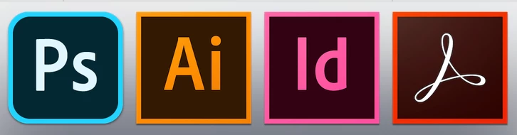
Just wondering why Photoshop 2020 is the oddball with a different app icon/shape design than the rest of the 2020 apps?
Hi There,
The rounded corners actually have a meaning- they mean the app works across multiple devices and the cloud.
Regards,
Sahil
Copiar vínculo al Portapapeles
Copiado
Hi There,
The rounded corners actually have a meaning- they mean the app works across multiple devices and the cloud.
Regards,
Sahil
Copiar vínculo al Portapapeles
Copiado
Ah, that makes sense. Thank for getting back to me! And thanks for answering my curiosity of UI disuniformity.
Copiar vínculo al Portapapeles
Copiado
Although I can appreciate the logic in your response, I must agree with Kleajmp and others who find it inconsistent with the other CC apps. Why give it the attributes of other products with rudimentary functionality compared to other more robust apps in the suite as well as being inconsistent from a design perspective?
Also, while were on the subject, why apply a function (sans shift to scale) feature in Photoshop as in other CC design apps? No offense, but seems illogical.
Copiar vínculo al Portapapeles
Copiado
I totally agree, this suite should be designed as an entity. I would preffer all the Apps with the same icon design, and that some functions were cross-platform. It's really anoying when you're going from PS y AI and the scale function is different. This is supposed to be an integraded suite, innit?
Copiar vínculo al Portapapeles
Copiado
Okay. It looks really bad tho
Copiar vínculo al Portapapeles
Copiado
How does this fit your explanation?
Copiar vínculo al Portapapeles
Copiado
That's so stupid, whoever came up with it should be fired.
Copiar vínculo al Portapapeles
Copiado
Copiar vínculo al Portapapeles
Copiado
thats SO annoying, PLEASE make the icons consistent! you are making products for designers, so do your job and make your product look consistent. this icon really drives me nuts. eighter make them all the same in general or per device. but NEVER EVER mix them!! its not even the rounded corners, even the font is too bright!!!
Copiar vínculo al Portapapeles
Copiado
If you copy the old icon in finder you can replace the new one. That is what I have done 🙂
You will need to remove from dock then put it back again.
Copiar vínculo al Portapapeles
Copiado
Done.... thank you so much for the tip!!
Copiar vínculo al Portapapeles
Copiado
Ah, that makes sense. Thank for getting back to me! And thanks for answering my curiosity of UI disuniformity.
no it doesn't, it's totally stupid. It's a cheap marketting trick to make people aware of a tabled photoshop version, where no one is waiting for. why should anyone downgrade to software that can do less?
If you copy the old icon in finder you can replace the new one. That is what I have done
You will need to remove from dock then put it back again.
That's exactly what I did directly after installing the new CC before I even read it was annoying so many other designers. For me the rounded corner apps are the "simple" apps like Premiere Elements and Photoshop Elements, they are good for a certain croud, but don't bring any new functionality to me. I'm sorry.
Copiar vínculo al Portapapeles
Copiado
These programs are designed for DESIGNERS. I personally think it's ridiculous to make the shape different from the other apps. Consistency is one of the most basic yet most important principles in design yet the update has foolishly ignored this.
Copiar vínculo al Portapapeles
Copiado
I agree!
Copiar vínculo al Portapapeles
Copiado
But Illustrator and InDesign can be used on multiple devices (Mac and PC) and use cloud features. You probably mean mobile devices.
I conceptually understand, but as a designer this annoys me every time I look at it. The icons don't feel integrated, and the icon differentiation does not explain why they are different, so for most people the reason is lost and it looks like a mistake.
Copiar vínculo al Portapapeles
Copiado
That's one of the dumbest ideas I've ever heard.
Copiar vínculo al Portapapeles
Copiado
I had to remove the apps from dock because the inconsistency makes me get a rash.
Copiar vínculo al Portapapeles
Copiado
Wel, the update of today finally solved all icon-inconsistencies. Let alone the apps which werent updated as of now:-)
Copiar vínculo al Portapapeles
Copiado
I'm curious if they finally put back the old decent Photoshop icon. The rounded icons are assiciated with unusefull apps in my mind. Will install update now and see 🙂
Copiar vínculo al Portapapeles
Copiado
I can watch my Dock's icons with peace now.
Encuentra más inspiración, eventos y recursos en la nueva comunidad de Adobe
Explorar ahora