- Home
- Photoshop ecosystem
- Discussions
- Re: why is the small text blurry on photoshop?
- Re: why is the small text blurry on photoshop?
Copy link to clipboard
Copied
why is the small text blurry on photoshop? i am dong a very small advert for a newspaper! and the text is printing blurry and when zoomed in is appearing all blurry? how do i stop this i only have photoshop and indesign
 1 Correct answer
the font is myriad and the advert size is 3.3" x 5.4" inches! the add looks fine there but then when its printed it looks pixelated

Explore related tutorials & articles
Copy link to clipboard
Copied
»Blurry«? Do you mean pixelated?
Photohop is a pixel oriented image editing program, so text will be represented by pixels on-screen and in file formats that do not support that kind of data.
But if you save a pdf you can maintain vector and font data (provided no faux styles are applied, …).
i only have photoshop and indesign
Then why don’t you use Indesign for type to begin with?
Copy link to clipboard
Copied
yes probably pixelated is the word! so if i print it as a pdf it wont appear blurry? i tried typing the font in indesign and then opening it into photoshop and it still made it pixelated? will i need to save it as a vector? if so how do i do that?
Copy link to clipboard
Copied
A popular method is creating/editing the images in Photoshop, placing them in Indesign and then exporting pdfs for the printers from Indesign.
Edit: I forgot to mention the relevant part: Set the text in Indesign!
i tried typing the font in indesign and then opening it into photoshop and it still made it pixelated?
Converting type created in Indesign to a pixel image in Photoshop will result in pixel content.
will i need to save it as a vector? if so how do i do that?
If you set the type in Photoshop save a pdf copy (and verify the correctness in Acrobat).
Copy link to clipboard
Copied
Guys it might just be a font issue. Some fonts really don't work well at very small sizes. This can be even worse on the paper quality most newspapers are printed on. Tell us what font you are using, the size of the advert in inches or milimetres, and post the image to this thread.
http://37signals.com/svn/posts/140-the-10-most-popular-newspaper-typefaces
Copy link to clipboard
Copied
Valid points.
And if the text is not 100% of one of the printing colors additional (registration and halftone screen) issues may arise.
Copy link to clipboard
Copied
the font is myriad and the advert size is 3.3" x 5.4" inches! the add looks fine there but then when its printed it looks pixelated

Copy link to clipboard
Copied
No, don't make Typo in Photoshop. It will always come out pixelated.
- Create a new document in InDesign in the size of the ad.
- Make all typo in InDesign
- FPD convert to outline, and place the image in it.
- Place the other 2 images (take care that the images are rgb and psd)
- Adjsut your design, I would recommend to work with paragraph styles and define a character style fpr the red
- Export the pdf, if the printer needs cmyk, export as pdf/x1a. The printer should inform you on the specification he needs as on the colour profile. If no colour profile is given, use the recommendations of the European Colour Initiative at http://www.eci.org they have not only a German also an English part.
Never print a pdf out from any Adobe application. Only save or export.
For more question on InDesign you should consult the InDesign forum.
Copy link to clipboard
Copied
No, don't make Typo in Photoshop. It will always come out pixelated.
That is (edited) not fully correct.
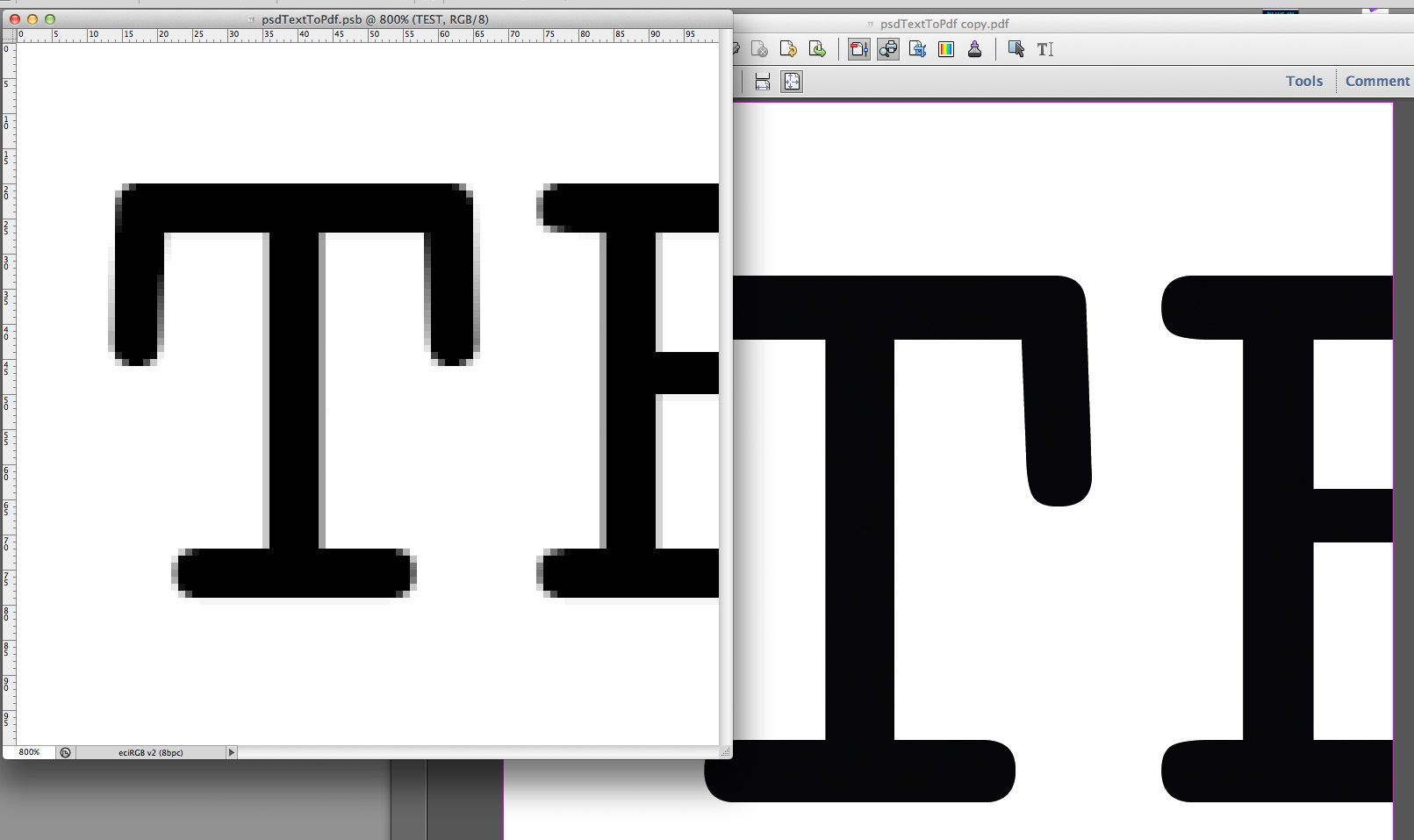
Attached screenshot shows a psd and the pdf saved off of it open in Acrobat in the background.

Copy link to clipboard
Copied
The typo is only not pixelated if saved as pdf. BUT there must not be any flattening! If any flattening occurs during pdf export it will loose any vector information!
The other problem is: In Photoshop and raster images it is best to work in rgb. In drawing, text and vector best in cmyk for print.
But Photoshop cannot mix rgb and cmyk, except with smart objects, but they are always pixelated in the output pdf.
So the easiest way to create a printable pdf is to make it in InDesign, not in Photoshop. To make a printable pdf from Photoshop you need much more know how than to do it in an apropriate programme as InDesign.
Copy link to clipboard
Copied
BUT there must not be any flattening!
That may not be altohether correct.
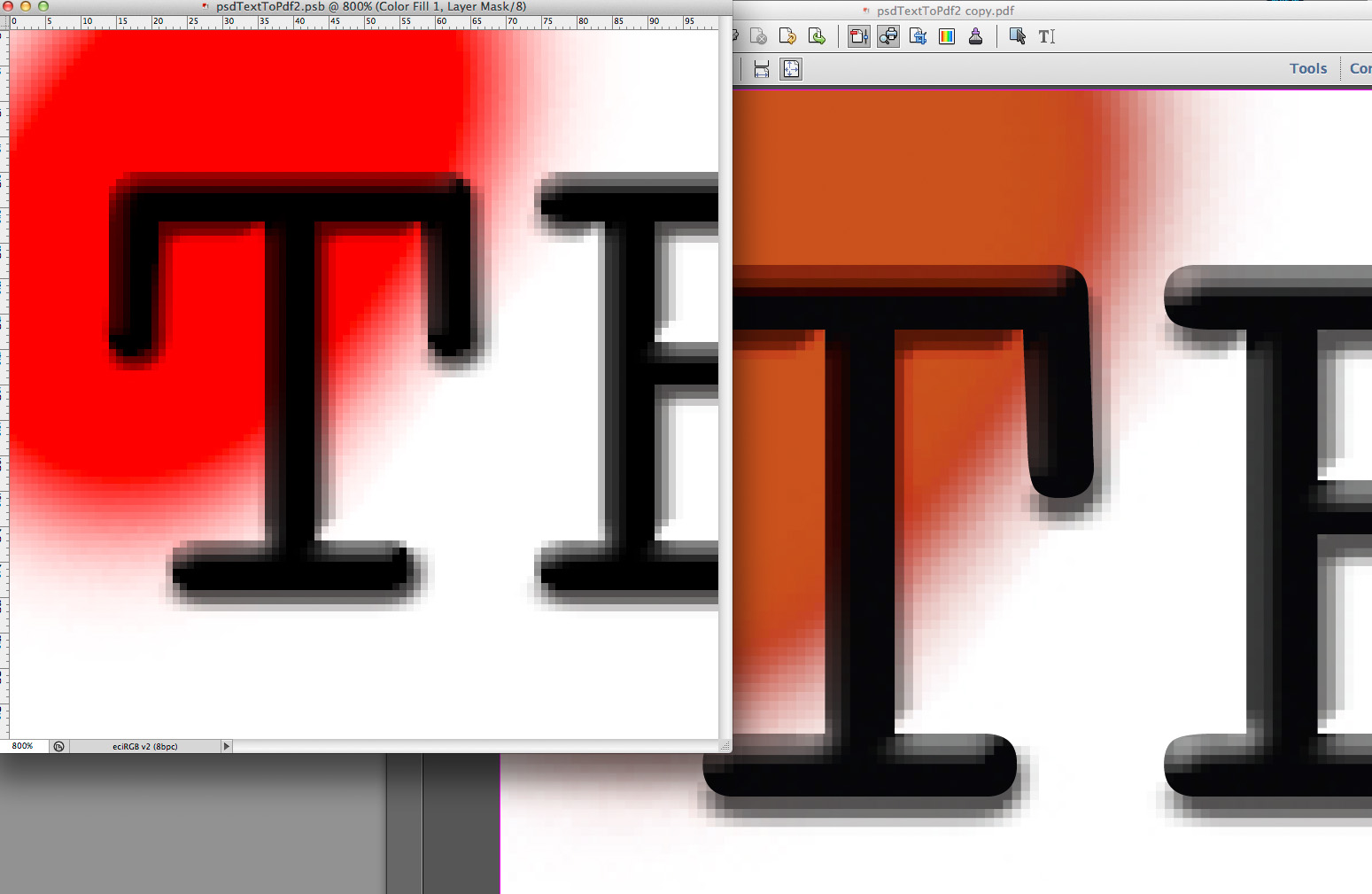
Attached screenshot shows the effect of a Layer Style and a multiplying Layer on the Text Layer – note that in Acrobat the vector information is apparently intact.

But your points on the advisability of using the proper tool for the task and that type for print is better handled in CMYK whereas halftone images are usually better edited in RGB are valid.
Copy link to clipboard
Copied
c.pfaffenbichler wrote:
BUT there must not be any flattening!That may not be altohether correct.
Attached screenshot shows the effect of a Layer Style and a multiplying Layer on the Text Layer – note that in Acrobat the vector information is apparently intact.
But your points on the advisability of using the proper tool for the task and that type for print is better handled in CMYK whereas halftone images are usually better edited in RGB are valid.
If a vector is intact, no flattening has been done. I don't talk about PDF layers, they are a complete different thing. When flattening is done no form or text survives as live vector or live text.
Another problem, I forgot to mention is that image text vector combinations have a much bigger file size than the same composition done in InDesign.
And it makes no sense to create these things in Photoshop. InDesign is the correct and best tool for printing layouts. How will you create the correct boxes for bleed and crop in Photoshop? You will have to do it later in Acrobat. Hey, why are you insisting to do it in Photoshop? You know it good enough that this is not the right tool for that task?
Copy link to clipboard
Copied
If a vector is intact, no flattening has been done. I don't talk about PDF layers, they are a complete different thing. When flattening is done no form or text survives as live vector or live text.
The pdf is X-1, so there are no Layers or transparencies in it, but the text is searchable still.
So I guess you are correct in that no flattening has happened, rather Photohop embedded two images in the pdf and clipped the one with the type.
How will you create the correct boxes for bleed and crop in Photoshop?
For a newspaper add those will probably be irrelevant as bleed is hardly necessary.
You know it good enough that this is not the right tool for that task?
Indesign is definitely the preferable tool for the task at hand, but claiming Photoshop cannot output type except pixelated was not proper.
Copy link to clipboard
Copied
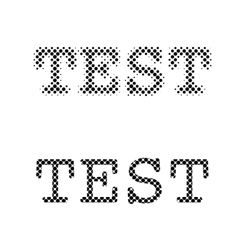
I wonder how this flattened image would print, by comparison...

-Noel
Copy link to clipboard
Copied
![]() Just fine methinks
Just fine methinks
Copy link to clipboard
Copied
While the halftone content will be screened overall vector data will allow to utilize the actual hardware resolutiuon of the output device.
The screenshot is but a simulation, but the principle applies in my experience with conventional offset printing.

Copy link to clipboard
Copied
This subject comes up regularly, and there is a lot of confusion about it, which I'll try to address as best I can. Saving Photoshop images with text layers into a PDF document is a very complicated process, and can produce results that may not make sense on first glance.
FIrst of all, there are two interconnected concepts or principles to keep in mind:
(1) the layering/compositing model of Photoshop is much more complicated--and not compatible with--the PDF imaging model. This pertains to both non-text related aspects (blend modes, layer opacity, raster and vector layer masks, layer transformations, smart layers, etc.) as well as text-specific aspects (rendering, kerning, text warp, text on path, etc.)
(2) when the layering/compositing conditions are such that it might compromise the visual integrity of the document when viewed as a PDF, Photoshop's prime directive is to maintain visual integrity at the cost of losing text (by flattening the image, or by rastering/vectorizing or otherwise discarding the text/font information).
In other words, Photoshop's goal is to make the PDF look exactly like the PSD image, even if that means losing the text information. Users rightly get peeved if the PDF doesn't look like the source document from which it was generated.
In all but fairly simple documents, this will generally means some or all of the text information will not be preserved. Photoshop users should not expect or count on text layers being preserved as text when creating PDFs; if it does preserve it, it's because it was able to do so without compromising the integrity of the image, and it is not something users have control over (other than keeping their document layer structure simple, which is often not possible.)
The bottom line is exactly what other people here have already said: Photoshop is not, and should not be used as a general purpose PDF creation tool in the same way that Illustrator and InDesign can be used. You should use one of those applications if maintaining textual information in PDF's is a requirement.
Hope this helps,
Paul
Copy link to clipboard
Copied
c.pfaffenbichler schrieb:
If a vector is intact, no flattening has been done. I don't talk about PDF layers, they are a complete different thing. When flattening is done no form or text survives as live vector or live text.The pdf is X-1, so there are no Layers or transparencies in it, but the text is searchable still.
So I guess you are correct in that no flattening has happened, rather Photohop embedded two images in the pdf and clipped the one with the type.
Exaclty, whe a pDF X1 or 3 is created transparency is flattened and here it can come to unwanted rasterizing of vectors.
How will you create the correct boxes for bleed and crop in Photoshop?
For a newspaper add those will probably be irrelevant as bleed is hardly necessary.
Not at all, it is much easier to assamble files in a greater layout if all boxes are correct.
You know it good enough that this is not the right tool for that task?Indesign is definitely the preferable tool for the task at hand, but claiming Photoshop cannot output type except pixelated was not proper.
I think in a forum we should not support the use of wrong tools but we have to show the best way to do things correct.
And there are also problems which cannot avoided with higher knowledge like coloured black (not in this ad). Yes, you an me we are capable to shift around the known problems with ads created in Photoshop, but others don't know these problems and will crash.
Copy link to clipboard
Copied
Willi Adelberger wrote:
I think in a forum we should not support the use of wrong tools but we have to show the best way to do things correct.
You don't really get to say what's "right" or "wrong". It's not that simple. Let's try not to be inflexible.
Acknowledging that in this case InDesign was a good choice, it could still be that an individual doesn't have access to a copy, or doesn't have the skills to use it (or time to learn it), or part of the image is already rasterized, or... Any number of things can be imagined that could make Photoshop the tool needed for a particular task.
Perhaps teaching what's really going on - in this case WHY using too few pixels can yield fuzzy images - might help vs. trying to change the game to avoid the problem. Admit it - you've used Photoshop successfully for something that might have been better done in another tool at least once. We all have.
And of course let's not forget this is the Photoshop forum, where we try to show how to get the best results with Photoshop.
A personal (minor) quest of mine is to get people to use more pixels for the tasks where pixels are involved, so as not to close off their opportunities for higher quality.
![]()
-Noel
Copy link to clipboard
Copied
Noel, as a user who was working with the earliest drawing, illustration and page layout programs, since MacDraw, MacPaint, Page Maker and QuarkXP PP well before ever picking up Photoshop, I find it hard to comprehend your position on this issue. But I certainly admire your determination.
Copy link to clipboard
Copied
Exaclty, whe a pDF X1 or 3 is created transparency is flattened and here it can come to unwanted rasterizing of vectors.
Unless certain conditions are in play (faux styles for example) Photoshop will maintain vectors in my experience.
Unlike Indesign and Illustrator Photoshop seems to generate the necessary amount of images covering the full area and clips them with Paths or type).
Of course this can lead to a lot of full area pixel images which may affect file size considerably – a legitimate argument for prefering Indesign or Illustrator created pdfs.
When opening a Photoshop created pdf in Illustrator the number of resulting Clipping Groups and embedded images can be quite remarkable.
Copy link to clipboard
Copied
One can use a screwdriver to drive a nail, but it's not the optimal tool for the job.
I look at your ad and it would have never occurred to me to make it in Photoshop. Adobe Illustrator and Adobe InDesign immediately come to mind.
Copy link to clipboard
Copied
Pixels are not evil. You just have to use enough of them to suit the intended purpose.
In other words, if you use a high enough ppi, all will be well.
-Noel
Copy link to clipboard
Copied
In other words, if you use a high enough ppi, all will be well.
To print the text sharp as pixels in a newspaper it would probably have to be provided as a 1bit bitmap of perferably above 600ppi.
As the ad contains text of different colors (edit) and images this is probably not a realistic option.
The potential additional resolution of a CMYK, RGB or grayscale pixel image will likely just be downsampled by the RIP or in PDF preflighting as far as I can tell.
Copy link to clipboard
Copied
c.pfaffenbichler wrote:
In other words, if you use a high enough ppi, all will be well.
To print the text sharp as pixels in a newspaper it would probably have to be provided as a 1bit bitmap of perferably above 600ppi.
As the ad contains text of different colors (edit) and images this is probably not a realistic option.
The potential additional resolution of a CMYK, RGB or grayscale pixel image will likely just be downsampled by the RIP or in PDF preflighting as far as I can tell.
Modern magazines and newspapers are not published only as print edition but also as electronic and pdf editions. A high resolution image might be ok in print but when the magazine is delivered also as pdf the recipient gets either a huge file or a pixelated not readable file. So text should never be pixeled if there exists a way to keep it as text.
-
- 1
- 2


