- Home
- Photoshop ecosystem
- Discussions
- Can I produce bright colours in CMYK?
- Can I produce bright colours in CMYK?
Can I produce bright colours in CMYK?
Copy link to clipboard
Copied
I'm used to working in the RGB colorspace as my work is video based. I'm now creating some work for fabric printing and I'm told to produce the artwork in CMYK and then save for printing as a PNG (obviously in RGB).
The thing I can't get my head around is that the CMYK colours are so dull and stay that way when I save as an RGB PNG file. Please see attached.
I need for instance a bright, cobalt blue and a bright fusia pink. Is there a way I can do this in CMYK? Surely all printed colours aren't always so lack-lustre!
Any advise, greatly appreciated. BTW, you may have noticed, I'm not that jargon savvy! ![]()
Using: Photoshop CC 14.2.1 x64
Thanks..
Explore related tutorials & articles
Copy link to clipboard
Copied
Yes this is the nature of CMYK. This is why “spot colour” is used. Quality garment printing may also use “screen printing”.
The instructions you are following are frankly weird. Do you know the printing process to be used? If it’s a commercial service, can you link?
Copy link to clipboard
Copied
As Test Screen Name, says, find out if you need CMYK. Yes, they have a smaller gamut.
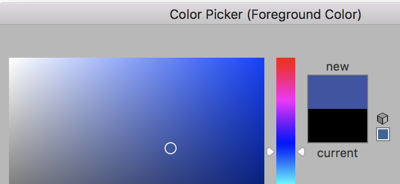
- When you look in the Color Picker, you will see a triangle when you pick an out-of-gamut color.

- Click the triangle to watch the color jump to the nearest printable color. (Don't worry about the obsolete web control.)

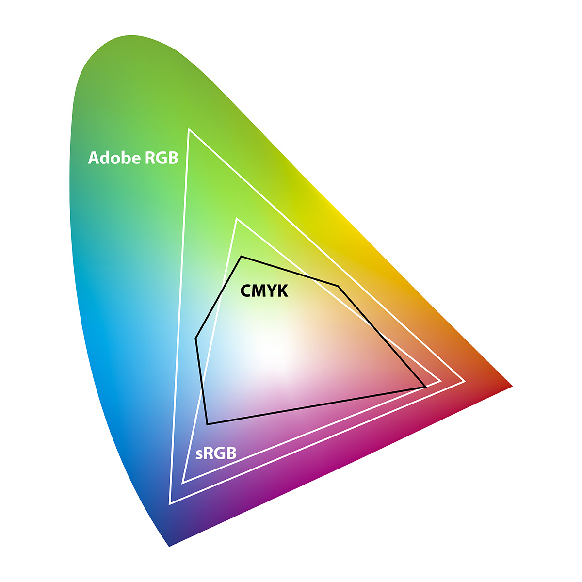
- Here is an image from Fotolia US » What is Best for Photo Printing: CMYK or RGB? that shows how small the CMYK gamut is.

Copy link to clipboard
Copied
The problem is inherent with how blues get reproduced in CMYK. You get a cyan ink plus three inks that are not blue at all, and you're supposed to try and reproduce saturated blues with that set of inks...it’s a tough challenge. If you are limited to CMYK (that is, your budget doesn't allow for spot inks like the exact blue or pink you want) there are techniques to get it to work better, but they have compromises. For more details on the issues involved and the merits of various approaches, here's a link to an old discussion involving some Photoshop experts:
Dan Margulis: Blue and Purple | Photoshop Training with Dan Margulis
Also, when you use graphs, a color picker, or soft-proofing to try and determine whether a color is in gamut, always make sure you're evaluating through a CMYK profile that represents the exact inks and press conditions your job will be using. Leaving your CMYK settings on a generic CMYK color space (like US Web Coated SWOP) may mean you're evaluating against a gamut that isn't accurate for your job.
