• Global community
    • Language:
      • Deutsch
      • English
      • Español
      • Français
      • Português
  • 日本語コミュニティ
    Dedicated community for Japanese speakers
  • 한국 커뮤니티
    Dedicated community for Korean speakers
Exit
0

Colour mismatch between LR and PS (V 2021)

New Here ,
Oct 30, 2020 Oct 30, 2020

Copy link to clipboard

Copied

Hi,

I sat down to edit a few images and saw that the colours between LR and PS do not match. Below are few of the issues I'm observing:


1. LR Library Module has a warmer White Balance than in LR Develop module. Even when the image is converted to black & white, it is represented as more of a Sepia tone in the Library module of LR.

2. When the image is opened in PS via LR, then the white Balance is displayed as it is displayed in the LR Library module (warmer than it actually is) instead of the changes made in the Develop Module.

3. Exposure/Contrat and other changes are carried over to PS but the image still has a strong warm White Balance in PS.


only raw images edited (no jpgs).

I have kept the colour space the same in both LR and PS (ProFoto RGB).


What do I do to correct this as Photoshop doesn't show me correct colours when editing. Any changes I do in PS look very different in LR and this is not a good workflow. Even the colour differences between LR LIbrary and Develop Module is a lot.


Both LR and PS are updated to the latest versions.


Thanks,
Pradhyumna

Views

601

Translate

Translate

Report

Report
Community guidelines
Be kind and respectful, give credit to the original source of content, and search for duplicates before posting. Learn more
community guidelines
Adobe
New Here ,
Oct 30, 2020 Oct 30, 2020

Copy link to clipboard

Copied

just to add, this is issue is more serious when working with portraits cos the skin tone and the overall image colour is all over the place. 

Votes

Translate

Translate

Report

Report
Community guidelines
Be kind and respectful, give credit to the original source of content, and search for duplicates before posting. Learn more
community guidelines
Community Expert ,
Oct 30, 2020 Oct 30, 2020

Copy link to clipboard

Copied

That has to be a defective monitor profile, which can affect applications in different ways.


If you don't use a calibrator, monitor/laptop manufacturers distribute their own generic profiles through Windows Update. These profiles are very often bad and we see this a lot.


Until you get a calibrator, set sRGB IEC 61966-2.1 as default monitor profile in Windows. It won't be entirely accurate, but better than a broken profile. Relaunch PS/Lr when done, they load the profile at application startup:

Displayprofile_20_3.png


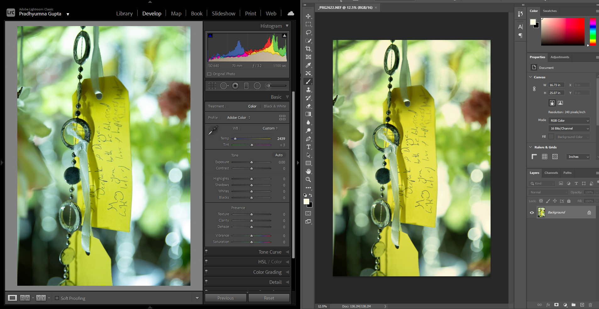
Here's a smoking gun. The color panel in your screenshot has a clear color cast and some gradients that don't look healthy:

panel.png


BTW - Lightroom and Photoshop color settings do not need to match. There's no particular reason to use ProPhoto just because it happens to be the Lightroom default for "Edit in Photoshop". Until you understand all the implications of using ProPhoto, I'd recommend changing this Lightroom setting to sRGB.


In the wrong hands, ProPhoto can cause a lot more harm than good.

Votes

Translate

Translate

Report

Report
Community guidelines
Be kind and respectful, give credit to the original source of content, and search for duplicates before posting. Learn more
community guidelines
Community Expert ,
Oct 30, 2020 Oct 30, 2020

Copy link to clipboard

Copied

Hi, Frustrating problem, that.

I would like to add one more vote for the idea that you should try replacing the possibly defective display system profile as D. Fosse explained.


If that doesn’t do it do make sure that Lightroom and Photoshop versions are in step with each other, the different raw processing "profiles" which may be part of different versions can cause some inter app. mismatch issues.


I hope this helps

thanks
neil barstow, colourmanagement.net :: adobe forum volunteer
[please do not use the reply button on a message within the thread, only use the blue reply button at the top of the page, this maintains the original thread title and chronological order of posts]

Votes

Translate

Translate

Report

Report
Community guidelines
Be kind and respectful, give credit to the original source of content, and search for duplicates before posting. Learn more
community guidelines
New Here ,
Nov 05, 2020 Nov 05, 2020

Copy link to clipboard

Copied

Thank you both.

I did calibrate the monitor using a Spyder and now the colours match between LR (Library & Develop) and Photoshop.


Played around with the Colour Management window. Chose the profile I created as default and wherever applicable and now the colours are almost similar across LR, PS, IrfanView, Firefox etc (there is veryyy minimal variance, maybe 1-2% but that's ok). 
However no matter what settings I choose, the colours appear cooler if I open the images in Windows Photos. and there is no setting to force it to use a particular profile. 

Capture.PNG

Any idea why? I can learn not to use it and use IrfanView but IrfanView's UI looks so dated and not at all appealing.

I can live with using IrfanView and will probably look out for some modern and cleaner image viewing software.


Thanks again,

Pradhyumna

Votes

Translate

Translate

Report

Report
Community guidelines
Be kind and respectful, give credit to the original source of content, and search for duplicates before posting. Learn more
community guidelines
Community Expert ,
Nov 05, 2020 Nov 05, 2020

Copy link to clipboard

Copied

If you are using a calibrator (Spyder), don't do anything! Don't change anything in the Advanced tab, restore everything there to what it was.


The Spyder software sets everything up automatically, on system level. The monitor profile is set in the Devices tab, not the Advanced tab (as per my screenshot above) - but the Spyder software will do it for you. There's no need to go in there; that's only if you need to change the profile manually.


Actually, most problems people have with calibrators is because they feel they have to do something. Don't.


All you have to do is set the parameters before you run the calibration/profiling: white point luminance (start with 120 cd/m²), white point color (start with D65), gamma (that's an easy one: always 2.2) and black point if the calibrator supports it. Those numbers are starting points and you may need to adjust them later. But for now, just get it running.


Votes

Translate

Translate

Report

Report
Community guidelines
Be kind and respectful, give credit to the original source of content, and search for duplicates before posting. Learn more
community guidelines
Community Expert ,
Nov 05, 2020 Nov 05, 2020

Copy link to clipboard

Copied

LATEST

"the colours appear cooler if I open the images in Windows Photos"


Windows "Photos" is not color managed and doesn't even know what a profile is (document or monitor). Ignore it, don't use it, find something else.

Votes

Translate

Translate

Report

Report
Community guidelines
Be kind and respectful, give credit to the original source of content, and search for duplicates before posting. Learn more
community guidelines