 Adobe Community
- Home
- Photoshop ecosystem
- Discussions
- Font Size in PX isn't accurate, why?
- Font Size in PX isn't accurate, why?

Copy link to clipboard
Copied
Hi everybody,
When I measure a font's height at 40px, it's not. It's 30px. It must be measuring the box around the text (I guess?), but that doesn't really help me.
Why doesn't Photoshop just measure the actual font height and can I adjust things so that my actual letter height = the height in the panel?


 1 Correct answer

soupking wrote
I'm just surprised there isn't a rough reference for capital lettering.
Hi,
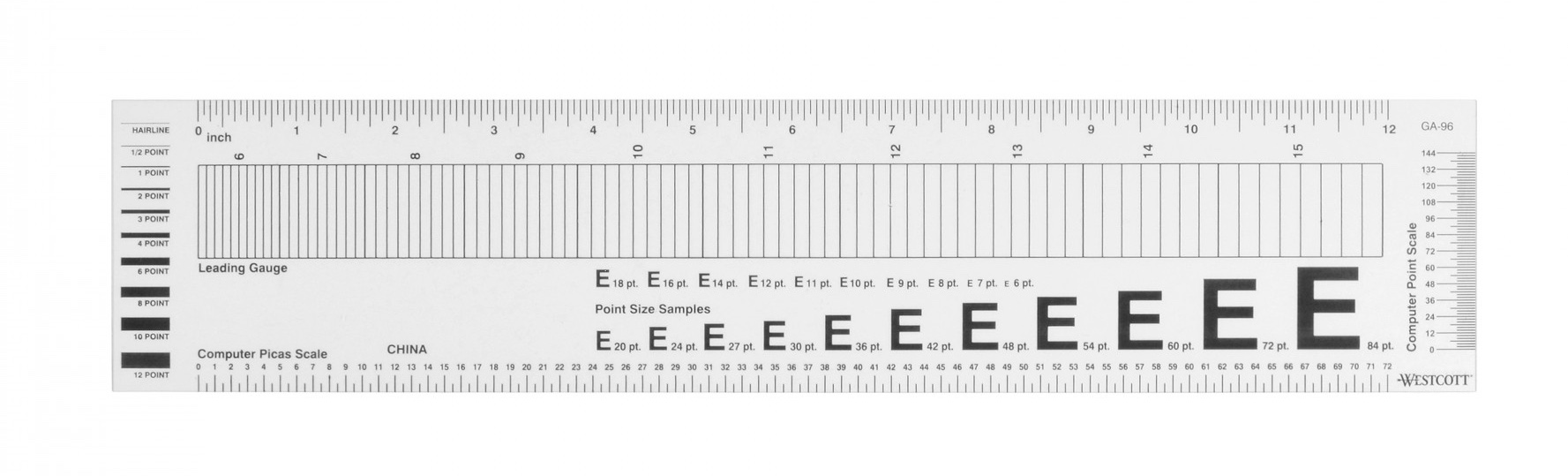
We measure type as Guttenburg did—by measuring the size of the metal block the text is on (or used to be on), including ascenders and descnders. This is the ruler I’ve been using for 30 years to measure typesize and leading. Hold the various E’s on top of a capital letter to find your typesize.
Type Setting Graphic Arts Ruler 13.75 inch Painting Crafts division of Hofcraft The Painters Source
Jane
Explore related tutorials & articles
 18
Replies
18
18
Replies
18

Copy link to clipboard
Copied
Have you allowed for descenders and ascenders?
Dave
Copy link to clipboard
Copied
Ascenders and descenders, never heard of them.

Copy link to clipboard
Copied
The size of a font is always given in terms of the box around it, has been for 500 years. This always includes the ascender (the tallest part of the font like "T") and descender (the lowest part of the font like "j"), and a bit of space top and bottom. Photoshop does what all other apps do (and if the size was dynamic, horrible things would happen, like you add a "j" and the text shrinks and jumps up).
Copy link to clipboard
Copied
K, so in order to measure fonts in an exact fashion it would be a mess. Gotcha.
I'm just surprised there isn't a rough reference for capital lettering. I would think that would be a pretty solid way to measure letters w/o a box. Then take ascenders/descenders as an addition to that base measurement.
Copy link to clipboard
Copied
soupking wrote
I'm just surprised there isn't a rough reference for capital lettering.
Hi,
We measure type as Guttenburg did—by measuring the size of the metal block the text is on (or used to be on), including ascenders and descnders. This is the ruler I’ve been using for 30 years to measure typesize and leading. Hold the various E’s on top of a capital letter to find your typesize.
Type Setting Graphic Arts Ruler 13.75 inch Painting Crafts division of Hofcraft The Painters Source
Jane

Copy link to clipboard
Copied
Wow, that's a pretty cool tool. I kind of wish Photoshop had a PX font preference for something like that. Heh, but messing with fonts and such like that could possibly crash things. LOL

Copy link to clipboard
Copied
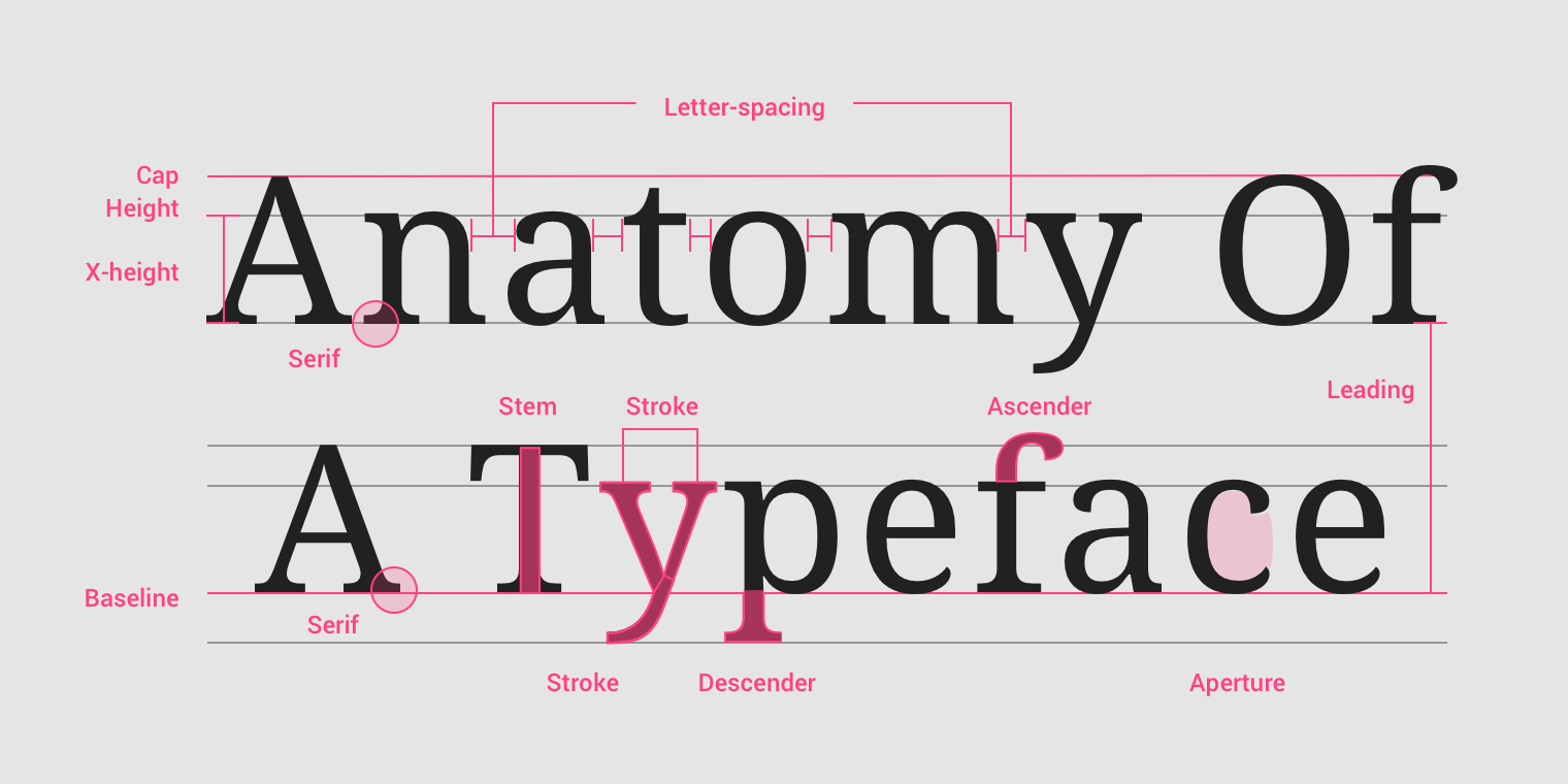
Parts of a typeface:

Copy link to clipboard
Copied
I do not know how Adobe specifies type size so perhaps the following has little relevance. On the off chance that it is similar to the foundry type that, as a youngster, I learned to set (and distribute it back into the job case after it had been used).
I searched around for a diagram that might be helpful when referring to type in terms of point size.
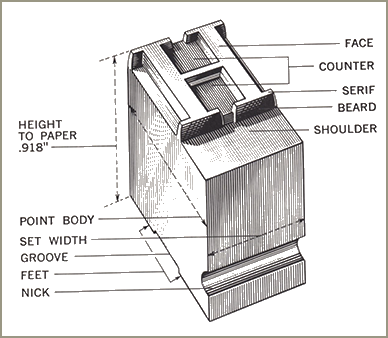
Note that the letter sits on a shoulder that is larger than the letter. This allows area for ascenders (lower case l, k and h, for example) and for desscenders (example: g, p and q)
In fact, the origin of the phrase "mind your p's and q's", meaning be careful, originated in letterpress shops where the metal letters are backward, easy for the novice to confuse.
In addition to the. face, ascender and descender there is additional blank space at the bottom of the shoulder so that, when several lines are set, the bottom of a descender will not butt the top of an ascender in the line below.
As a result, you cannot take a measure of the face and call that the type size. The point size is what is shown above as Point Body and includes the shoulder.
To repeat, when Adobe refers to point or pixel size, I don't know whether or not the presumed body is part of the point designation. I assume, in providing for line-below-line spacing, even without leading, they make the same accommodation.

Copy link to clipboard
Copied
Copy link to clipboard
Copied
While we are on this subject, I'd like to add two useful terms that describe a face's style.
Consider the height of the lower case x.
A face that is large on the body has a larger than normal x height and, as a result, has smaller ascenders and descenders
A face that is small on the body has a smaller than normal x height and, as a result, has longer ascenders and descenders.
It can mislead you when guessing the point size of a printed page.
Copy link to clipboard
Copied
https://forums.adobe.com/people/pixxxel+schubser schrieb
How about a little script?
Re: Retrieve cap height from font
Have fun
Does have anyone tested the mentioned script for getting the (real) capital letter height?
That was only a script studie (with a fix font height). But you can change the font size in the script.
Copy link to clipboard
Copied
In some fonts the cap height is lower than the lowercase ascenders.
Copy link to clipboard
Copied
Yes it is possible. Was that the question?
Copy link to clipboard
Copied
No, it was a statement.
Copy link to clipboard
Copied

Not: was that a question - but: was that the question.
You know that I know that you know that I know …

Copy link to clipboard
Copied
Natch.
Copy link to clipboard
Copied
norman.sanders wrote
I do not know how Adobe specifies type size so perhaps the following has little relevance. On the off chance that it is similar to the foundry type that, as a youngster, I learned to set (and distribute it back into the job case after it had been used).
.
Norman, your descriptions are spot on, and measuring type has not changed since those days. A font is still one typestyle, one typeface, and one type size — only what goes in one of those cases.
soupking, hopefully you have a better understanding now about measuring type and how it’s not Adobe’s decision to make. And it’s too late to take it up with Gutenberg!
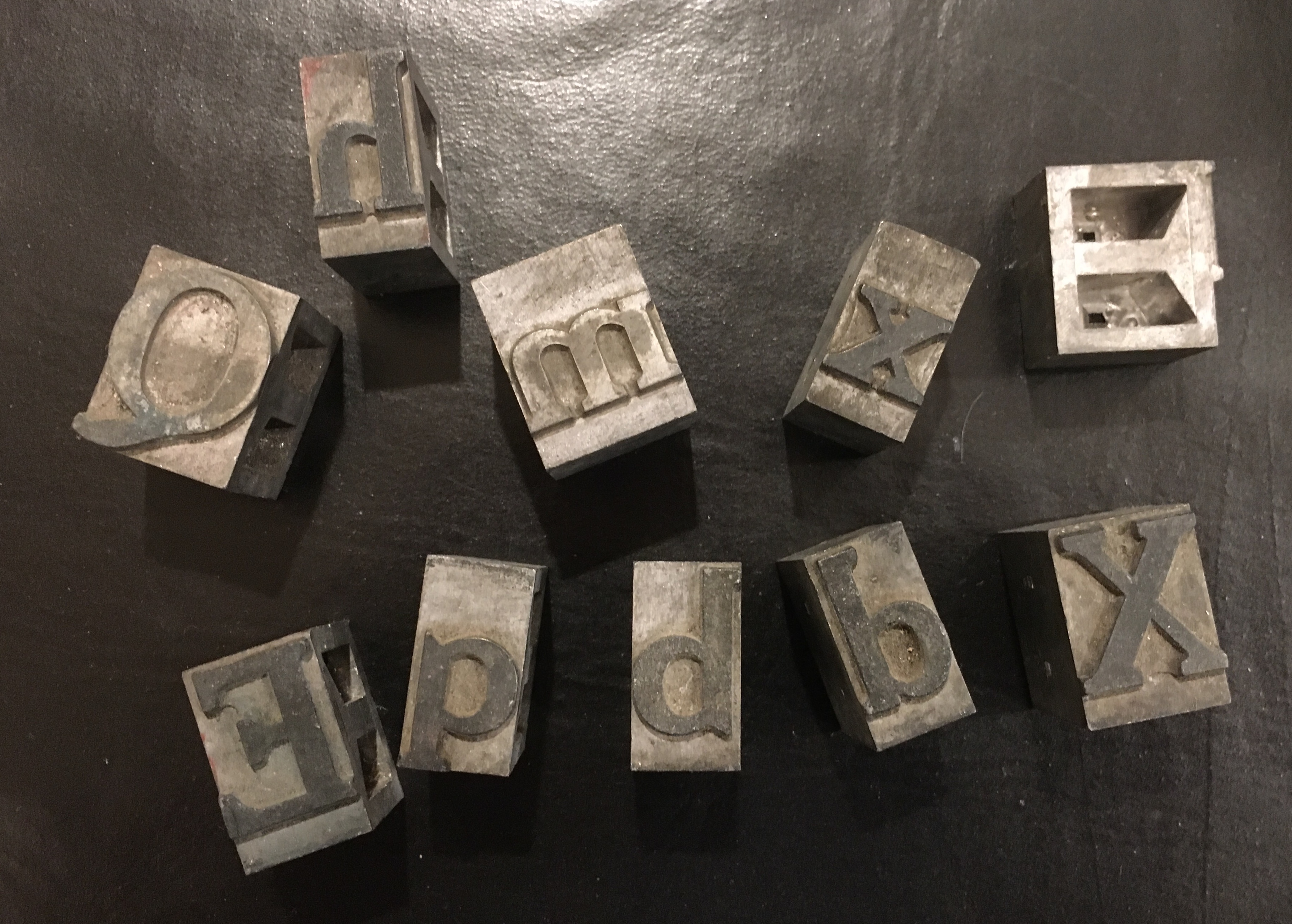
Norman, now that I’m home, I grabbed a couple of letters out of my box of type and took a quick photo:
Copy link to clipboard
Copied
You should view (and read) them the other way around.

 AdChoices