How do I make an image more "vibrant"?
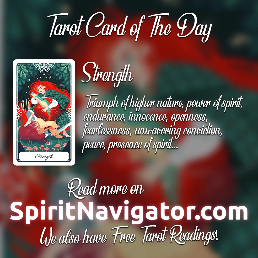
Hello, first time posting!
I am the lead designer of Spirit Navigator. My task for the week was to design a set of images like the sample one below, but we haven't released them yet into the public, so no resharing, please. My boss tells me that the images should be "more vibrant and colorful" so I tried the different color manipulation options presenting more than 20 options for each image (they're 22 in total, so that makes 440 images... ugh), but he's still not satisfied with the results. I am using Photoshop CS6, the methods I applied to the images were mainly from the Adjustments options and playing with the sliders to achieve an effect that I thought would be satisfactory. I used Vibrance, Hue/Saturation controls, Exposure levels, the Color balance functions and the Curves graph. I've tried almost everything and I am at a point that I'm close to surrendering. Do you have any tips for me? How do I make an image "more vibrant" than this? Any tips are welcome. Please help I'm desperate! 
(p.s. on a side note it might be that my boss is having a bad week or something, but this is going on for more than I thought it would... already for 22 simple images)