Copy link to clipboard
Copied
TLDR: Can this flash-compromised photo be fixed in any of Adobe’s apps/software?
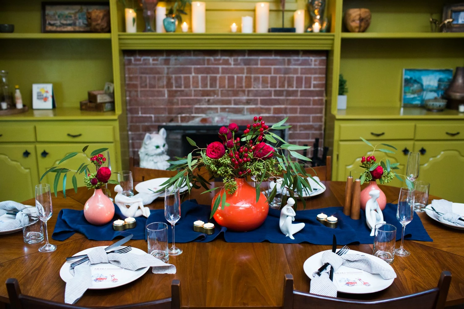
I’m helping a friend with a new blog about hosting dinner parties. Her photographer friend took photos for a couple parties. There’s one photo that my friend wants to use in the blog, but I think too much flash has compromised the photo. I played around with it a bit, but photo editing is not my thing. I’m not even sure the photo can be fixed. I‘m assuming the main problem is what appears to be flash with no diffusion, no bounce. The background fights with the middle ground. Glossy objects stand out, etc.
Can the photo be fixed?
How?
Or what keywords can I use to find the solution?
Also, if you happen to recognize lighting isn’t the problem, then what is it?
A big thank you in advance!
Michelle
https://i1.wp.com/dinnerwithjen.com/wp-content/uploads/2019/03/Italian-Summer-Dinner-Party-016.jpg
Copy link to clipboard
Copied
Hi
You would be better starting with the raw files where you can possible extract more detail in the white plates , but below I took your jpeg image and warmed the foreground slightly in the camera raw filter. Then on a duplicate layer darkened the background and added a vignette, painting in some shadows on a layer set to multiply. The Hue and sat layer is just there to control the reds slightly
Dave
Copy link to clipboard
Copied
Gradients can be helpful in reducing contrast. A black gradient set to Soft Light at maybe 25% will darken the lighter parts of the foreground and reduce the spotlight effect. You can also use a white gradient to lighten the top in the same way.
Copy link to clipboard
Copied
Thisis a clear case of "What's wrong with this picture?"
The flash was responsible for the inordinate light falloff.
The flash is also responsible for the featureless disappointing whites, the area where the eye is drawn to first.
The short lens focal length and choice of vantage point were responsible for the distracting foreground plate and other image distortion.
The wrinkled blue cloth looks sloppy rather than flat and the layout looks crowded and lacking a design sense and elegance.
The screaming orange vase is a considerable distraction. Wrongvase. Wrong choice of flowers.
The objects on the plates lack a sense of symmetry and attention to detail.
I don't think this is the subliminal message the client wants to convey.
I apologize if all this seems harsh but for professional results, perhaps it would be more useful to consider Photoshop as a application for image enhancement rather than image salvage.
In this case, don't use the photograph.
Find more inspiration, events, and resources on the new Adobe Community
Explore Now