Copy link to clipboard
Copied
Hello everyone!
I've tried to look for this question online, but could not find the thing I was looking for. I'm a designer/marketeer at a car company and would like to know how I could make something like the image you can see in this post.
So how do I create the curtain look on something (like the red Fiat in this case)
Thank you in advance!
The more I look at this stuff, the more inclined I am to move towards greater contrast and harder lines. This is shiny paint and metal after all. I know I get weighed down with technique above how things should look. Blurring a brush stroke is very satisfying, and the soft way it merges in to its setting can be irresistible.
It's much easier and faster to do it all free hand, which does mean a tablet, but it is not hard with practice. My tip is making brush strokes is like riding a motorcycle
...Copy link to clipboard
Copied
Use two layers each with the car coloured differently. You can use the same base image and colour it.
Then use a combination of warp and displace on the top image to give that rolled up effect. It will take a little work to look convincing but is a good exercise.
Dave
Copy link to clipboard
Copied
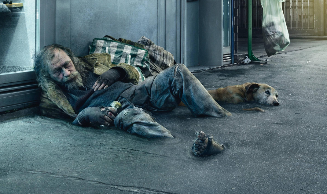
This reminds me of Christophe Huet's series of images of homeless people sinking into the pavement. These images are so famous now, it is difficult to find Christophe's site in a sort of 'can't find the wood for the trees'. The ripples are subtle, but the same rings of shadow and highlight provide the illusion of depth.
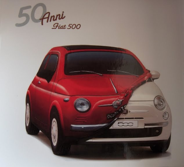
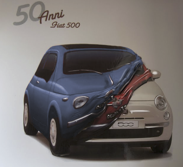
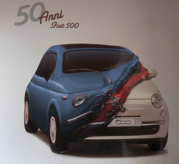
So alternating thin lines of Gaussian blurred black and white start the process, and then decide to do paint in the ends on a new layer. I couldn't decide whether the crumpled skin should show red or blue? Note also the thin highlight that marks the edge.
If I was doing this for myself, I'd use an Erick Johannson trick and roll up a sheet of card and photograph the end to see how the shading worked.
Copy link to clipboard
Copied
There you go - I decided to give it another blanket on top of the first.
I made a copy of the red area and coloured it blue, then made that into a smart object.
I distorted it using puppet warp - then painted in some shadows on the blue and underneath on the red.
Dave
Copy link to clipboard
Copied
The more I look at this stuff, the more inclined I am to move towards greater contrast and harder lines. This is shiny paint and metal after all. I know I get weighed down with technique above how things should look. Blurring a brush stroke is very satisfying, and the soft way it merges in to its setting can be irresistible.
It's much easier and faster to do it all free hand, which does mean a tablet, but it is not hard with practice. My tip is making brush strokes is like riding a motorcycle. You need to look where you want to get to, as opposed to where you are, and the stroke follows a path to that place. I still have to undo and try again, but that's the beauty of doing this digitally.
Copy link to clipboard
Copied
This is actually amazing. Thanks!
Find more inspiration, events, and resources on the new Adobe Community
Explore Now