

- Home
- Photoshop ecosystem
- Discussions
- Luminance Equalisation Batch Processing
- Luminance Equalisation Batch Processing

Copy link to clipboard
Copied
Hello guys.
I have over 5000 images in different colors (below 200x200px) which have different luminosity. I want the perceived brightness for all the images to be same. I tried playing around with the LAB color mode but couldn't figure it out. I need the images to be processed with batch action. is there any way I can do that?
Thanks


 1 Correct answer
My description above refers to creating a common Luminosity,

so that, if it is placed as a layer above the original image with its Blending Mode set to Luminosity, the color images will all have a common luminosity and the white and black in any image will be preserved.
Here are Before and After. (Reminder: You can change standard luminosity if desired.)

Explore related tutorials & articles
 26
Replies
26
26
Replies
26

Copy link to clipboard
Copied
Please provide a more meaningful explanation of the intended process (which brightness – average, random, …?) and sample images.
And automation like this might exceed Actions’ scopes so you may want to post over at
Copy link to clipboard
Copied
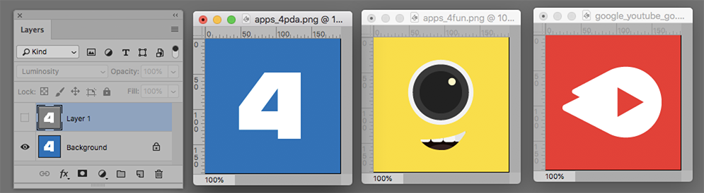
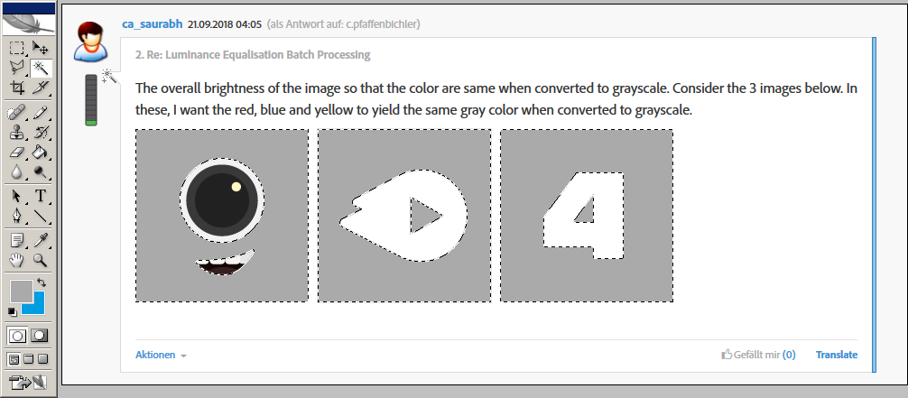
The overall brightness of the image so that the color are same when converted to grayscale. Consider the 3 images below. In these, I want the red, blue and yellow to yield the same gray color when converted to grayscale.


Copy link to clipboard
Copied
What is the images’ original Color Space?
Were they originally vector data?
Copy link to clipboard
Copied
The original color space is RGB and yes I also have vector files for them.
Copy link to clipboard
Copied
The original color space is RGB
I did not ask for the Color Mode but the Color Space – usually that is described by an icc-profile.
Please set the Status Bar to »Document Profile« and post a screenshot unless it is »Untagged RGB« – then please tell what the RGB Working Space is.
I also have vector files for them.
If you intend to print the images then using the pixel versions instead of the vector versions would seem imprudent.
Copy link to clipboard
Copied
Sorry, I am not that good with the terminology.
The color space says sRGB IEC61966-2.1 (8bpc)
Also, I do not intend them to print but are used as icons for mobile, thus using bitmap instead of vector.
Thanks

Copy link to clipboard
Copied
Equalizing the perceived brightness for each image is a difficult task.
Such an image doesn't have a perceived brightness.
But if you're really intending this, as explained,
"I want the red, blue and yellow to yield the same gray color when converted to grayscale",
then you may proceed as follows:
– Select each color area by magic wand (two areas in each of the two images at the right).
– Fill the selections with a predefined gray, here for instance R=G=B=170.
An automation is probably difficult.
Best regards --Gernot Hoffmann
Copy link to clipboard
Copied
Thanks for your reply..
Actually, i want to normalize the icons with color (just said they should yield the same grey so as to explain better). So what I want is that red, blue and yellow should have the same perceived brightness. I read somewhere that it can be done in LAB mode by fixing the L value but I am unable to achieve it. Do you have any inputs with regards to the LAB color mode?
Thanks
Copy link to clipboard
Copied
This may still be better done in vector because there it should not be necessary to counter the white, gray and black elements’ effect as the background element could still be edited individually.
Copy link to clipboard
Copied
In my example the color areas have after the transformation the same luminance (RGB)
or luminosity (Photoshop luminance) or lightness (CIELab lightness), because the gray
is the same. In my case it is R=G=B Gray, which can be expressed by Grayscale.
The expression "perceived brightness" is used in color appearance theory. In such an
application, CIELab (Lab in Photoshop) is indeed used, here it's not necessary.
The question how to modify the icons so that they are gray and "appear" equally bright
by some undefined visual averaging is not straightforward, in my opinion.
Nevertheless, we can enter into a discussion about CIELab.
Of course C.Pfaffenbichler is right: the fill colors can be modified directly in a vector graphic
editor (Illustrator), but the difficulty how to find all areas with the same color in one image
isn't automized easily
Best regards --Gernot Hoffmann
Copy link to clipboard
Copied


1. Image > Adjustments > Black & White
2. Trash the lock, add a layer below and Fill with 50% gray -- or any gray. (Layer 0)
3, Return to the image layer duplicate the layer and add a transparent layer below (Layer 1)
4. Return to Layer 0. Double click to bring up Layer Style and Blend if this setting:
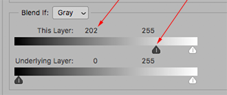
5. Choose the top layer (Layer 0 copy). Double click to bring up Layer Style and Blend i8f with this setting:

6, Layer > Flatten Image

Copy link to clipboard
Copied
Thank you for your reply, I would want to equalize luminance for colored images so they look equally bright.
Thanks
Copy link to clipboard
Copied
My description above refers to creating a common Luminosity,
so that, if it is placed as a layer above the original image with its Blending Mode set to Luminosity, the color images will all have a common luminosity and the white and black in any image will be preserved.
Here are Before and After. (Reminder: You can change standard luminosity if desired.)


Copy link to clipboard
Copied
Works till getting the common luminosity while black and white. Once we place the black and white layers with common luminosity over the colored layer and blending mode set to Luminosity, the luminosity for the images changes again.
In the below Image you uploaded, try turning these images to black and white again and notice the grey, they are far different and it is also clearly visible with yellow being much visibly darker than the other two.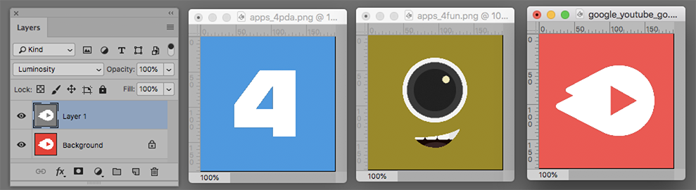
Copy link to clipboard
Copied
If you check the LAB Lightness value (similar, not exactly the same as Luminosity) of the colors you will see they are almost identical. If the Lightness of the samples were changed to match the yellow, the values would look like this:

Note the effect on your yellow sample as luminosity is decreased. The marker is your current yellow.

Perhaps your objective of matching luminosity should be reconsidered.

Copy link to clipboard
Copied
This won't work in Lab. But it will work in RGB, provided you stay in the same color profile throughout (here sRGB). Just use the same numbers, only "rotated" in the color channels:
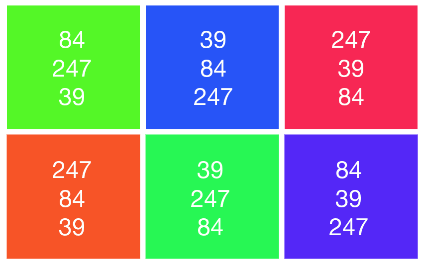
In this example they all average out to 143-143-143:

Now - here's the trick: if you don't mind a little calculation, you can use any other combination that averages out to the same value.
Copy link to clipboard
Copied
Nice trick, but I guess automation is not possible for images like mine.
Copy link to clipboard
Copied
Now I see that I misunderstood the task: actually the color should be preserved, the lumi-
nance or lightness should be equalized, and the gray conversion is merely a test.
I would like to add a few comments about solving this task in CIELab, which had been intended
originally for measuring color distances. And colors with the same value L* should appear
equally bright.
We encounter three problems:
a) A dark yellow isn't yellow but brown. This is a natural phenomenon, not related to CIELab.
The unhappy result had been shown...
b) Colors with the same value L* don't appear equally bright. Especially saturated colors
appear considerably brighter (called Helmholtz-Kohlrausch effect).
This is shown here: http://docs-hoffmann.de/palette30082003.pdf
Page 3 to 5 are constructed for the same value L* in each column. The document color
space is sRGB. Please load one of these pages in Photoshop in color mode Lab ( ! ) and
make channels a*, b* unvisible. The patterns will show channel L* equal gray, with the
exception of those patches which are out of gamut for sRGB. These are marked by a dot.
But the color patches don't look equally bright! A visual test without any mathematics...
c) A color conversion in CIELab with modified L*, but the same values a*,b*, can deliver under
certain circumstances colors which are out of gamut for the given colorspace.
This can be seen easily on pages 20 to 35 here:
http://docs-hoffmann.de/swatch16032005.pdf
Each page shows colors in CIELab for one hue and the opposite one (e.g. yellow and blue)
in a plane L* c*, with c=sqrt(a²+b²) , where c is a kind of saturation (asterisks omitted).
The inner gray contour shows the gamut boundary of sRGB, the middle contour that of
AdobeRGB and the outer large one means "OptiRGB", which is not relevant here.
Now we can see, that going vertically from a color with considerable saturation will result
always somewhere (either up or down) in an out-of-gamut color.
Maybe all this is merely of theoretical importance for the actual task. But I hope I could demon-
strate that CIELab doesn't solve the problems magically.
Best regards --Gernot Hoffmann
Copy link to clipboard
Copied
Thanks for such a detailed explanation.. I guess I will have to do it manually..
Copy link to clipboard
Copied
Is it possible that what you really are looking for is a common Saturation?
Below are the Original symbols and those with the Saturation HSB Saturation altered to 100%, 75% and 50%.

Copy link to clipboard
Copied
Indeed..Please pardon my knowledge of technical terms, I am working my way out to learn more of them. This is the closest result what I wanted. Can you please let me know how you achieved it?
Thanks
Copy link to clipboard
Copied
Magic Wand with Continuous in its Options Bar unchecked.
Eyedropper on the color in the art
Click on Foreground Color to open the Color Picker
In the S field of HSB enter a Saturation number. For example: 80 (I displayed 50, 75 and 100 in my example)
The Color Picker will reflect new saturation
Edit > Fill with the Foreground Color
Deselect the Selection.
[EDIT] You could probably automate this by first creating a version of the Luminosity file for each image (Message #11)--to use as a mask, with a white area in the mask for the color and black for the remainder of the mask. Then Edit > Fill the revised saturation on a layer above the art layer and attach the mask to this new layer. (I wrote "probably" because have not tried it, that's all.)
Copy link to clipboard
Copied
Thanks for your reply...I have tried the above...With the blue icon, the saturation is already at 100 then how come the color got boosted in your image at 100 saturation?
Copy link to clipboard
Copied
The top row of the most recent file I posted for you, the row showing the S values of your unaltered file, read as follows: Yellow 70, Red 75, Blue 73. Profile: Display. They may be the result of a profile different from yours. I made a note of the numbers at the time. You may want to try other profiles. Beyond that, I am unable to offer additional help.
-
- 1
- 2

Get ready! An upgraded Adobe Community experience is coming in January.
Learn more
 AdChoices