Ok. Thanks
--
Teena M. Stewart
[Links removed by moderator]
Hi
see if this helps your understanding of color spaces and their associated colour profiles :
Digital images are made up of numbers. In RGB mode, each pixel has a number representing Red, a number representing Green and a Number representing Blue. The problem comes in that different devices can be sent those same numbers but will show different colours. To see a demonstration of this, walk into your local T.V. shop and look at the different coloured pictures – all from the same material.
To ensure the output device is showing the correct colours then a colour management system needs to know two things.
1. What colours do the numbers in the document represent?
This is the job of the document profile which describes the exact colour to be shown when Red=255 and what colour of white is meant when Red=255, Green = 255 and Blue =255. It also describes how the intermediate values move from 0 through to 255 – known as the tone response curve (or sometimes “gamma”).
Examples of colour spaces are (Adobe RGB1998, sRGB IEC61966-2.1)
With the information from the document profile, the colour management system knows what colour is actually represented by the pixel values in the document.
2.What colour will be displayed on the printer/monitor if it is sent certain pixel values?
This is the job of the monitor/printer & paper profile. It should describe exactly what colours the device is capable of showing and, how the device will respond when sent certain values.
So with a monitor profile that is built to represent the specific monitor (or a printer profile built to represent the specific printer, ink and paper combination) then the colour management system can predict exactly what colours will be shown if it sends specific pixel values to that device.
So armed with those two profiles, the colour management system will convert the numbers in the document to the numbers that must be sent to the device in order that the correct colours are displayed.
So what can go wrong :
1.The colours look different in Photoshop, which is colour managed, to the colours in a different application which is not colour managed.
This is not actually fault, but it is a commonly raised issue. It is the colour managed version which is correct – the none colour managed application is just sending the document RGB numbers to the output device regardless without any conversion regardless of what they represent in the document and the way they will be displayed on the output device.
2.The colour settings are changed in Photoshop without understanding what they are for.
This results in the wrong profiles being used and therefore the wrong conversions and the wrong colours.
If Photoshop is set to Preserve embedded profiles – it will use the colour profile within the document.
3.The profile for the output device is incorrect.
The profile should represent the behaviour of the device exactly. If the wrong profile is used it will not. Equally if the settings on the device are changed in comparison to those settings when the profile was made, then the profile can no longer describe the behaviour of the device. Two examples would be using a printer profile designed for one paper, with a different paper. A second example would be using a monitor profile but changing the colour/contrast etc settings on the monitor.
The monitor profile is set in the operating system (in Windows 10 that is under Settings>System>Display >Advanced) which leads to a potential further issue. Operating system updates can sometimes load a different monitor profile, or a broken profile, which no longer represents the actual monitor.
There is one more scenario that is mentioned in this thread which is "soft proofing". That means simulating what the output will look like if converted to another profile. So it is possible to simulate any colour changes that might apply when printed with a particular colour printer profile if you have that profile installed on your system - hence the advice to request a copy of teh printer profile from your printer for soft proofing.
Colour management is simple to use provided the document profile is correct, always save or export with an embedded profile, and the monitor/printer profile is correct. All the math is done in the background.
I hope that helps
Dave

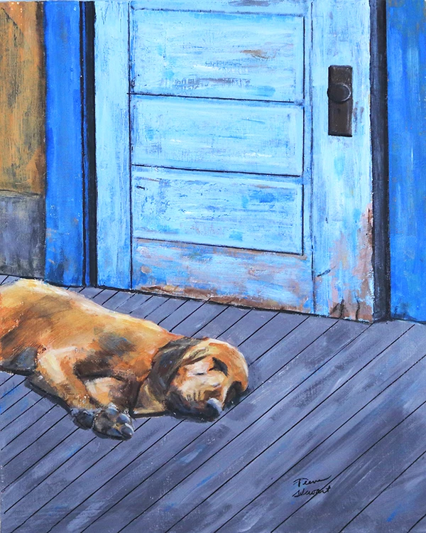
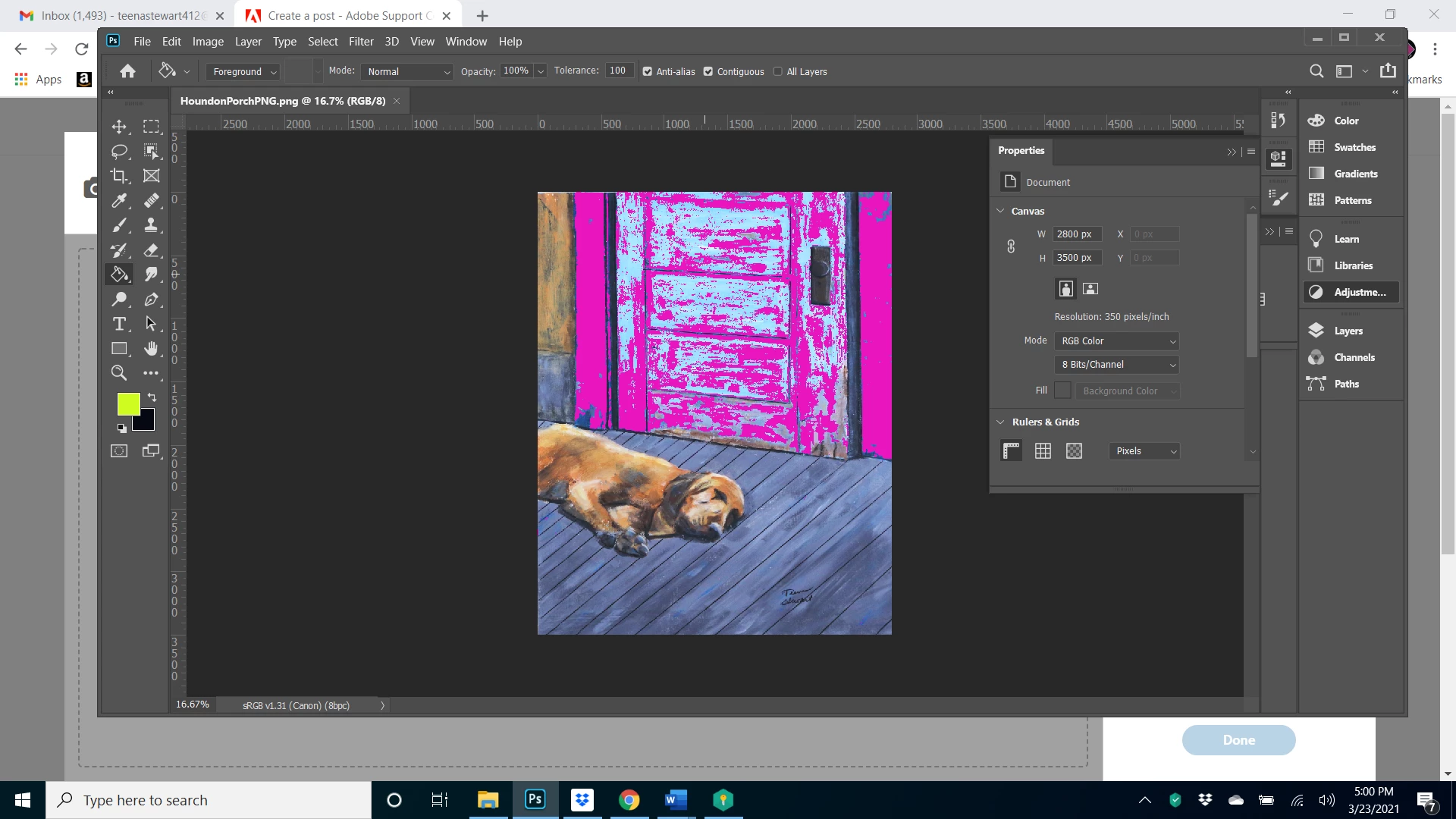 The out of gamut colors are on the door facing and door for the most part and I changed those gray colors to magenta so I could see them better. Several tutorials gave several different explanations of how to fix. One suggests creating a new adjustment layer and changing the the saturation in that layer, but when I do that and get rid of all the out of gamut magenta color, it washes out the rest of the color. Another tutorial suggested that a better way was to using edit preferences, transparency in gamut and then choosing to lighten the chosen color of blue which I am selecting but that seems to wash out the enter picture. Maybe both of these are okay because it's a masked layer but I am not sure about the results I am getting. The image certainly looks washe out. Does that sound like the right result?