• Global community
    • Language:
      • Deutsch
      • English
      • Español
      • Français
      • Português
  • 日本語コミュニティ
    Dedicated community for Japanese speakers
  • 한국 커뮤니티
    Dedicated community for Korean speakers
Exit
0

Strange results when converting to RGB or sRGB.

Engaged ,
Jul 30, 2019 Jul 30, 2019

Copy link to clipboard

Copied

I am trying to send a photo to print and for that i need to convert it to rsg or srgb.

The images, in PS are in Prophoto rgb.

When i use LightRoom to do this, the colors in the exported files are very similar to the ones in PS, which is what i want.

However, when i use PS to export as JPEG, or export and save layercomps, or convert to sRGB/RGB and save as jpeg, i always get wring (washed out) colors.

To which profile should i convert my PS images, which are currently in Prophoto rgb so that they would appear similar when saved as jpeg.

these are my original settings:

which setting should i convert to when i convert to rgb?

I also noticed that if i use PS "Export As" dialog the colors appear fine but i cannot use this since i want to use my scripts which saved the images as rgb.

Dan

Views

4.0K

Translate

Translate

Report

Report
Community guidelines
Be kind and respectful, give credit to the original source of content, and search for duplicates before posting. Learn more
community guidelines

correct answers 1 Correct answer

Community Expert , Jul 31, 2019 Jul 31, 2019

karpiyon  wrote


After opening the file, if I (A) hide the adjustment layer, convert to srgb the colors are preserved correctly.

When I (B) unhide the adjustment layers and do the same the colors are washed out.

When I try to flatten the image before converting or play around with the settings, the colors suddenly appear correctly.

If I then undo try (B) again, suddenly the colors show up correctly.

This is not a bug. It is in fact expected and normal behavior.

Adjustments are numerical. A profile conv

...

Votes

Translate

Translate
Adobe
Community Expert ,
Jul 30, 2019 Jul 30, 2019

Copy link to clipboard

Copied

Hi Dan,

Right off the bat I see your using Relative Colorimetric Rendering intent to go from the largets RGB color space to the smallest.  That clips off colors from the large space going to the smallest and scales neutrals.  Try using Perceptual rendering, I'm sure you will get a more pleasing result.  Also When exporting RGB images always embed the ICC profile.  In your case it's sRGB.  Are you doing that when exporting out of PS?

Bob

ICC programmer and developer, Photographer, artist and color management expert, Print standards and process expert.

Votes

Translate

Translate

Report

Report
Community guidelines
Be kind and respectful, give credit to the original source of content, and search for duplicates before posting. Learn more
community guidelines
Community Expert ,
Jul 30, 2019 Jul 30, 2019

Copy link to clipboard

Copied

Bob_Hallam  wrote

Right off the bat I see your using Relative Colorimetric Rendering intent to go from the largets RGB color space to the smallest.  That clips off colors from the large space going to the smallest and scales neutrals.  Try using Perceptual rendering

Standard RGB working color spaces (sRGB/Adobe RGB/ProPhoto) do not support other intents than Relative Colorimetric. You can choose other intents, but Relative Colorimetric is what you get regardless.

Votes

Translate

Translate

Report

Report
Community guidelines
Be kind and respectful, give credit to the original source of content, and search for duplicates before posting. Learn more
community guidelines
Community Expert ,
Jul 30, 2019 Jul 30, 2019

Copy link to clipboard

Copied

Interesting and confirmed here...Is this a bug?  Seems a very bizare behaviour For Adobe to include nerfed rendering intents. 

ICC programmer and developer, Photographer, artist and color management expert, Print standards and process expert.

Votes

Translate

Translate

Report

Report
Community guidelines
Be kind and respectful, give credit to the original source of content, and search for duplicates before posting. Learn more
community guidelines
Community Expert ,
Jul 30, 2019 Jul 30, 2019

Copy link to clipboard

Copied

No bug, I think it was just never included in the profile specifications. Print profiles and CMYK profiles do support it. Monitor profiles probably not (I don't know).

There has been talk of new version 4 RGB profiles forever, but so far very little has come of it, only an "experimental" v4 sRGB profile that nobody uses and with its own problems from what I hear. But it supposedly supports rendering intents.

Votes

Translate

Translate

Report

Report
Community guidelines
Be kind and respectful, give credit to the original source of content, and search for duplicates before posting. Learn more
community guidelines
LEGEND ,
Jul 31, 2019 Jul 31, 2019

Copy link to clipboard

Copied

The ICC V2 profile spec is here: http://www.color.org/ICC_Minor_Revision_for_Web.pdf

To oversimplify: two important types of profile are the "output profile" and the "three component matrix based profile". These are the types commonly used for CMYK and RGB profiles. (But not monitor profiles).

The output profile is required (6.3.3.2) to have six tables for converting to and from the color space, using each of three intents. No color science is involved, just a big list of numbers.

The three component matrix based profile has a curve for each of the three channels (a simple lookup table for each), and the exact color of each component in XYZ color. That's it. There is no provision for intents at all.

I speculate some reasons for this:

1. Rendering intents become crucial when reducing gamut; the designers were thinking in terms of RGB and CMYK, with RGB always having a bigger gamut. Yes, gamut is an issue for RGB to RGB too.

2. Because the colorants are each given as XYZ, pure color science can be used to do the conversion, and a CMM could choose to offer rendering intents on the conversion. The effect could be quite nasty: a true relative colorimetric conversion between RGB spaces would change ALL the colors, as the outer bounds of the gamuts are matched rather than the colors.

Votes

Translate

Translate

Report

Report
Community guidelines
Be kind and respectful, give credit to the original source of content, and search for duplicates before posting. Learn more
community guidelines
Community Expert ,
Jul 31, 2019 Jul 31, 2019

Copy link to clipboard

Copied

https://forums.adobe.com/people/Test+Screen+Name  wrote

The ICC V2 profile spec is here

Not that I understand very much of that, but I'm not sure this is the same sRGB. There are many varieties, and the icc have published several. One is known as sRGB black scaled, and it causes no end of problems in Photoshop. They have also published version 4 sRGB profiles.

It may well be that sRGB IEC61966-2.1 is old and outdated. But it's the one everybody uses, and it works everywhere.

Votes

Translate

Translate

Report

Report
Community guidelines
Be kind and respectful, give credit to the original source of content, and search for duplicates before posting. Learn more
community guidelines
Community Expert ,
Jul 30, 2019 Jul 30, 2019

Copy link to clipboard

Copied

First of all, don't use Export in Photoshop. It's for web/screen, it's not intended for print. Just Save As.

Edit > Convert to sRGB, make sure the profile is embedded. Save As to jpeg. That's it.

karpiyon  wrote

my PS images, which are currently in Prophoto rgb so that they would appear similar when saved as jpeg.

That's a misunderstanding. ProPhoto is a very dangerous color space to use if you don't understand the implications, and I've always thought it very strange that it's the default in Lightroom. Defaults are supposed to be fit for beginners - but beginners get in trouble all the time because of this. Those who need ProPhoto will have enough knowledge to find it on their own.

I'd recommend you stay with sRGB until you get more experience.

Votes

Translate

Translate

Report

Report
Community guidelines
Be kind and respectful, give credit to the original source of content, and search for duplicates before posting. Learn more
community guidelines
Community Expert ,
Jul 30, 2019 Jul 30, 2019

Copy link to clipboard

Copied

Can you post a lo res copy of the image before  and after color conversion.

What are your jpeg settings especially level of compression.

Are you using edit >> Convert to Proflle >> sRGB

Votes

Translate

Translate

Report

Report
Community guidelines
Be kind and respectful, give credit to the original source of content, and search for duplicates before posting. Learn more
community guidelines
Engaged ,
Jul 31, 2019 Jul 31, 2019

Copy link to clipboard

Copied

I think it a bug...

I've been using Pro Photo profile for years. It has the largest color range and is the best profile to use when working with luminosity masks.

I think this is a bug since I see different results when I follow the same procedure.

I always convert to sRGB and save as JPEG for printing. I used “Export as” just to test what the results would be but I never use it for print.

After opening the file, if I (A) hide the adjustment layer, convert to srgb the colors are preserved correctly.

When I (B) unhide the adjustment layers and do the same the colors are washed out.

When I try to flatten the image before converting or play around with the settings, the colors suddenly appear correctly.

If I then undo try (B) again, suddenly the colors show up correctly.

I've attached my sample image and what i noticed it an inconsistent behavior.

https://adobe.ly/319f6HE

Votes

Translate

Translate

Report

Report
Community guidelines
Be kind and respectful, give credit to the original source of content, and search for duplicates before posting. Learn more
community guidelines
Community Expert ,
Jul 31, 2019 Jul 31, 2019

Copy link to clipboard

Copied

karpiyon  wrote


After opening the file, if I (A) hide the adjustment layer, convert to srgb the colors are preserved correctly.

When I (B) unhide the adjustment layers and do the same the colors are washed out.

When I try to flatten the image before converting or play around with the settings, the colors suddenly appear correctly.

If I then undo try (B) again, suddenly the colors show up correctly.

This is not a bug. It is in fact expected and normal behavior.

Adjustments are numerical. A profile conversion changes the numbers. So it follows that all numerical adjustments are color space specific. The same adjustment will produce different effects in different color spaces. Again, this is how it has to be, and this is why Photoshop asks you if you want to flatten before conversion.

I was about to say "try it for yourself" - but that's just what you did...you just misinterpreted the result.

---

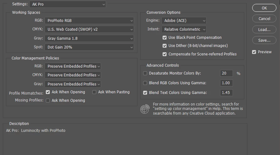
BTW, there is no particular advantage in ProPhoto for luminosity masks. A luminosity mask is lifted from a (slightly modified) Lab L channel, and the mask is identical whatever the document color space.

There are many myths surrounding ProPhoto. One of the most persistent is that it's the "best" color space. It isn't - it's just the largest. But that comes at a price. Increased risk of banding is one, severely compressed shadow values is another. The latter makes subtle shadow adjustments very difficult, because small numerical changes have large effects. It's difficult to use the histogram to spot and correct shadow color casts.

Routinely using ProPhoto increases the risk of unwanted gamut clipping, because you are forced to deal with it all in one go, at the output stage. Clipping is much easier to control early on. The main use of ProPhoto is to catch and contain raw processor artifacts until you can get them under control, without premature clipping.

Oh, and BTW - there is no reason whatsoever to "match" Lightroom and Photoshop (or to "synchronize" color settings). These are color managed applications, and any profile, regardless what it is, will be correctly handled. That's the whole point of color management in the first place. That's what it does.

Votes

Translate

Translate

Report

Report
Community guidelines
Be kind and respectful, give credit to the original source of content, and search for duplicates before posting. Learn more
community guidelines
Engaged ,
Jul 31, 2019 Jul 31, 2019

Copy link to clipboard

Copied

Good to know!

I was using then, probably unnecessarily, Pro Photo due to the recommendation in the TKaction masks panel.

Following your advice I would switch to Adobe RGB, however, doing this, as you explained, will probably cause color changes in my current adjustment layers,

So would you suggest using RGB only for new files I create and keep opening older files, using Pro Photo, in their original color space?

Votes

Translate

Translate

Report

Report
Community guidelines
Be kind and respectful, give credit to the original source of content, and search for duplicates before posting. Learn more
community guidelines
Community Expert ,
Jul 31, 2019 Jul 31, 2019

Copy link to clipboard

Copied

I mostly stay in Adobe RGB when I can - but I do switch to ProPhoto when necessary. It just isn't all that often.

All color spaces have their pros and cons. There is no "best", only most appropriate for the purpose. Even the much hated sRGB has its advantages in some circumstances - and even the hyped-up ProPhoto has its disadvantages in others.

Here's an illustration - a dark nighttime image with a pretty ugly blue color cast in the shadows. It's easy to spot in the Adobe RGB histogram, next to impossible to see in the ProPhoto histogram:

argb.png

pp.png

Votes

Translate

Translate

Report

Report
Community guidelines
Be kind and respectful, give credit to the original source of content, and search for duplicates before posting. Learn more
community guidelines
Community Expert ,
Jul 31, 2019 Jul 31, 2019

Copy link to clipboard

Copied

ICC Version 4 is not going to happen for Adobe.  There was debate in some companies Adobe being one of them if the cost of support was worth the retooling.  For Adobe it was not.  Version 2 profiles are compatible with Version 4 profiles. Version 4 sRGB profiles may, but are not required to, implement gamut mapping in Perceptual transforms but there has been no wide use of this feature so far and it appears that unless the user specifically chooses a sRGB profile that includes gamut mapping the profiles that come with CS do not include it. 

Now with the new spectral icc Max specification (ISO 20677) just made an ISO standard earlier this year there is great benifit for all to remove metamerisem in their workflows.  Adobe had tried to block this since 2006 but in 2009 at the Leone meeting we had enough votes to begin work on it, 

The benifits have allready been beyond what we had hoped for.  Medical imaging picked up the torch right away and icc Max changed the face of Cancer research.   Only with user pressure will Adobe change their opinions and support this latest standard.   

More info Here: Current status of iccMAX specification

IMO Syncronizing Color settings is basic color management practice, as is embedding icc profiles in documents.  Just good practice.  Having them different and not embedding profiles has been one of the issues that cause color differences accross CS apps.  Agree that good color management practices should negate that need but I see no reason to have different settings if your using multiple apps in a large company recieving files from who knows who.  Just a dangerous place to begin. 

ICC programmer and developer, Photographer, artist and color management expert, Print standards and process expert.

Votes

Translate

Translate

Report

Report
Community guidelines
Be kind and respectful, give credit to the original source of content, and search for duplicates before posting. Learn more
community guidelines
Community Expert ,
Jul 31, 2019 Jul 31, 2019

Copy link to clipboard

Copied

Bob_Hallam  wrote


IMO Syncronizing Color settings is basic color management practice, as is embedding icc profiles in documents.  Just good practice.  Having them different and not embedding profiles has been one of the issues that cause color differences accross CS apps.  Agree that good color management practices should negate that need but I see no reason to have different settings if your using multiple apps in a large company recieving files from who knows who.  Just a dangerous place to begin. 

OK, point taken, but my concern is that synchronizing settings doesn't fix anything. That's not the reason for color inconsistencies. The reason is that you are either not embedding the profile, or using applications without color management at all.

There are good cases for having different color settings, like e.g. CMYK policies in Photoshop (Preserve Embedded) vs. InDesign/Illustrator (Preserve Numbers). That will come up as "Unsynchronized", as if it was a problem.

Votes

Translate

Translate

Report

Report
Community guidelines
Be kind and respectful, give credit to the original source of content, and search for duplicates before posting. Learn more
community guidelines
Community Expert ,
Jul 31, 2019 Jul 31, 2019

Copy link to clipboard

Copied

LATEST

"There are good cases for having different color settings, like e.g. CMYK policies in Photoshop (Preserve Embedded) vs. InDesign/Illustrator (Preserve Numbers). That will come up as "Unsynchronized", as if it was a problem."

The easiest solution to the CMYK problem is to have Color Settings with CMYK policies turned off.  Then they will work on all aplications.  Any color decisions can be made later as they should be, 

ICC programmer and developer, Photographer, artist and color management expert, Print standards and process expert.

Votes

Translate

Translate

Report

Report
Community guidelines
Be kind and respectful, give credit to the original source of content, and search for duplicates before posting. Learn more
community guidelines