This is clipping:
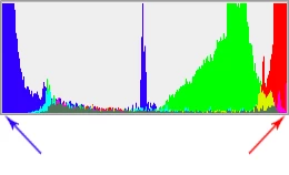
That's information lost, usually translating to lost texture and detail. It looks flat and dead. The saturation is too high for the color space you're working in (sRGB in this case). The original color can't be reproduced in sRGB, and it clips. Once clipped, it's gone and can't be recovered, only at best repaired.
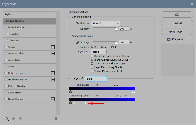
To target highlights and/or shadows, use for instance the Blend If sliders in an adjustment layer:
This isn't supposed to be easy. In fact that's my whole point - it's not nearly as easy as people think. There isn't a recipe. Photoshop provides all the tools you need, and more - but you have to use your own eyes. This isn't a shortcoming in Photoshop. It's the complexity of nature.
Of course, you can just go ahead and substitute the color, but as you correctly observed yourself, it doesn't look credible unless you also make some adjustments to the contrast range and saturation.
Thanks alot for your help.


 results.