- Home
- Premiere Pro (Beta)
- Discussions
- Re: Discuss: Alignment improvements for titles and...
- Re: Discuss: Alignment improvements for titles and...
Discuss: Alignment improvements for titles and graphics
Copy link to clipboard
Copied
Starting with beta build 23.0x25, Premiere Pro is expanding its alignment capabilities for text and shapes.
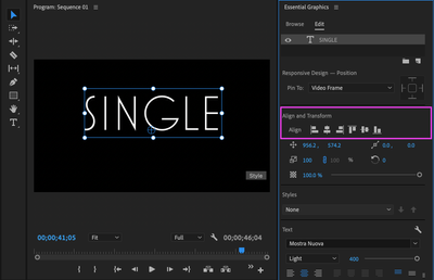
This is what this change looks like:
(How do I install Premiere Pro beta?
In the Creative Cloud desktop app, select Beta apps in the left sidebar of the Apps panel. Then select Install for Premiere Pro. You can run beta builds side by side with the release versions of Premiere Pro.)
Description:
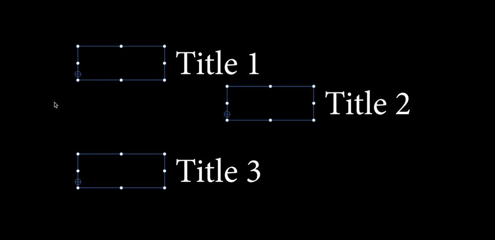
So far you were only able to align multiple objects (text and/or shapes) to the selection. For example, aligning three rectangles to the top, means two rectangles move to the same top edge as the highest rectangle. Like this:
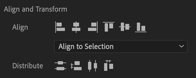
While this alignment might be desired in some cases, in others it is not. That’s why we are giving users more flexibility to align based on three different modes:
- Align to Video Frame
- Align to Video Frame as Group
- Align to Selection (this was the default behavior before)
Align to Video Frame
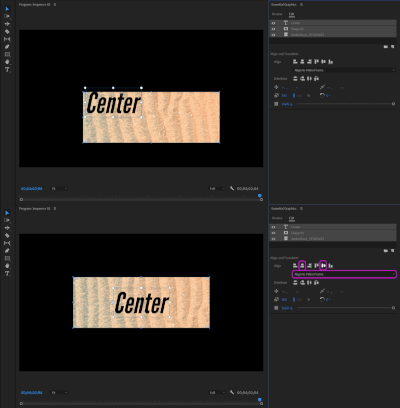
This means aligning to the Program Monitor while each object is aligned individually.
Workflow example: Align a box and a text layer to center of the frame.
Align to Video Frame as Group
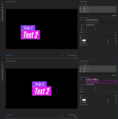
This means aligning to the Program Monitor while the multi-selection is considered as one group object.
Workflow example: Align multiple objects that are already perfectly aligned to each other as a group to the center of the frame.
Align to Selection
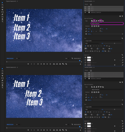
This means aligning to one specific chief object in the selection which tells the other objects where to align to. The chief when aligning left is the left most object, the chief when aligning to the bottom, is the lowest object.
Workflow example: Move one object to the position you like and align others to that object
Removal of Vertical and Horizontal Center
We have removed the Vertical and Horizontal Center buttons. They served the purpose of aligning multiple objects to the video frame as opposed to the selection. This can now be accomplished by selecting Align to Video Frame in the dropdown and using the Align Center Horizontally/ Align Center Vertically buttons.
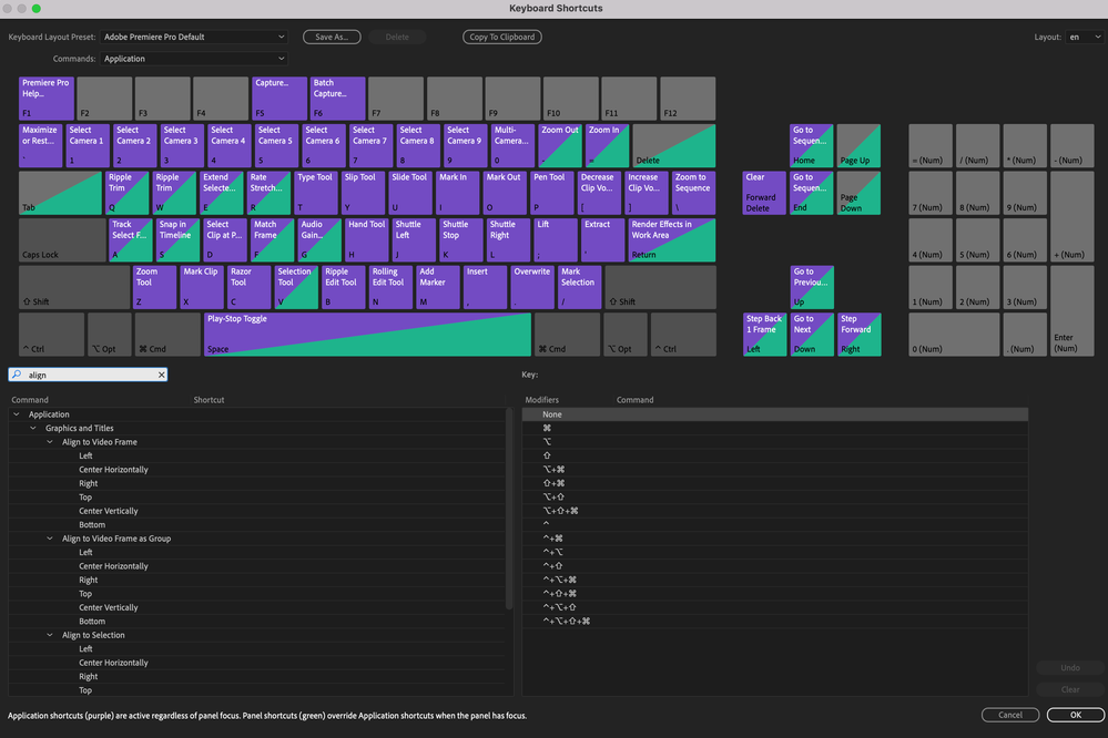
Keyboard shortcuts
With the removal of Vertical and Horizontal Center buttons we now have 6 alignment buttons for each mode. Users have the flexibility to give custom keyboard shortcuts to 18 alignment commands to accelerate their individual key workflows.
UI simplification for single selections
For single object selections we have simplified the UI. We have removed Distribute buttons, since these only apply to a minimum of three objects. We have also removed the mode dropdown, since for single selection there is only one mode: Align to Video Frame.
Change of order
We changed the order of the buttons to match most other Adobe applications. The order now is:
- Left
- Center Horizontally
- Right
- Top
- Center Vertically
- Bottom
Alignment in menus
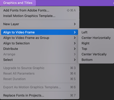
We have also changed alignment through the Graphics and Titles menu. Each alignment mode now has its own submenu and we have moved Distribute to its own menu.
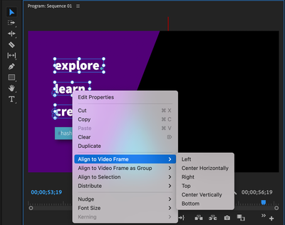
We have also added a new context menu for graphics in the Program Monitor which allows, among other things, to align objects from here.
Let us know what you think!
Copy link to clipboard
Copied
Very welcomed feature
Copy link to clipboard
Copied
Love this.
Copy link to clipboard
Copied
Let's see:
- flexible alignment options to serve the alignment needs of all users
- useful context-menu options
- priority given to consistency with other Adobe applications
- availability of keyboard shortcuts
Seems like a win x4 to me! Well done Annika and team!
The #1 feature in all of this to me is the new ability to Align to Video Frame as Group.
I'll report back if I find anything worth mentioning after I try out these new features.
Copy link to clipboard
Copied
BUG: When selecting the Align Center Horizontally option from the context menu, the bounding boxes don't update until you click anywhere away from the selection and reselect the items. This doesn't happen for single items. (see image)
Suggestion 1: Now that it's possible to treat a group of titles as a single cohesive unit for the purpose of alignment, the same needs to apply to resizing. This has always been the case with the LT, but strangely missing to this day in EG. When users resize a group of titles, they almost always want the group to resize as a group, rather than have each item within the selection resize individually, thus ruining the spacial relationship between items (i.e. messing up the layout).
Suggestion 2: Please make it possible to select multiple titles with the Ctrl/Command key. There is simply no valid reason to resort to the Shift key when this breaks decades-long UI conventions in software and operating systems! There's no need to remove the Shift key as a selector, but please ADD the ability to select multiple items with the Ctrl/Command key. Even to this day, I sometimes get caught trying to select items with those keys because those are the keys used to select items everywhere else, including Windows and MacOS! Even Pr's own Project window (among other windows) makes proper use of the Ctrl/Command key for selecting individual items, while the Shift key is used to select a range of items. If certain parts of Pr are capable of respecting this UI convention, why can't the Program Monitor and Timeline? Please fix this once and for all by simply enabling the selection of multiple items with the Ctrl/Command key as users expect to be able to do! To not fix this is to continue throwing a so easily avoidable wrench in people's workflows. It's bad design, pure and simple. Thankfully, the solution is incredibly simple. PLEASE fix this!
Suggestion 3: When a group of titles is selected, the red alignment guidelines only appear relative to the title that's clicked on to move the selection, rather than being relative to the group as a whole. It would be absolutely fantastic if these guidelines applies to the group instead. This would give users yet another super easy way to center a group of titles! If this request isn't clear, please let me know and I'll elaborate further, but hopefully it's self-explanatory.
BTW, thank you for making the Alignment Mode menu in the EG window sticky! It's great to see the last selected option remain selected when reopening Pr!
That's it for now. If I notice anything else to report, I'll let you know.
Copy link to clipboard
Copied
I forgot to mention that Suggestions 1 and 3 are already the case in Photoshop and Illustrator (Suggestion 1 even applies to the LT), so adding this to Pr's EG would simply be giving users basic behaviors they've come to expect in Adobe software.
Copy link to clipboard
Copied
Here's another couple of ideas:
Suggestion 4: Why not give users the ability to center their title(s) in 1 step vs 2? (see illustration) To make this option a fully comprehensive solution, new keyboard shortcuts for 'Center' could be added, and a 'Center' icon could be added to the alignment icons in the EG window (you mentioned wanting consistency in the button layout with other Adobe software, which doesn't have this button, but then why not add it to any other programs where it would be useful as well?)
Suggestion 5: When mousing over buttons in the EG window, it's nice that tooltips appear for users to learn the name/function of each button. It would be even handier, however, if these tooltips showed any associated keyboard shortcuts. This way, if a user assigns a keyboard shortcut to 'Align Left' for example, but later forgets it, all they'd have to do to remember it is mouse over the button.
Copy link to clipboard
Copied
AE has a 'Center in View' context menu option and keyboard shortcut, turning the task of centering an item a 1-step affair. In Pr, using the new keyboard shortcuts or buttons, it's 2-steps instead of 1. Why not offer a 1-step option like AE does? 2-steps when 1-step would easily suffice is never desirable. Here's my suggested icon.
Please focus on maximizing efficiency in every new design. Thank you.
Copy link to clipboard
Copied
NOTE: Since users may want to center non-EG items as well, it would make sense to place the suggested 'Center' button in the Program Monitor's Button Editor. This way users can display the button if/where they want to, and use it to center PIPs, pictures, graphics, etc, in addition to EG titles.
Copy link to clipboard
Copied
We really need the alignment buttons to show in the Effects Control tab/panel. It's the only text specific task that I have to switch from Editing Workspace to Captions/Graphics to do. And no, I don't want the Essential Graphics panel cluttering my Editing workspace.
This is a major pain point. All of the other text controls that appear along with the align controls in Essential Graphics appear in the text area of the Effect Controls panel except for the alignment buttons. I can change font size, opacity, position, font, vertical alignment (why not horizontal also!?!???). This would be a huge win for me, thanks!!!
Copy link to clipboard
Copied
same

